ABOUT ME

Hi my name is Gary and my passion is how we interact with the entire world around us, creating products and solutions that enable people to do this better is truly what excites me.
I am a natural creative problem solver and ten years in UX has served to sharpen that ability even further. I honestly enjoy each step of the process, whether building a new product or refining an existing one.
From research, to client and team communication, through testing phases and final design. And every hurdle in between that you inevitably encounter.
More About Me
- My path into UX is one I've been on since sketching and inventing as a teenager obsessed with Leonardo da Vinci
- I hold a bachelors degree in Journalism and worked in Sky News in London which has enhanced my researching skills for UX
- I hold a masters degree in the field of Interaction Design
- Away from my desk, I like to relax with family, strive to keep healthy and help animals in any way I can.
- I am as equally adept leading the research phase of a project, as I am with final design. Workshops and brainstorming sessions are my favourite method to begin the creative process of building a product.
- My startup, Teemie won funding from the Irish government and was chosen by Google as one of their Adopt A Startup companies. Leading a startup has given me an entire collection of other skillsets that cannot be taught anywhere else.
I would estimate that 60% of the work of a UX or Product Designer is done behind the scenes and goes uncredited. That is why I have created a weekly blog, 8 weeks in total that will go into detail of my daily tasks as I navigate two new projects in parallel.
SOME OF MY WORK
PROJECT NAME: KTTIPAY
OBJECTIVE: CREATE A PLATFORM THAT ALLOWS USERS MANAGE FINANCES AND SHARE EXPENSES
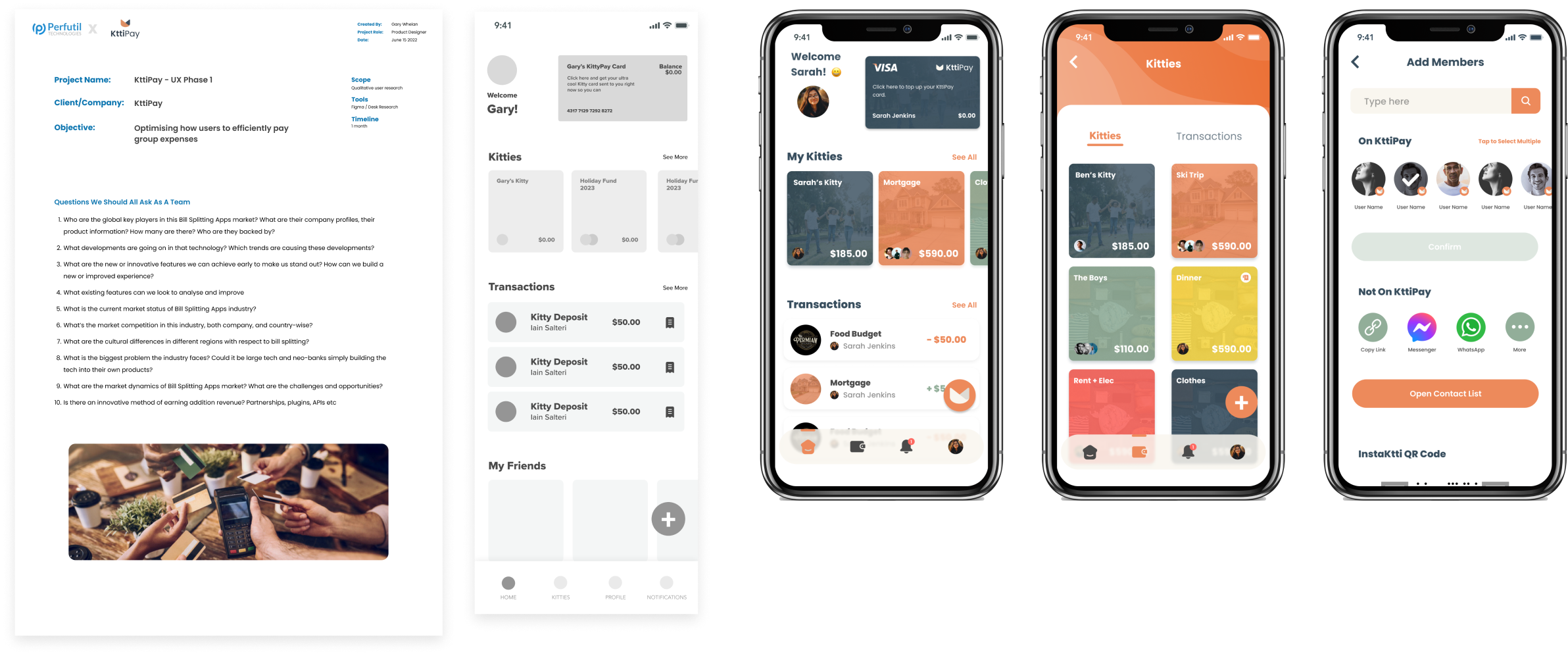
This project was brought to me with just an general idea and an objecive to take that idea through first, a phase of validation and early research to provide enough data for the client to then feel comfortable in proceeding to a build phase.
Through a variety of methods from workshops with target users, prototyping and desk research we achieved the validation the client was seeking and started a full traditional UX process. Further research, wireframing and eventually onto the final design you see below.
The final result evolved from what was simply an idea for bill splitting to what is now a more robust group sharing and expenditure product. Users can create accounts or ‘Kitties’ and share them with loved ones to group save and virtual cards are generated for all members to spend with. It is an extremely quick process when compared to banking products.
PROJECT NAME: HUMM
OBJECTIVE: RESEARCH, TEST AND DESIGN A NEW UX STRATEGY FOR THIS COMPANY
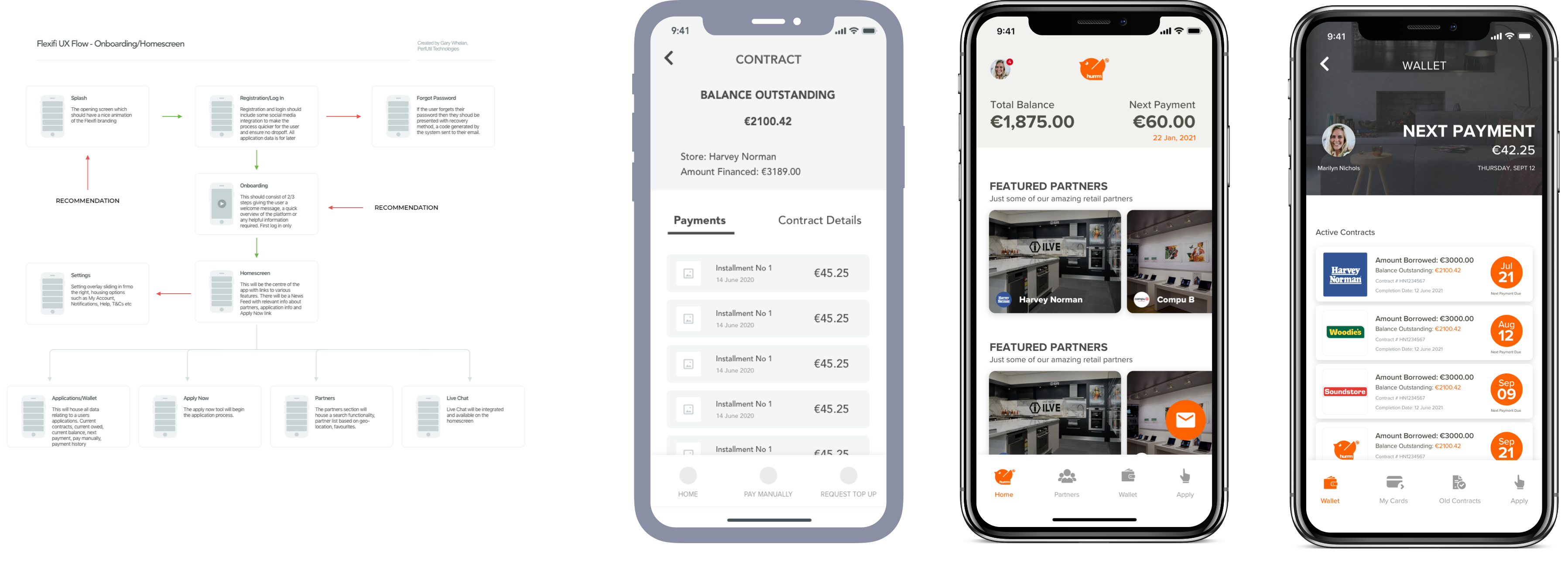
I was approached by a company in Ireland called Flexifi, who had an existing product in the Fintech sector over the last number of years, who were preparing to scale their company, and optimise their product.
The product provides a method for shoppers to make instant purchases in store, and pay back in installments with zero interest up to a certain amount. My objective was to do a complete audit of the previous product, conduct research on methods to optimise the user experience based on that audit, carry out user testing, build wireframes and create a high-fidelity prototype to test some of these ideas. I then went through a test and evaluation phase before completing the final design.
Full Portfolio here

MY METHODOLOGY
The more experience I have built up working as a UX Designer, the more that I have experimented both individually and as part of groups, different methods of sourcing information which can help to map out the direction of a product.
As a full stack UX designer, I am as passionate about seeing the reaction of test users in the early stages of a workshop, as I am about seeing the reaction of the client when they see the final design working for the first time.
From sketching on paper, to wireframing and from interviewing test users to viewing the results of a survey about my teams ideas, the research phase is the most crucial part of the process. I most enjoy creating personas and having sticky note sessions for projects, as I find they really fuel creative thoughts and ideas which have resulted in some great features in finished products.
CASE STUDY - INSTAGRAM STORIES AR MODE
OBJECTIVE: A LOOK INTO AR FUNCTIONALITY BEING IMPLEMENTED INTO INSTAGRAM STORIES
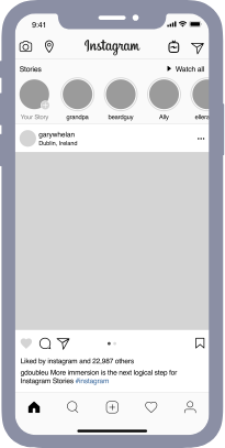
As a Product and UX Designer, my mind naturally and regularly envisions ways in which users interact with products, both digital and physical. I wanted to use that ability to imagine the user experience of my favourite social media tool, Instagram.
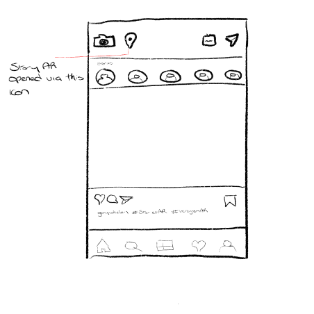
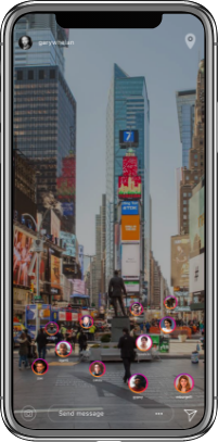
The objective of Instagram, whether through Stories or Posts is to allow users to become digital storytellers. To share moments, be they passing or everlasting events in their lives and to more importantly, immerse their audience in that story. So I wanted to build upon that offering even more interactivity in how users can engage in this content. By allowing users to both create and consume stories at particular locations and pinning them in AR. The example below showing a user in Times Square who can view in augmented reality, stories pinned to that location.
Read Full Case Study
PROCESS FROM PAPER TO FULL DESIGN
PROJECT NAME: TEEMIE
OBJECTIVE: IMPROVING THE WORKFLOW OF STAFF AND MANAGERS IN NON-OFFICE INDUSTRIES
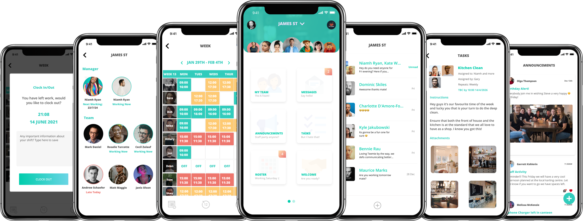
Teemie is a project that I have been lead researcher and designer from the conceptualisation phase, to post development. I have been responsible for not only providing the necessary data in the early stages to validate the product, but also for creating the full product design for multiple platforms, wIth desktop, mobile and admin packages .
The creation of that product did not end there with my responsibility continuing while being the PM and guiding the process through full development. Our objective was to create a product that would help out certain industries with tools built just for them, and with a v2 and investment incoming, I believe we more than achieved that.
Read Full Case Study
PROTOTYPING
I am a big believer in testing ideas, and it is our responsibility as UX designers to use every method possible to validate an idea for a client. This can have many different outcomes, either they will have the best version of their idea moving forward they or will quickly find out if they need to re-evaluate their plans.
Fully interactive, high-fidelity prototypes will give them the information they need to make this decision, before paying high costs for development. This cannot be achieved with traditional hotspot prototypes. Which is why I use tools like Flinto, that allow complex animations and behaviours to build as close to a final product as possible.
It is also the most powerful visual from a design perspective to analyse the user experience and make any adjustments necessary. I have in the past couple of years begun to use prototypes far more regularly, as a method to create a a fully realised visual for the client, but also to enable the development teams to have an interactive visual to work from. This alone saves many potential back and forth.
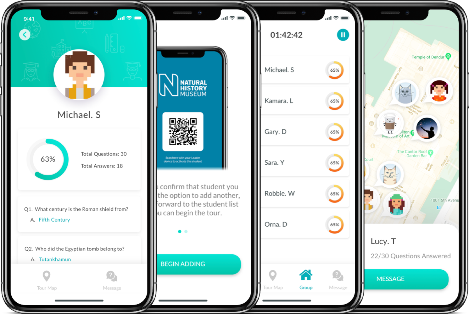
PROJECT NAME: ED TRIPPER
OBJECTIVE: A STUDY INTO THE BEHAVIOUR OF TEACHERS AND STUDENTS ON EDUCATIONAL TRIPS
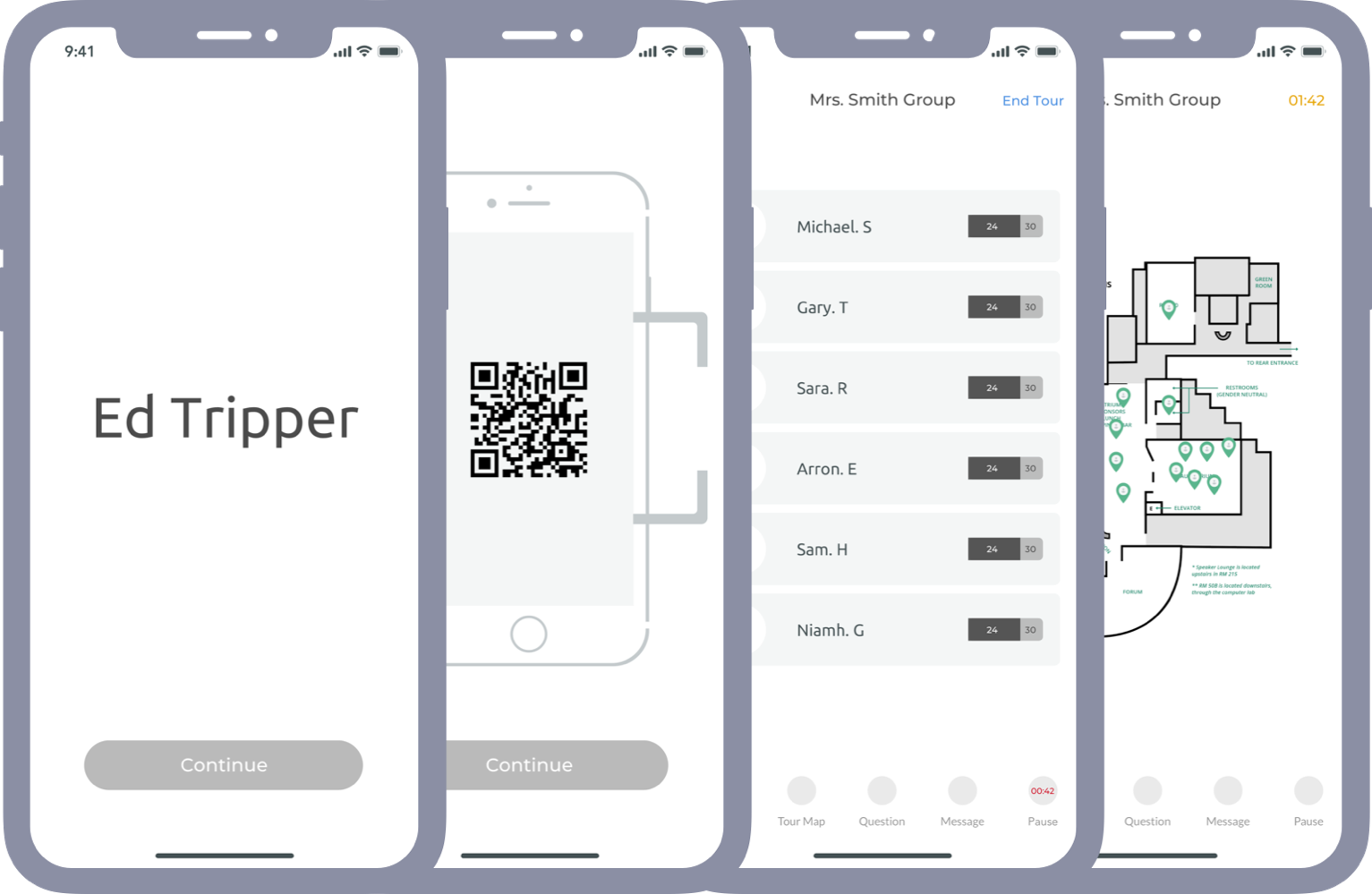
Working closely with the client company, in addition to some schools in Australia and museums, we had to objective of improving the interaction and organisation of school trips. Our early research showed that there were many options out there for booking or organising the administrative aspect of a school trip.
Parental permission, logistics etc. The area we wanted to focus on was how teachers and students interacted while on the trip, and how digital tools could enahnce the learning experience for kids.
CASE STUDY : TECHNOLOGY IN FASHION RETAIL
User experience and mobile usage in retail, not just in fashion but in any aspect of commerce is one that is changing on a consistently regular basis over the past decade and all signs point to that trend continuing into the next decade.
CASE STUDY: DESIGNING AND CARRYING OUT UX WORKSHOPS
A key element of research, in particular in the user experience or interaction design field is how to gain insight into what people like when interacting with products, how they use apps or websites, what they expect and more importantly what they don’t like.


