EdTripper: Optimising educational trip planning for schools across Australia
Overview
Addressing the logistical challenges faced by schools and ensuring a seamless, engaging experience for both educators and students.


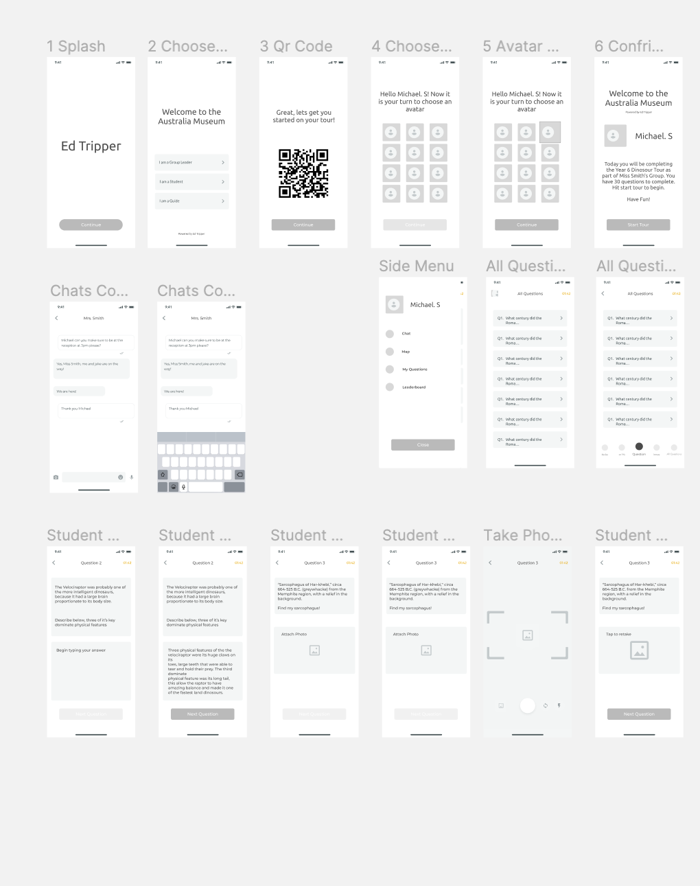
- The project began with an initial concept to simplify educational trip planning, requiring a comprehensive UX design process that started with in-depth research to map out the user journey.
- Conducted a series of workshops over several weeks to ideate, test, and refine the user experience, involving educators and stakeholders to ensure the platform met their needs.
- Performed thorough due diligence on different service partners to ensure they could meet the platform's technical and user experience requirements.
- The team built the product from scratch, consistently adhering to the defined requirements and UX constraints, ensuring a seamless and user-friendly final product.
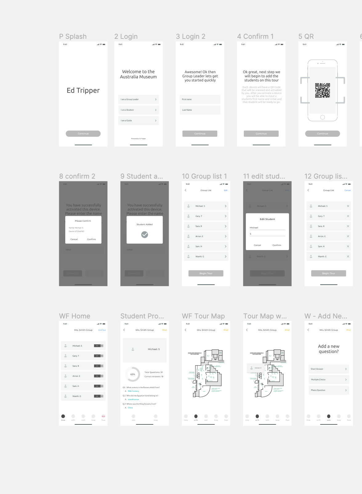
Products Delivered
Challenges and Problem Solving
Data Integration
Integrating diverse data sources (transportation schedules, venue details, educational content) into a single platform was complex and risked disrupting the user experience.
User Engagement
Keeping students and educators engaged with the platform required balancing functionality with an intuitive, attractive design.
Security and Privacy
Ensuring robust security measures to protect sensitive information was crucial, given the platform's educational context.
Research Methodologies Used
Research Papers:
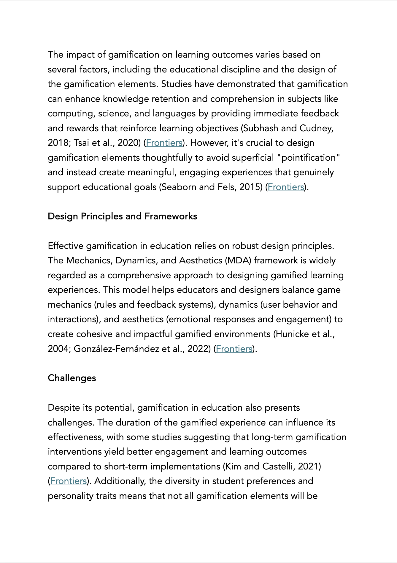
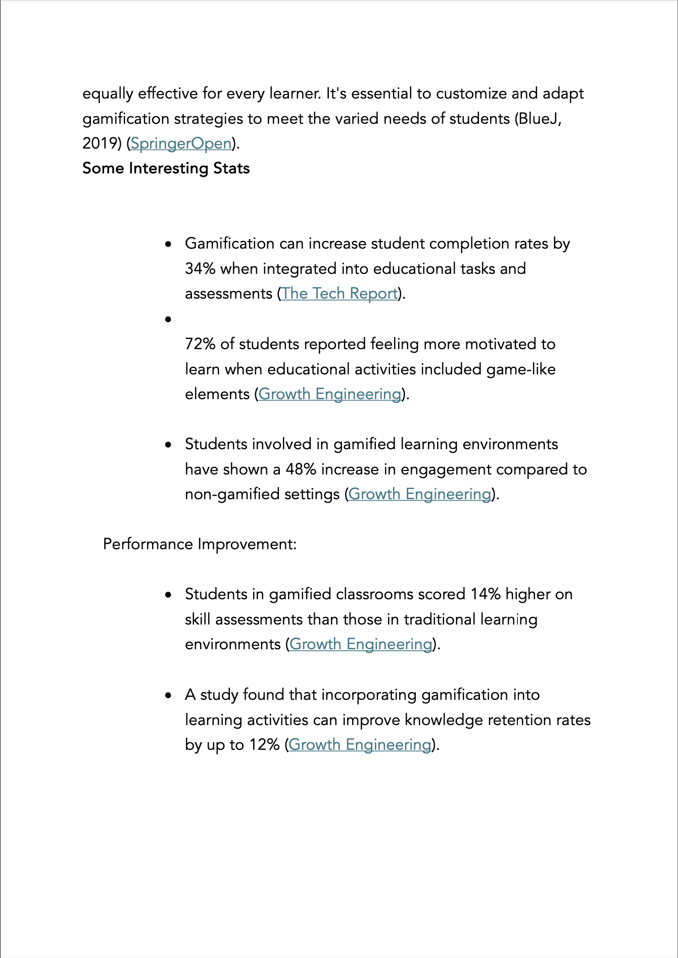
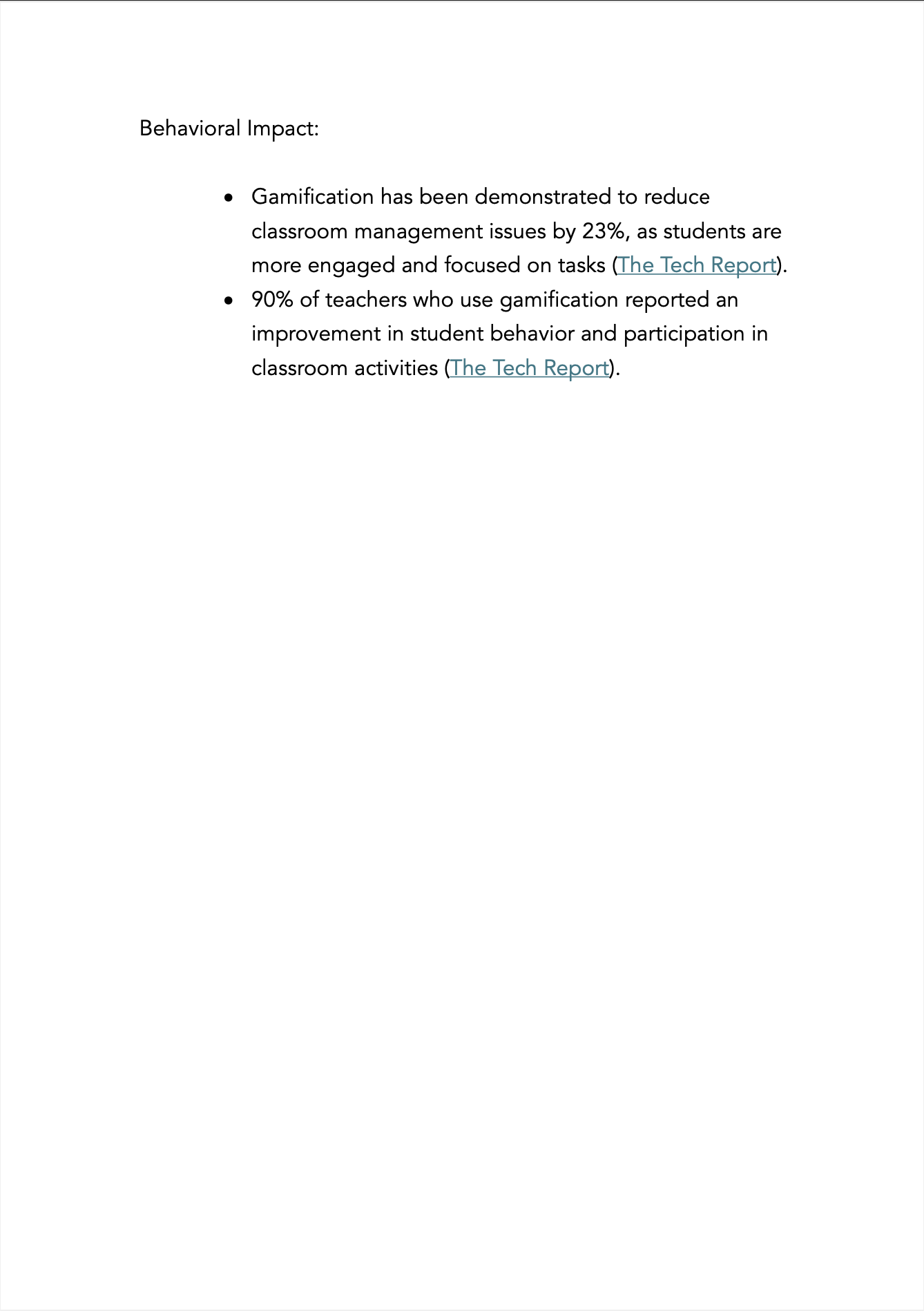
Reviewed existing academic research into relevant areas to validate any potential early stage design decisions. Some of those reviewed that enhance student engagement, motivation, and learning outcomes by incorporating game-like elements into the learning process.
User Interviews and Surveys:
Conducted in-depth interviews with educators and surveyed over 30 teachers to understand their challenges and preferences. This helped identify key areas for improvement and essential features needed in the platform.
Competitive Analysis:
Analyzed existing educational trip planning tools, focusing on their features, user experience, and shortcomings. This analysis informed our strategy to differentiate Ed Tripper and offer superior functionality.
Evaluation Sessions:
Conducted user evaluation sessions with products in a similar space. Performed a heuristic evaluation to systematically pinpoint areas of friction and inefficiency, providing a foundation for our design improvements.
Some of the research material
Problem Discovery: We encountered significant challenges with the initial GPS-based student location feature, which provided poor accuracy and was a major concern for schools and teachers.
The GPS solution fell short in terms of precision, which could only locate students within a broad area, leading to potential safety issues and logistical difficulties.
To address this issue, our team conducted further research and identified Bluetooth technology as a more accurate solution. Bluetooth offered location accuracy within a couple of meters, providing the reliability required for educators to monitor students effectively.
Solution Implementation:
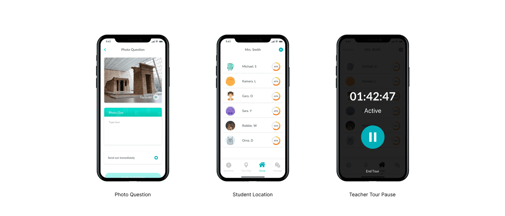
We integrated Bluetooth technology to enhance location accuracy and developed a feature that notifies teachers when students move outside a designated radius.
This feature ensures teachers can quickly locate and respond to students' movements, significantly improving safety and oversight during trips.
The Final Product
Interface Design Philosophy:
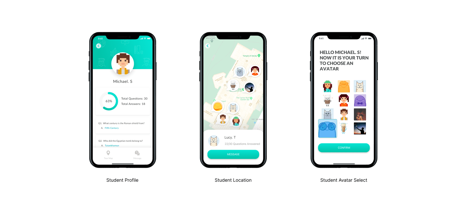
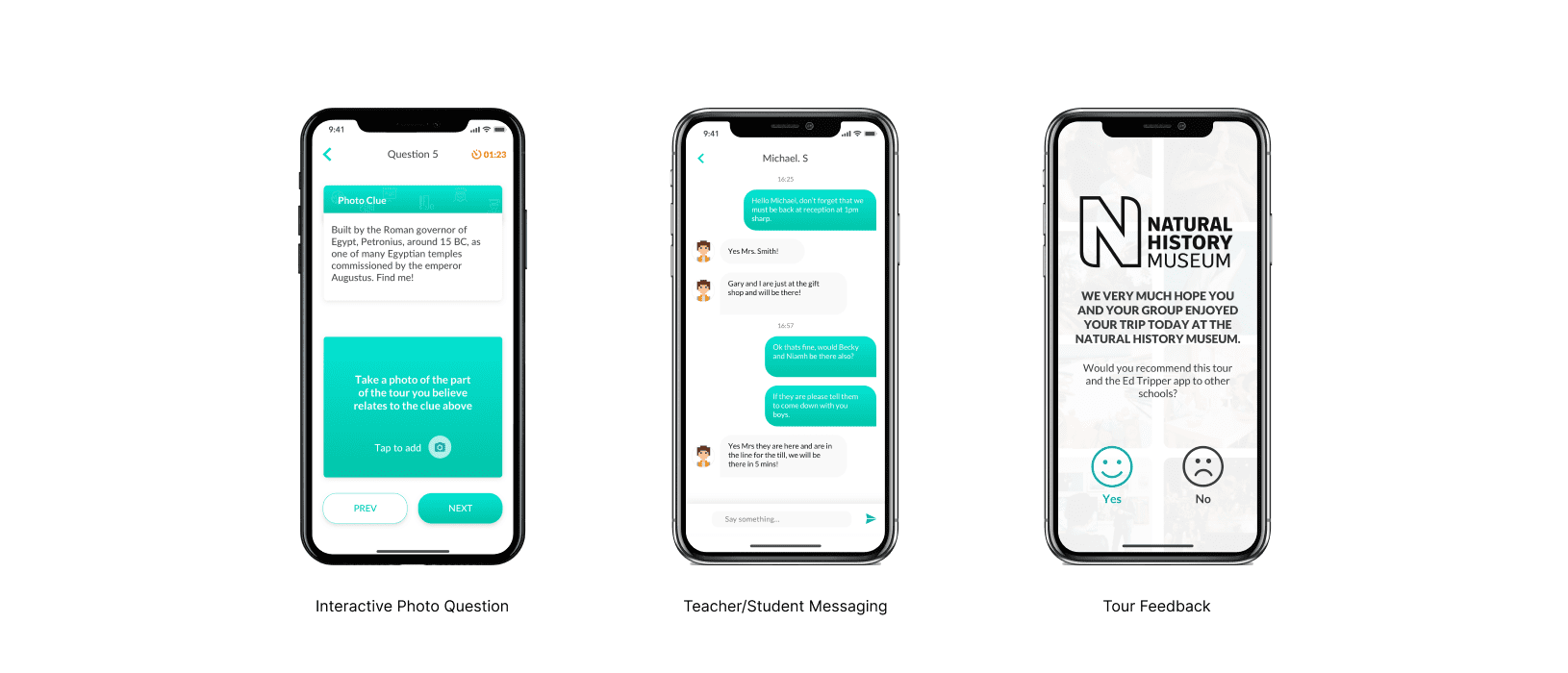
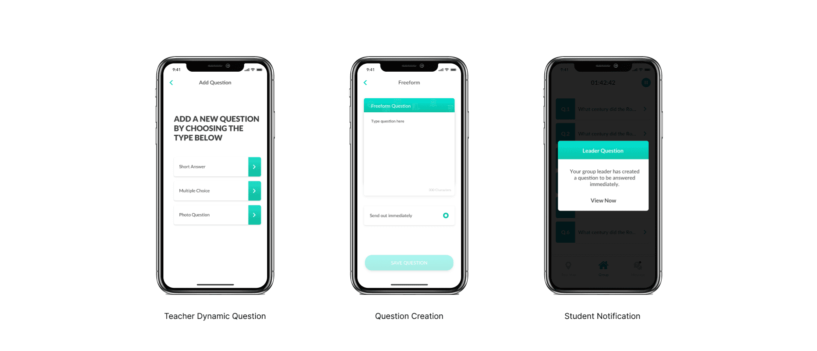
The difficult task here was to create an experience that was frictionless and helpful for teachers and educators. While also trying to engage young students in a fun and exciting way.
The range of students using the platform were between the ages of 6 and 18, which made the objective harder. Our goal was to be fun, friendly without veering towards overly childish. Through, testing and iteration with our different end user types, we have been given all positive signs that we did achieve that.
