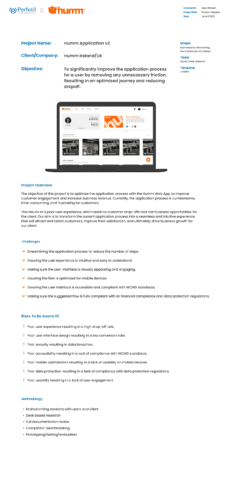
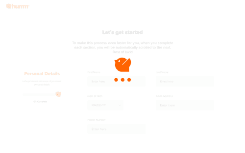
Project: Conduct a comprehensive UX audit to streamline Humm's application onboarding process, reducing user drop-offs and increasing conversions.
Overview
The experience while applying for their service was not designed previously with a user-centered mindset and had been built for functionality first. This resulted in long, multi-step process for users and ultimately, a huge drop in their loan application and journey completions.

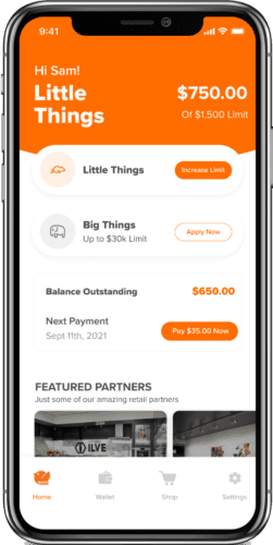
Platforms Worked On
- I was the lead product designer on this project and was responsible for the output at research, testing and design phases
- I led the audit the and the pitch to the client to discuss the results
- Following this we were given the go-ahead to implement the suggested changes
- The success of this project has now grown into multiple applications in different regions of the world
- We work directly with the Humm team to continue to innovate and improve their products, via UX led workshops and sessions
Humm noticed a low conversion rate on their sign-up process. We were tasked with researching and creating a solution to impact this experience and ultimately increase their customer base.
Objective: Conduct a comprehensive UX audit to streamline Humm's web application onboarding process. Present the results to the client company with the suggested solutions to the problem. The goal to reduce user drop-offs and increase conversions.
Challenges and Problem Solving
Initial Onboarding Complexity
The original onboarding was too lengthy, with far too many steps and complex questions. This led to a lot of friction and ultimately, significant user drop-off.
We simplified the process by reducing the number of steps and ensuring each step was clear and concise.
Third-Party Integration
Integrating third-party services for verification posed challenges some potentially serious challenges to the experience.
We worked closely with these providers to ensure a smooth integration that didn't disrupt the user flow.
User Trust and Security
Ensuring users felt secure sharing their information was crucial. We incorporated transparent communication about data security and used trust signals throughout the process.
Making sure the suggested flow is fully compliant with all financial compliance and data protection regulations.
The process that I used
Research
Phase
Heuristic Evaluation:
We conducted a thorough heuristic evaluation of the onboarding process to identify usability issues. This allowed us to systematically pinpoint areas of friction and inefficiency.
User Interviews and Surveys:
Engaged with users through interviews and surveys to gather qualitative data on their experiences and challenges with the current onboarding flow. This provided valuable insights into user needs and pain points.
Analytics Review:
Analyzed user journey data to understand where users were dropping off. This quantitative analysis helped us focus our redesign efforts on the most critical stages of the onboarding process.
Design Process
Iterative creation of wireframes and prototypes to explore different user flows and interface layouts, ensuring intuitive usability.
Developed the final user interface design, focusing on simplicity and clarity to enhance user experience in managing shared financial activities.
Continuing Responsibilities
Although the UX phase had ended, my work on the project continued by regularly engaging with the development team and Humm to ensure the execution of the plan I provided.
Build
Phase
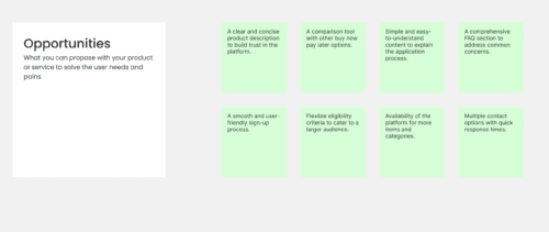
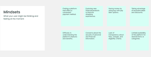
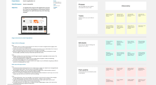
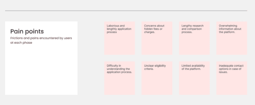
Some of the early research conducted
Key insights from that research
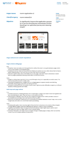
Impact of Form Length on User Drop-off Research indicates that the length of forms significantly affects user completion rates.
Perceived Complexity:
Users may feel overwhelmed by the number of fields and the effort required to complete the form.
Time Consumption:
Longer forms are perceived to take more time, which can discourage users from starting or completing them.
Shorter forms or forms broken into manageable steps typically see better completion rates because they reduce the cognitive load and make the process feel quicker and less burdensome.
The impact of my work

- Reduced Drop-off Rates: The redesigned onboarding process led to a 30% reduction in user drop-offs.
- Increased Conversions: Conversion rates increased by 25%, as more users completed the onboarding process.
- Enhanced User Satisfaction: User feedback highlighted the ease and intuitiveness of the new onboarding flow.
- All of the above leading to happier Humm customers and ultimately increased business performance
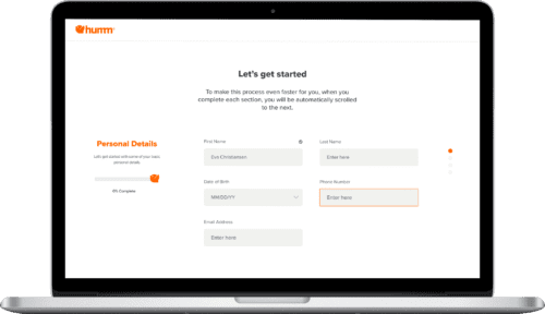
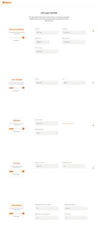
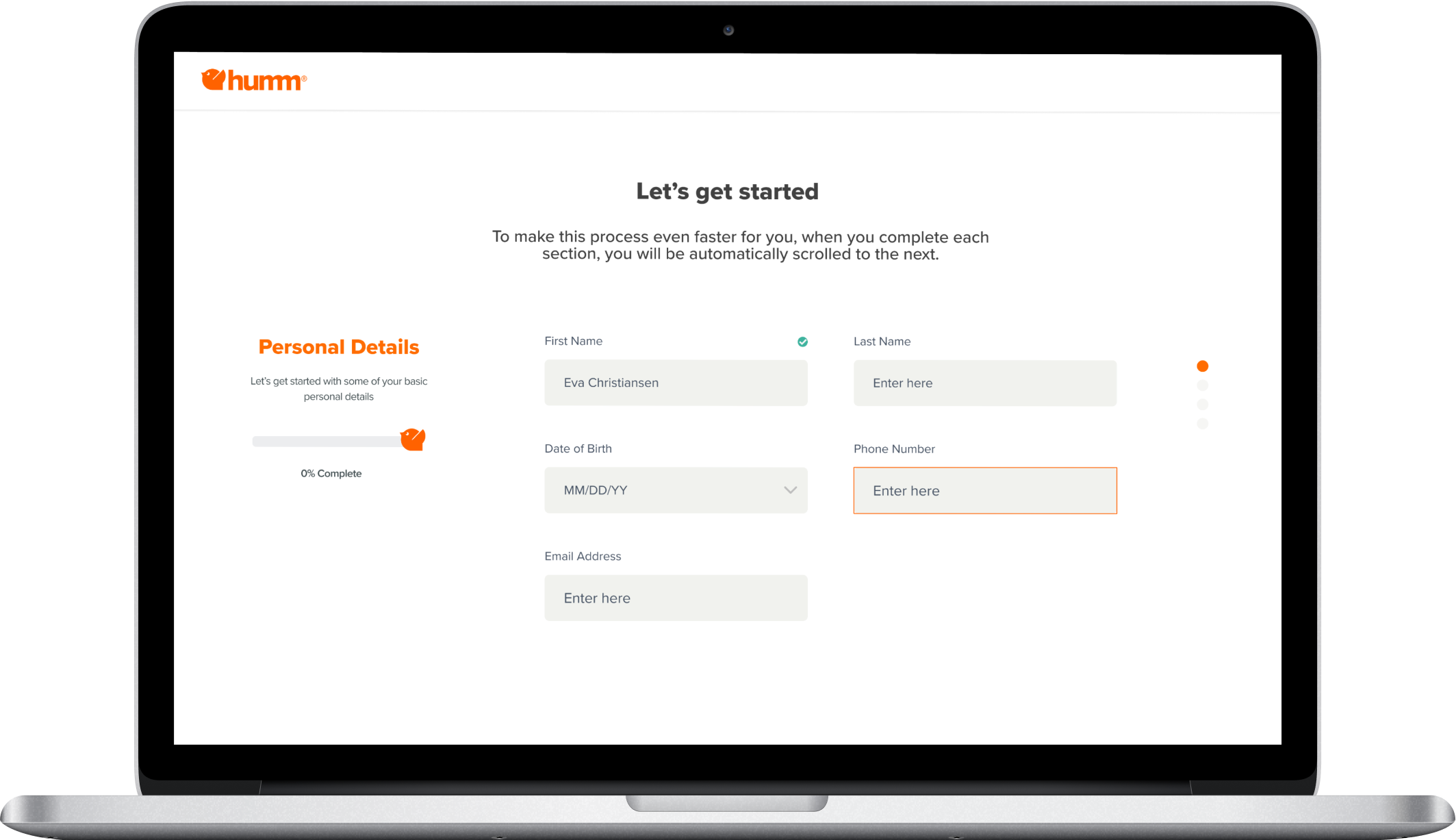
The Final Product
Design Philosophy: The final UI was crafted to align with Humm’s branding while ensuring an intuitive, user-friendly experience. Key elements included clear visual cues, concise instructions, and streamlined steps to guide users through the onboarding process effortlessly.

