Architecting a complete P2P neobank platform from concept to launch
Kttipay
In what is a very complex space, I had to design a platform that adhered to all of the above, while also simplifying the experience of shared financial activities for users across Australasia.
My Role
Products Delivered
Major Design Considerations
Security and Privacy Concerns
To address users' concerns about financial data security, we used a user-centered design approach with regular security testing and user feedback.
Security audits during the build phase helped prevent breaches in the live product.
Regulatory Compliance
Fintech products must meet various regional regulatory standards.
We collaborated with legal teams from the start and used prototyping and iterative testing to integrate regulatory requirements without affecting the user interface.
Complex User Interactions
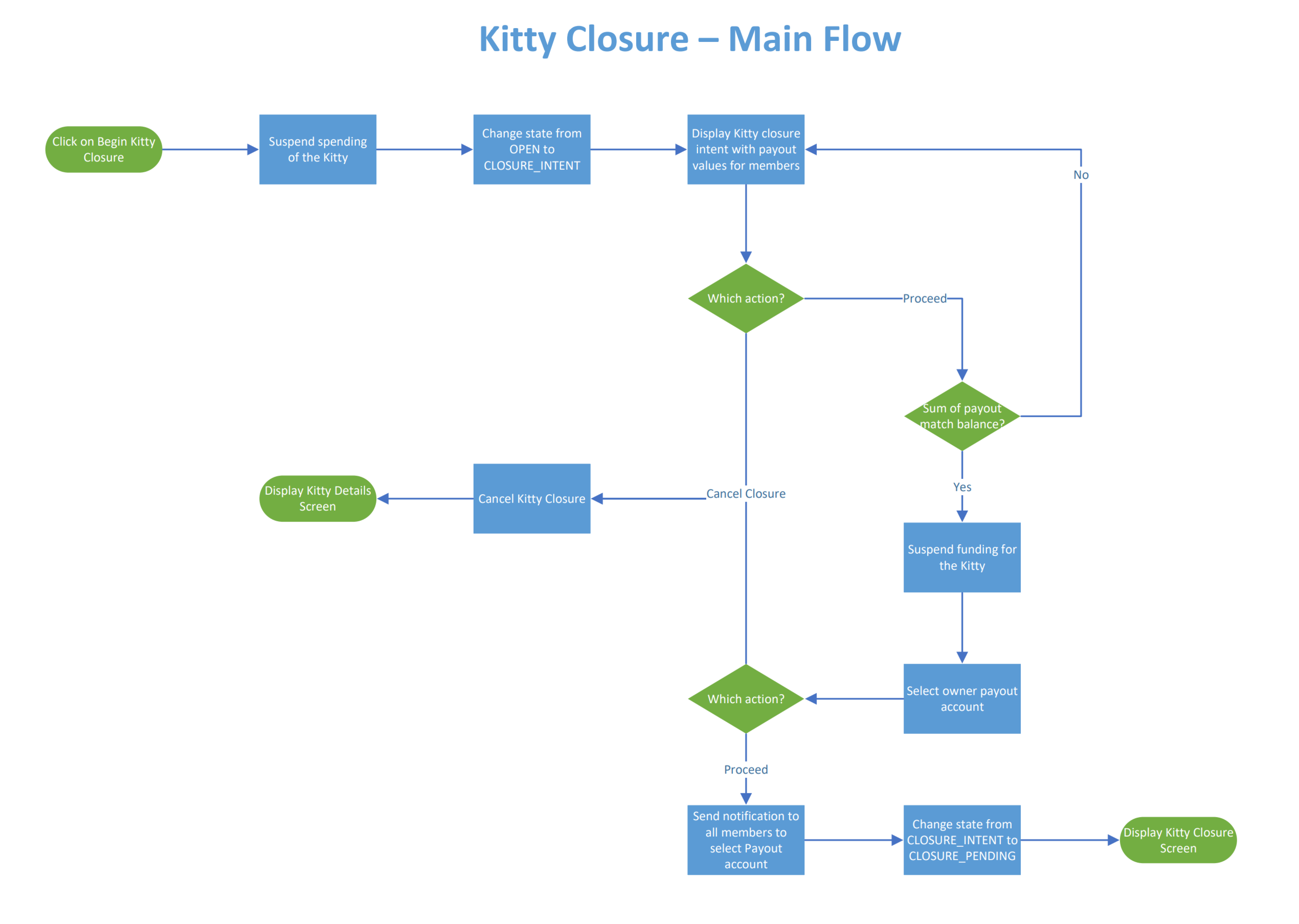
Simplifying complex financial tasks into user-friendly experiences involved user flow diagrams, storyboarding, and regular usability testing to ensure interactions were intuitive and accessible.

- Project began with an idea and required a validation phase beginning with deep research
- I led a number of workshops, over a number of weeks to ideate, test and refine the experience
- Testing, paper prototyping, wireframing and user testing were all used to achieve the end goal
- Scoping the requirements for the MPV was an important step to determine what and when
- We've performed due diligence on different service partners to ensure the requirements were met
- The team build the product from scratch, always observing the requirements and UX constraints set
We are so thankful to have worked with a great partner
Gary was there every step of the way, from ideation, wireframing, solution design, and implementation. We couldn't have launched KttiPay without him.
Ian Salteri, Founder of KttiPay

Methodologies Used
Target User Identification: Conducted initial surveys and interviews with potential users, including families and friend groups, to understand their financial management habits and pain points.
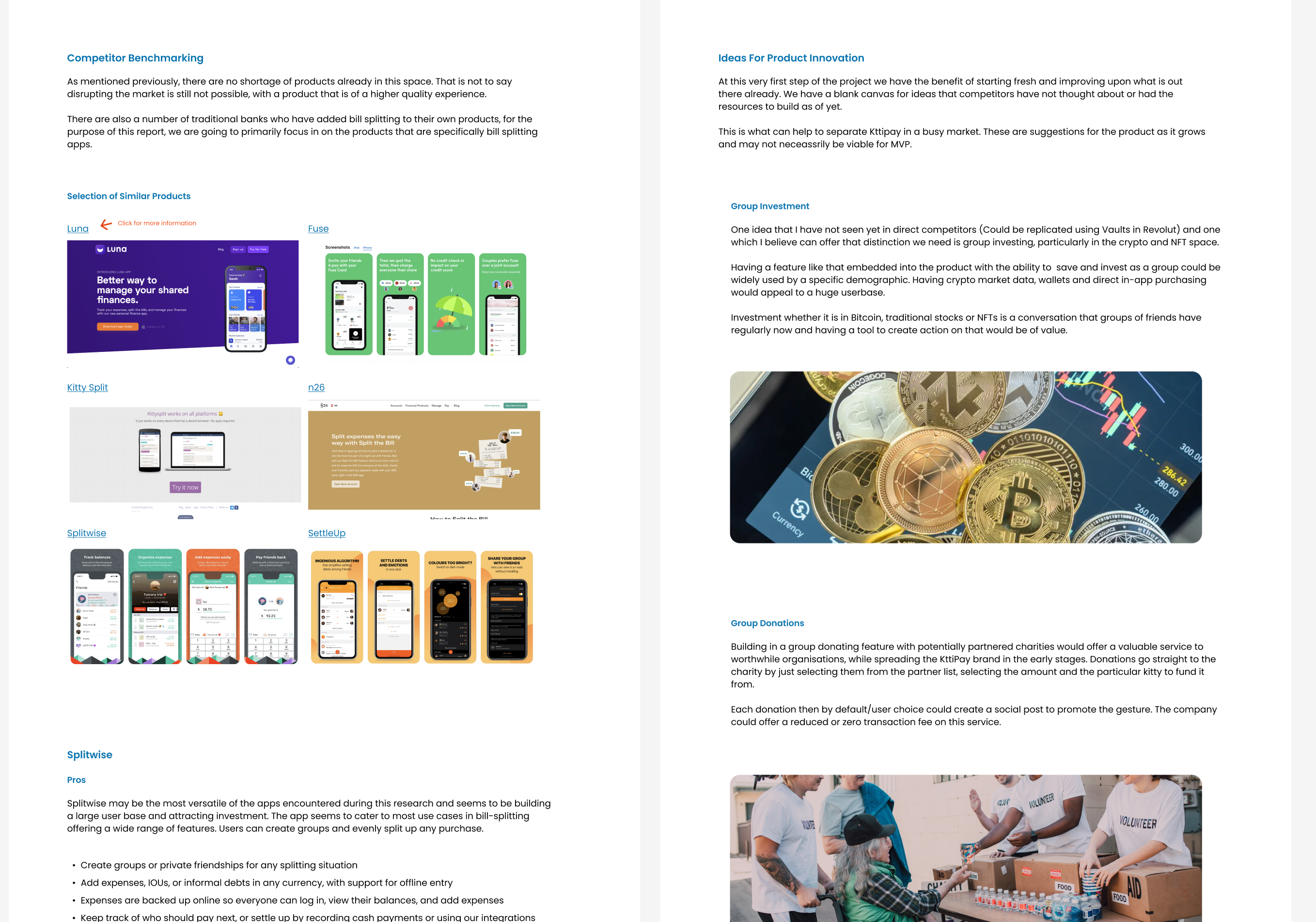
Market Analysis: Analyzed competitors in the fintech space to identify gaps and opportunities for innovation in group financial management.
Design Process
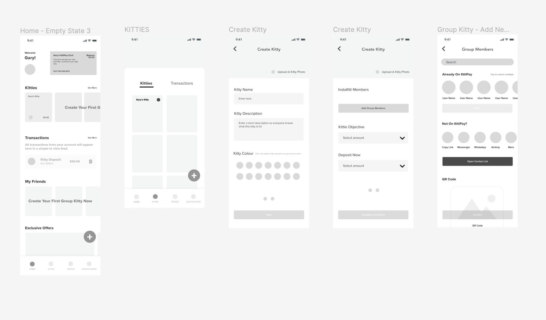
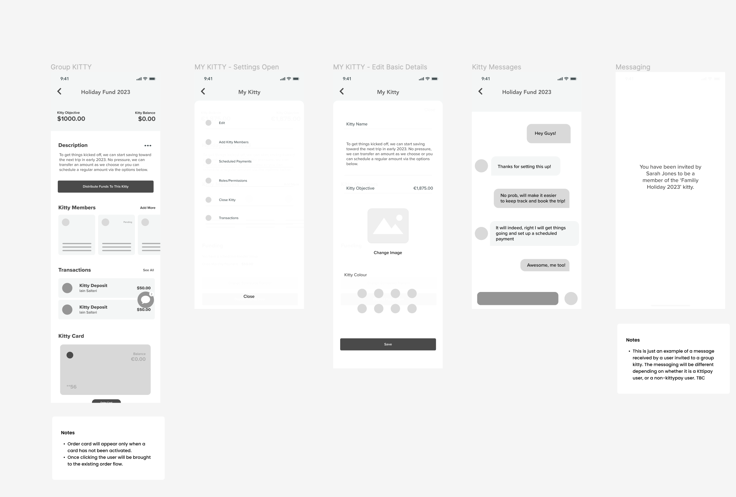
Wireframing and Prototyping: Iterative creation of wireframes and prototypes to explore different user flows and interface layouts, ensuring intuitive usability.
User Testing: Conducted multiple rounds of user testing with prototypes to refine interactions and gather feedback on usability and satisfaction.
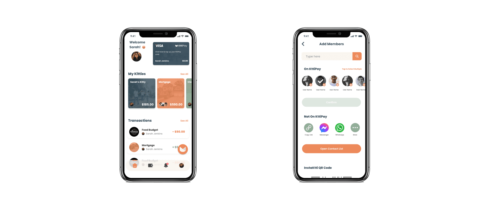
Final UI Design: Developed the final user interface design, focusing on simplicity and clarity to enhance user experience in managing shared financial activities.
Challenges and Problem Solving
Integrating Third-party Services: Navigated complexities of integrating third-party fintech services, which required adapting UX and software architecture strategies to accommodate external constraints while maintaining a seamless user experience.
Security Concerns: Emphasized robust security measures in the build to protect sensitive financial information, which involved implementing advanced encryption methods and secure authentication processes.
Design for Trust: Focused on building user trust in a new financial platform through transparent design practices and clear communication of security features.
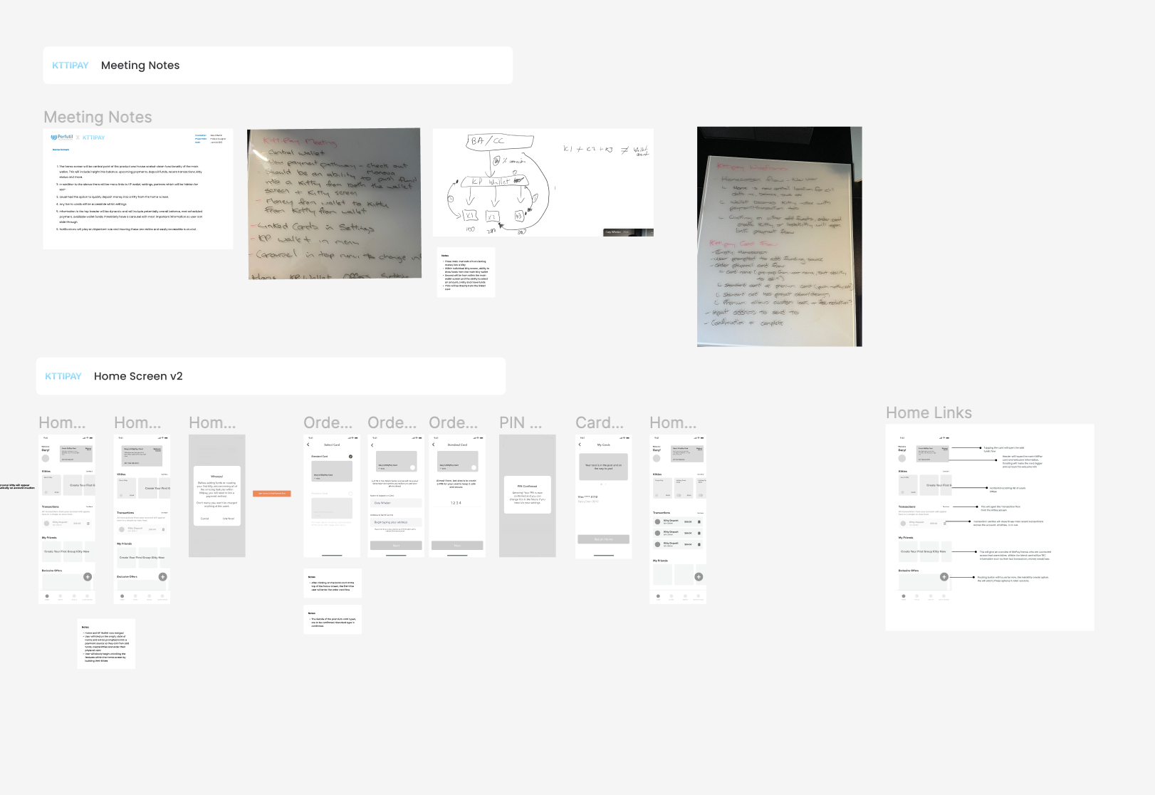
A fraction of the resulting work from user workshops
Problem Discovery: We encountered significant challenges with the initial third-party payment processing integration.
The provider's solution fell short in terms of functionality and ease of integration, which adversely impacted the user experience.
To address this issue, our team embarked on a comprehensive evaluation of alternative payment processors. We conducted extensive testing in sandbox environments to assess the functionality and integration capabilities of each option.
Design Methodologies Used
User-Centric Testing: We conducted focused test sessions with selected users to prototype significant changes to the user flows that would result from switching to a different payment processing service.
Iterative Prototyping: This involved rapidly creating and revising prototypes to integrate feedback effectively, ensuring that the new payment integration was user-friendly and met our functional requirements.
Design Optimization: Our design team re-architected the user interface to maintain simplicity and security, successfully incorporating the new payment processor without disrupting the core user experience.
The Final Product
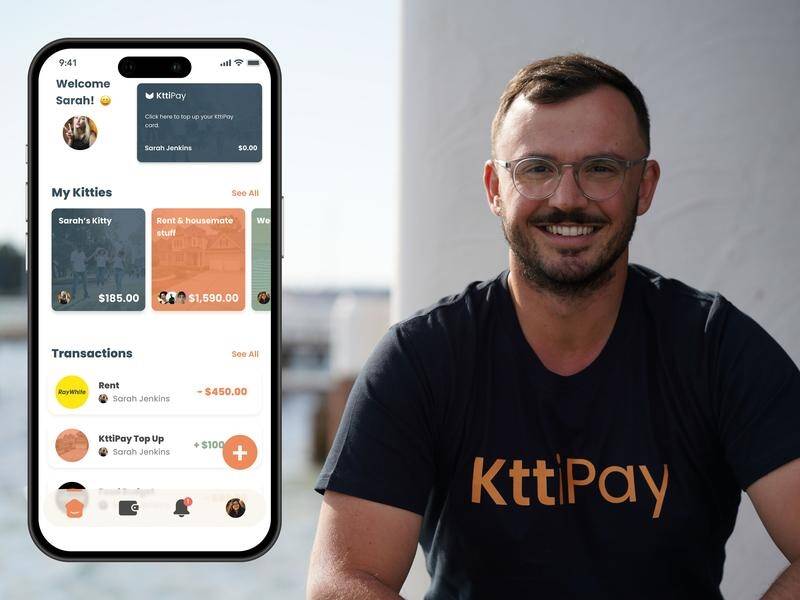
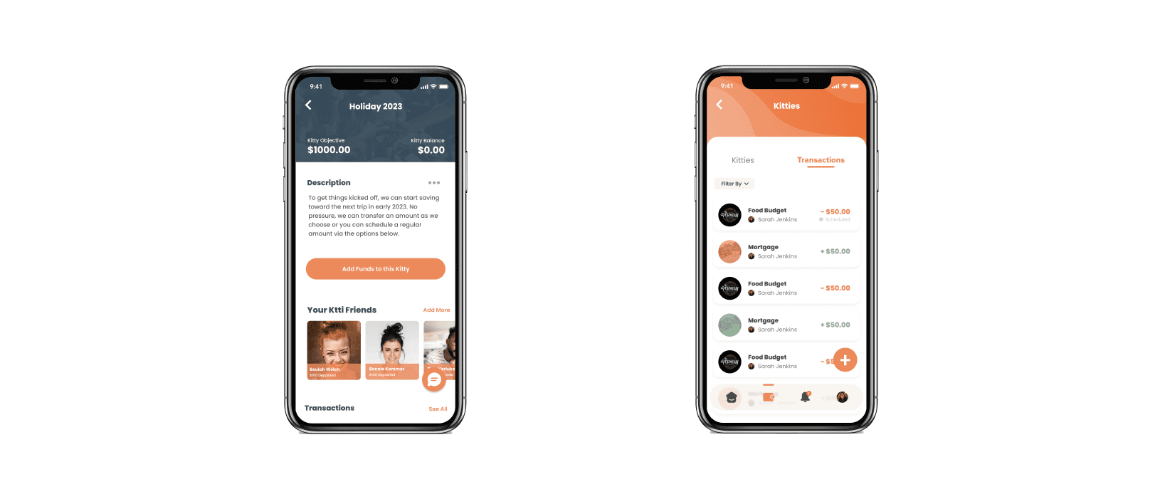
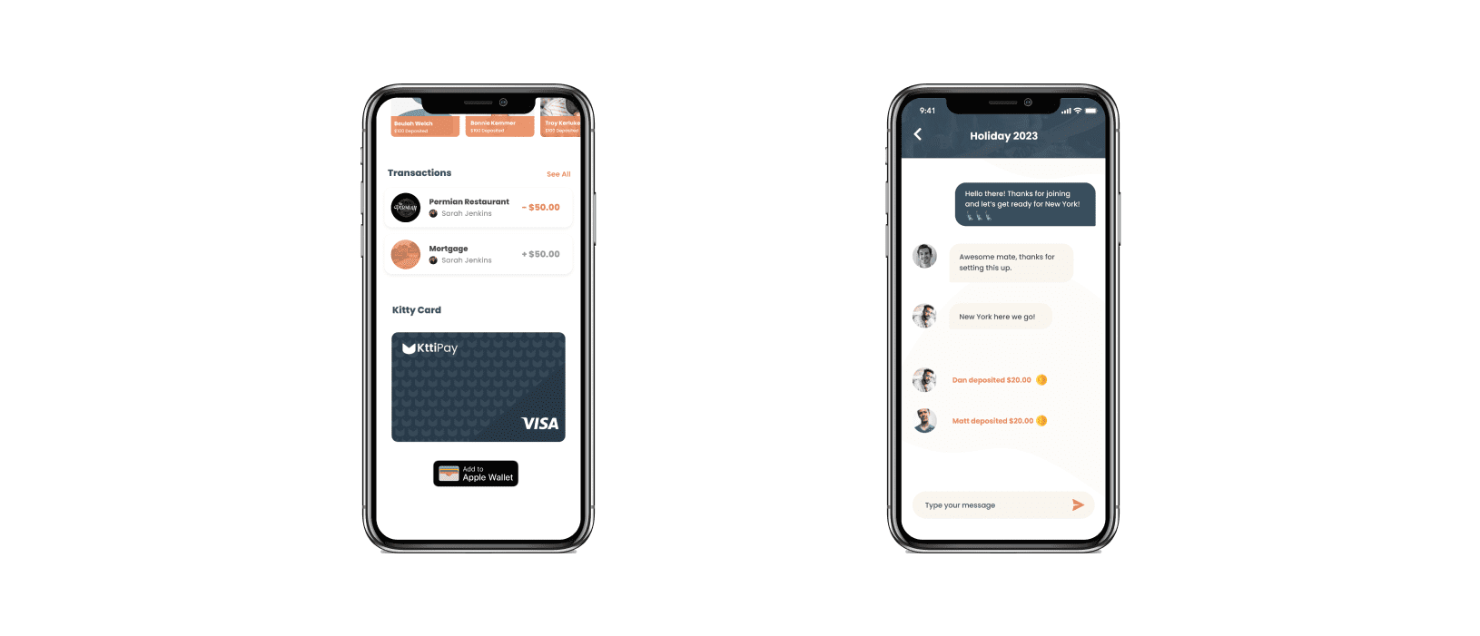
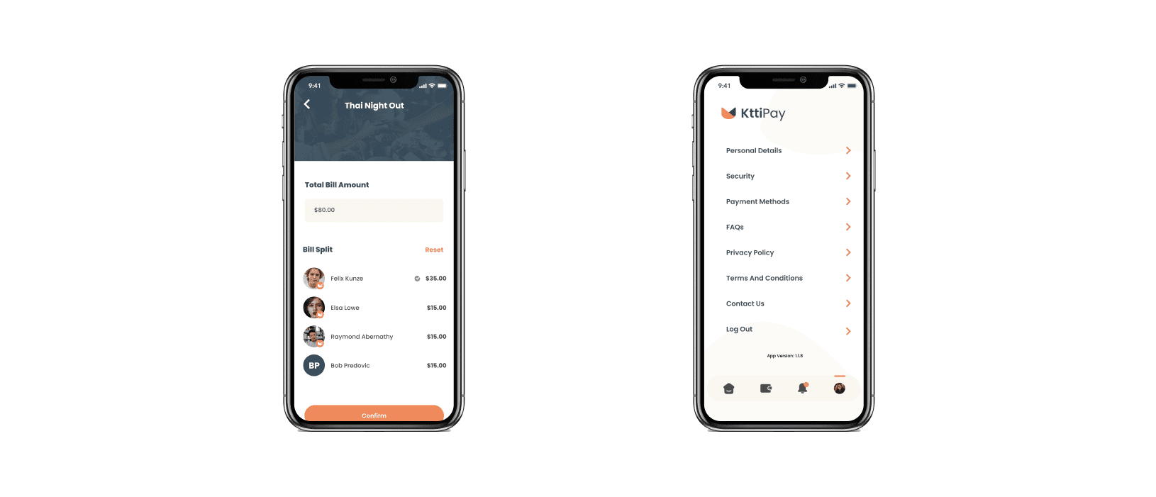
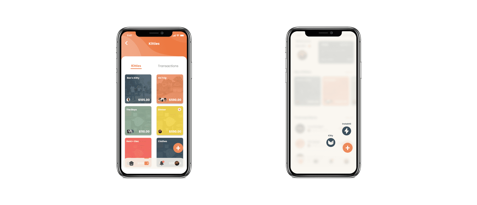
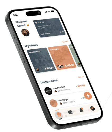
Design Philosophy: Our goal was to create a final UI that not only met the high standards of the fintech industry but also exuded a friendly and approachable vibe to resonate with our diverse demographic of users. The design needed to balance technical robustness with ease of use, appealing to both tech-savvy individuals and those new to digital banking.
My work in numbers
1000 s users and rising
The product has now progressed from a concept on paper, to full launch and user numbers increasing every month
11 specialists
Worked alongside a team of Solution Architects, Product Managers and developers with a variety of tech stacks
18 months UX
This product from beginning to launch went through an 18 month long, UX-led journey
