Move 01
Let the system emerge from real screens.
Don't start with abstract tokens. Build the new product first. Let the design language emerge from production screens. Then codify it into a system other tools can adopt.
Teemie is a workforce platform for frontline teams in retail, hospitality and service — scheduling, clock-in, messaging, jobs, reports, the lot. I founded the product, designed it, shipped it, and spent six years living in it. In 2026 I led a complete platform-wide design refresh — every tool, plus a new product (Teemie Rewards) — solo, while the businesses running on it kept running every shift.
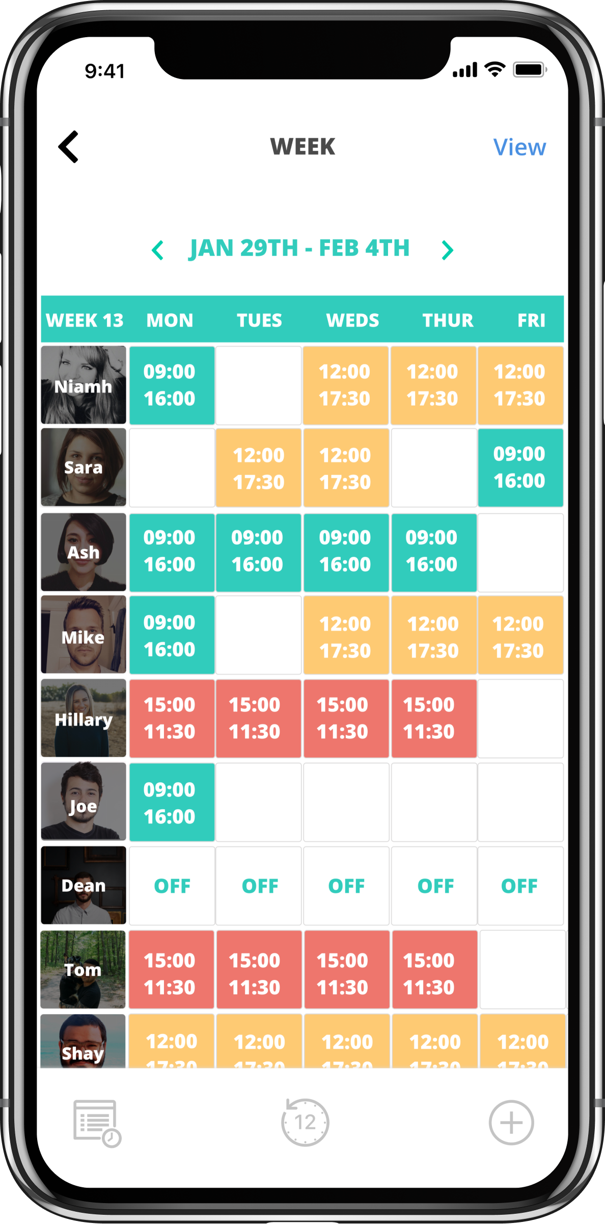
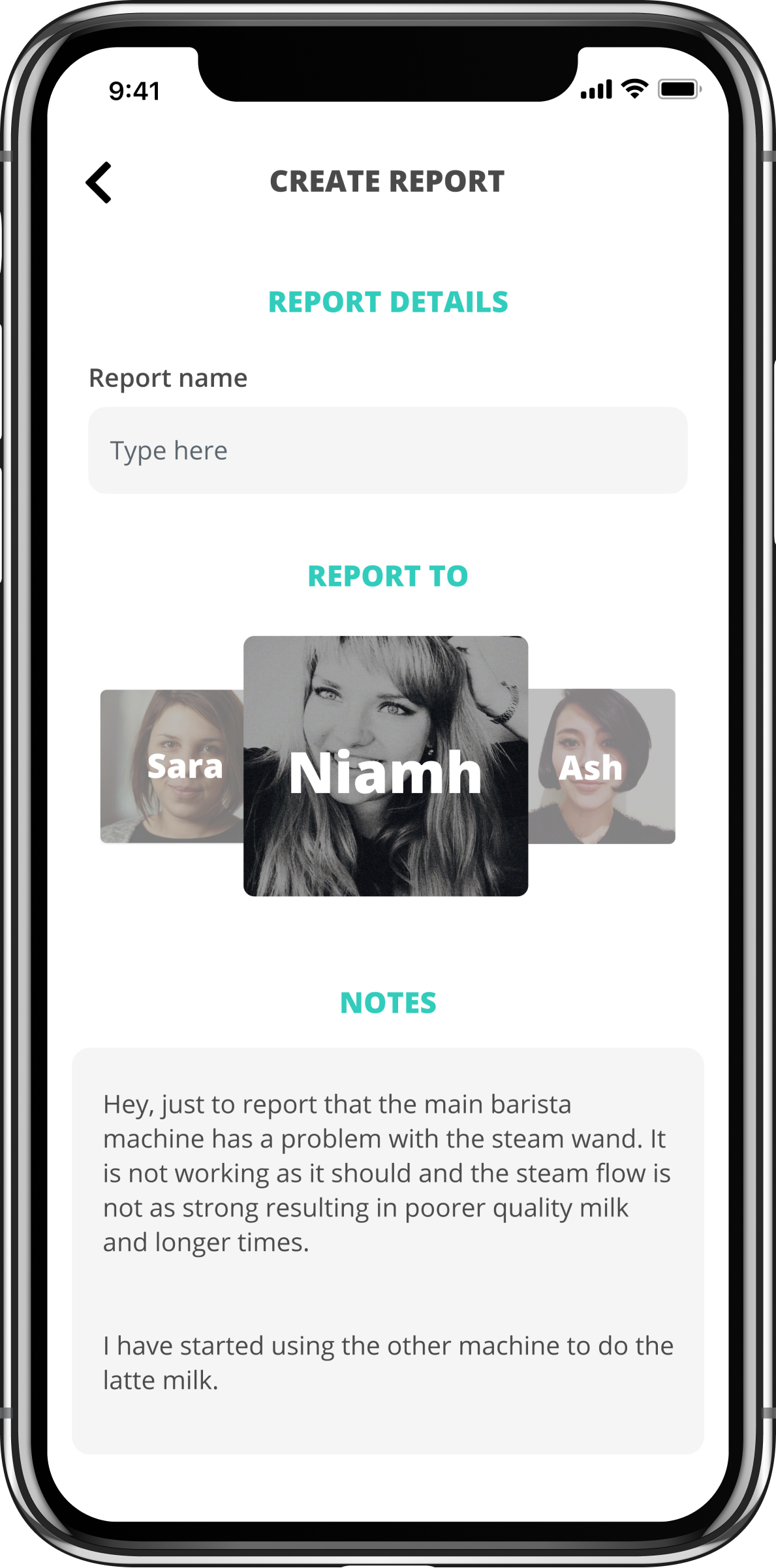
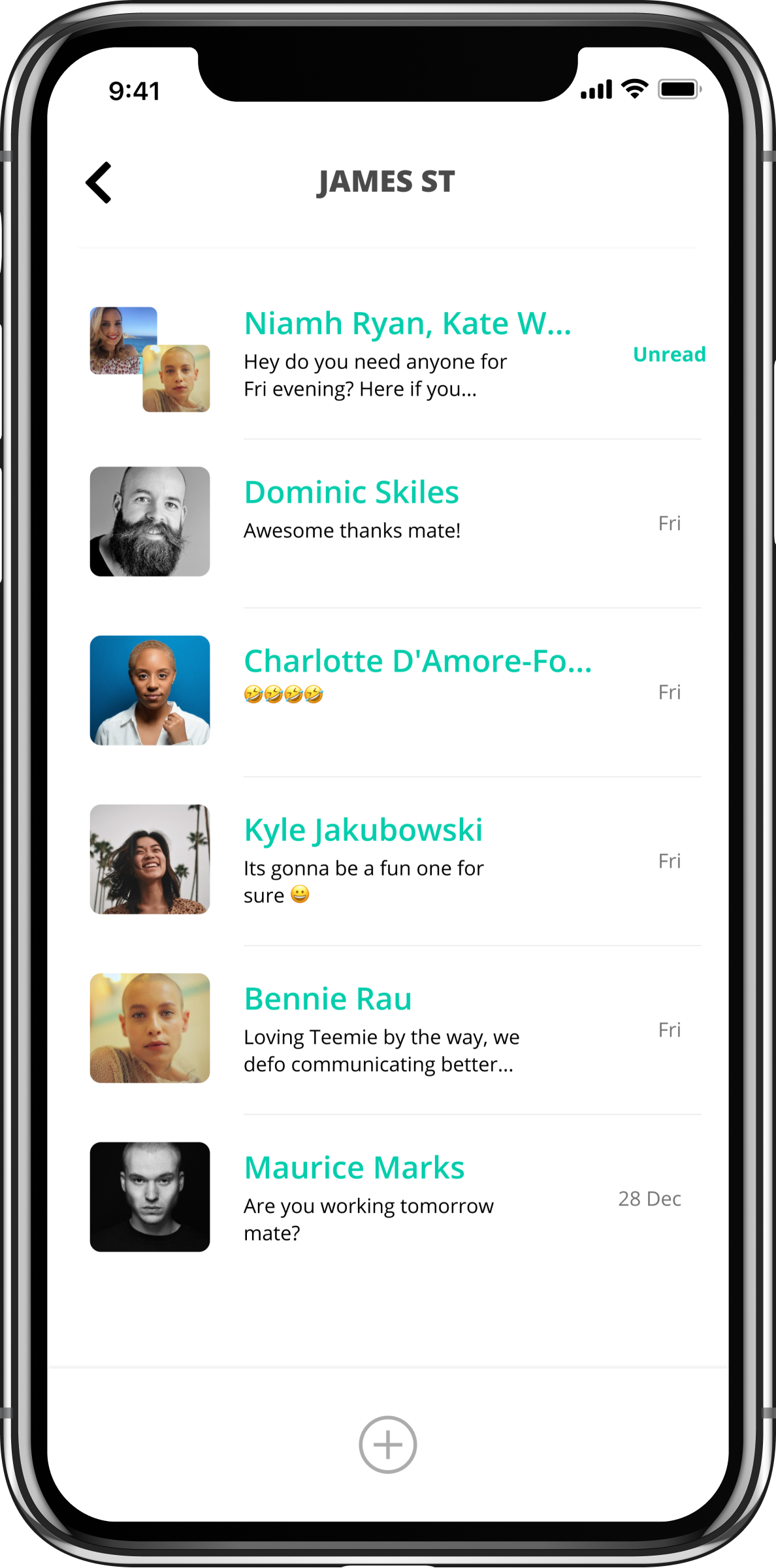
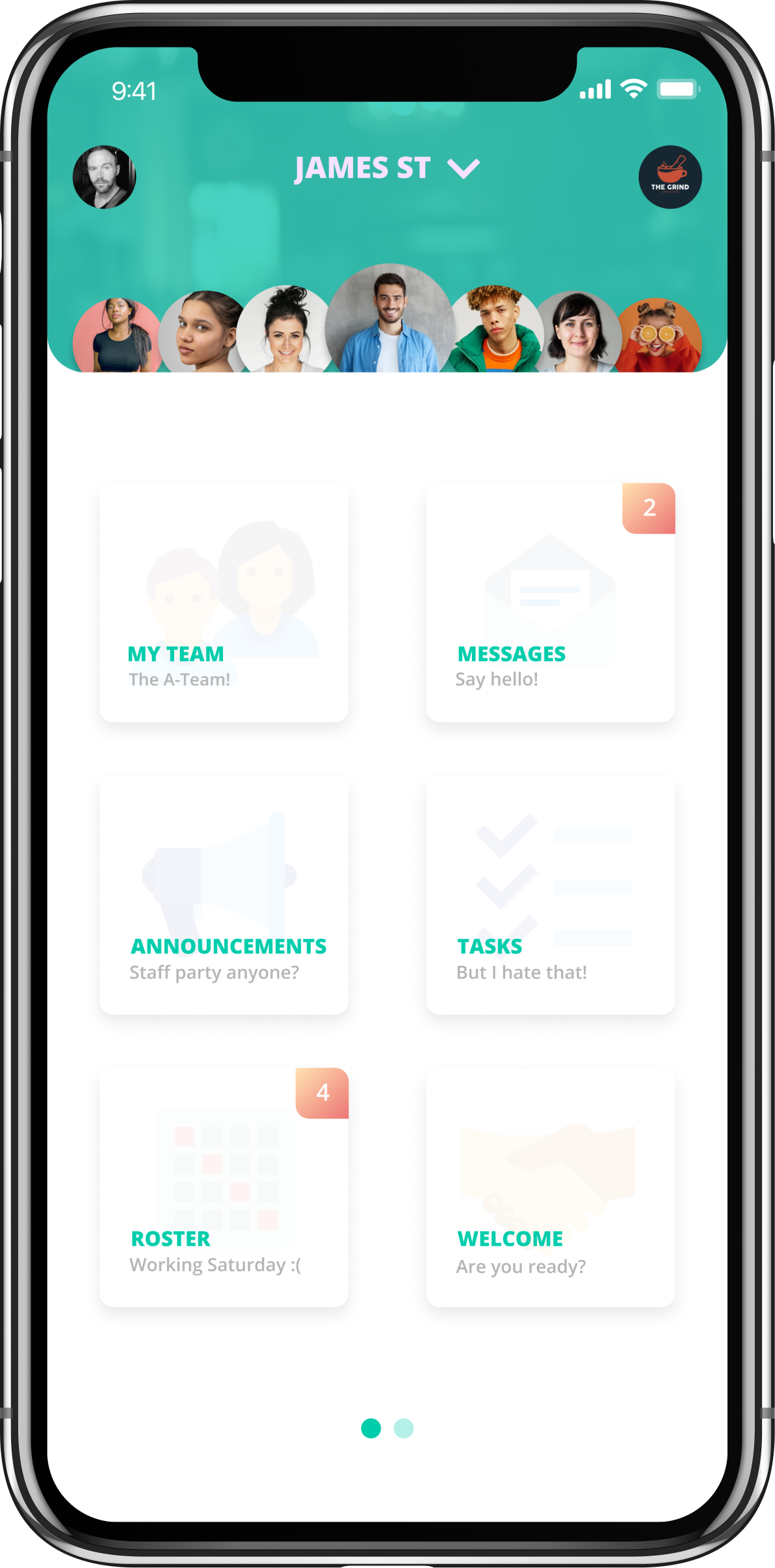
Six years in, Teemie had grown feature by feature. Roster, scheduling, clock-in, messaging, jobs, announcements, reports, calendar — each tool built when it was needed. The visual language had drifted. Different tools had subtly different patterns. The product worked, but it looked like what it was: a product that had been added to for six years.
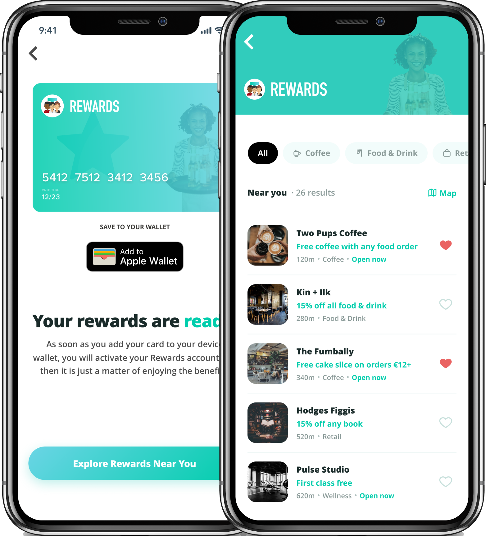
A new product was greenlit: Teemie Rewards — a closed staff-perks network for frontline workers. It needed its own design work. The obvious decision was to build it fresh. “Fresh” introduced a new problem. Half a platform redesigned looks worse than no redesign. If Rewards landed in a different visual language than the rest of the product, the inconsistency would erode trust in both.
The deeper problem: I’m the founder. I’m the only designer. There are live businesses running their teams on this platform every day — scheduling, clock-in, communication. A botched refresh wouldn’t just look bad. It would cost real customers their faith in software they depend on every shift.
No process diagram. The interesting work was not the sequence — it was the three moves below. Each one set up the constraints I'd use to make every later decision.
Don't start with abstract tokens. Build the new product first. Let the design language emerge from production screens. Then codify it into a system other tools can adopt.
Tried Figma-with-AI; the output didn't hit production quality. HTML mockups are browser-native, render at production fidelity, and don't need a separate build step to look real. For a solo designer-founder, that compresses the cycle by weeks per tool.
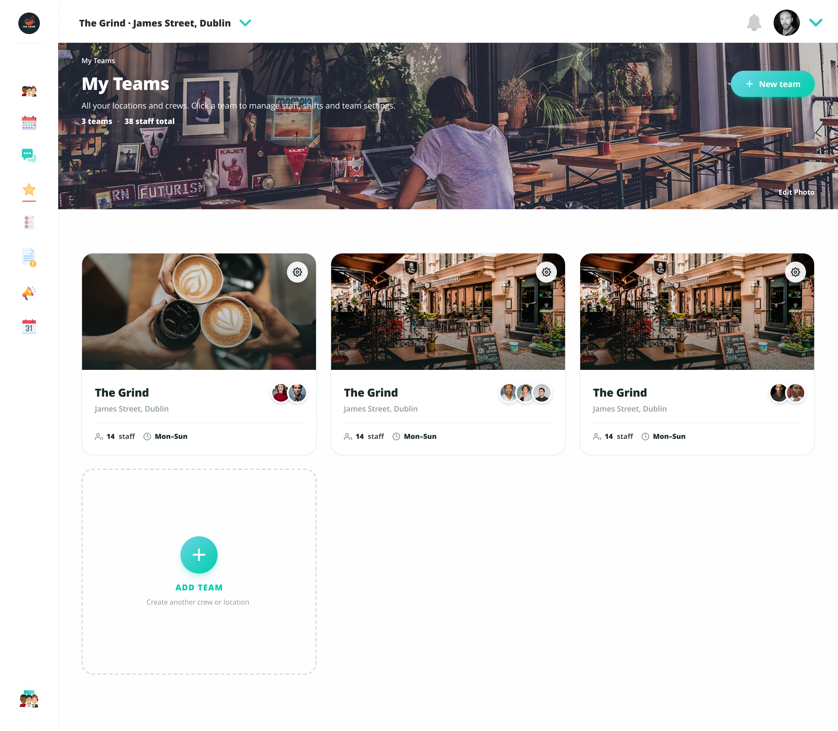
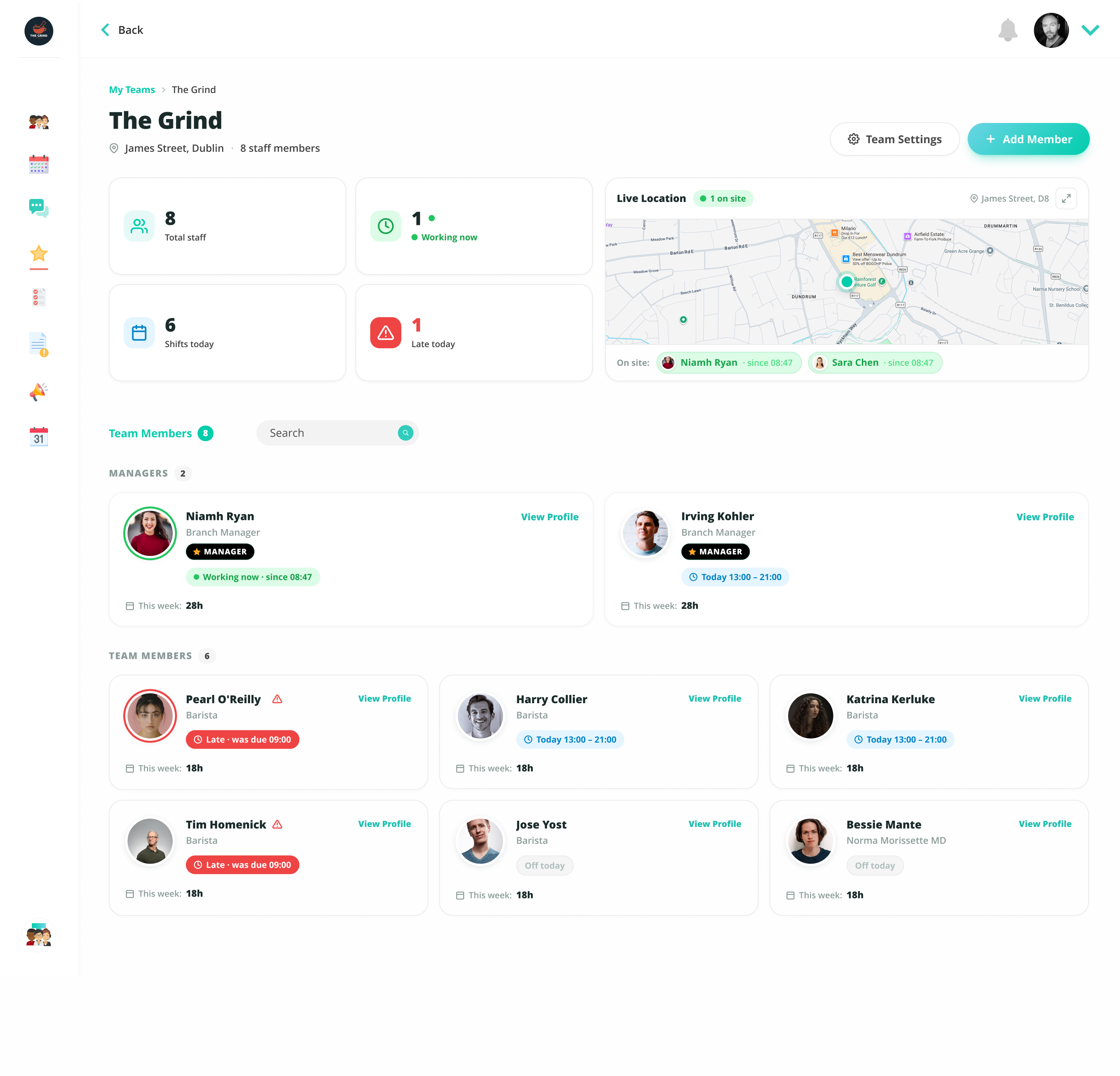
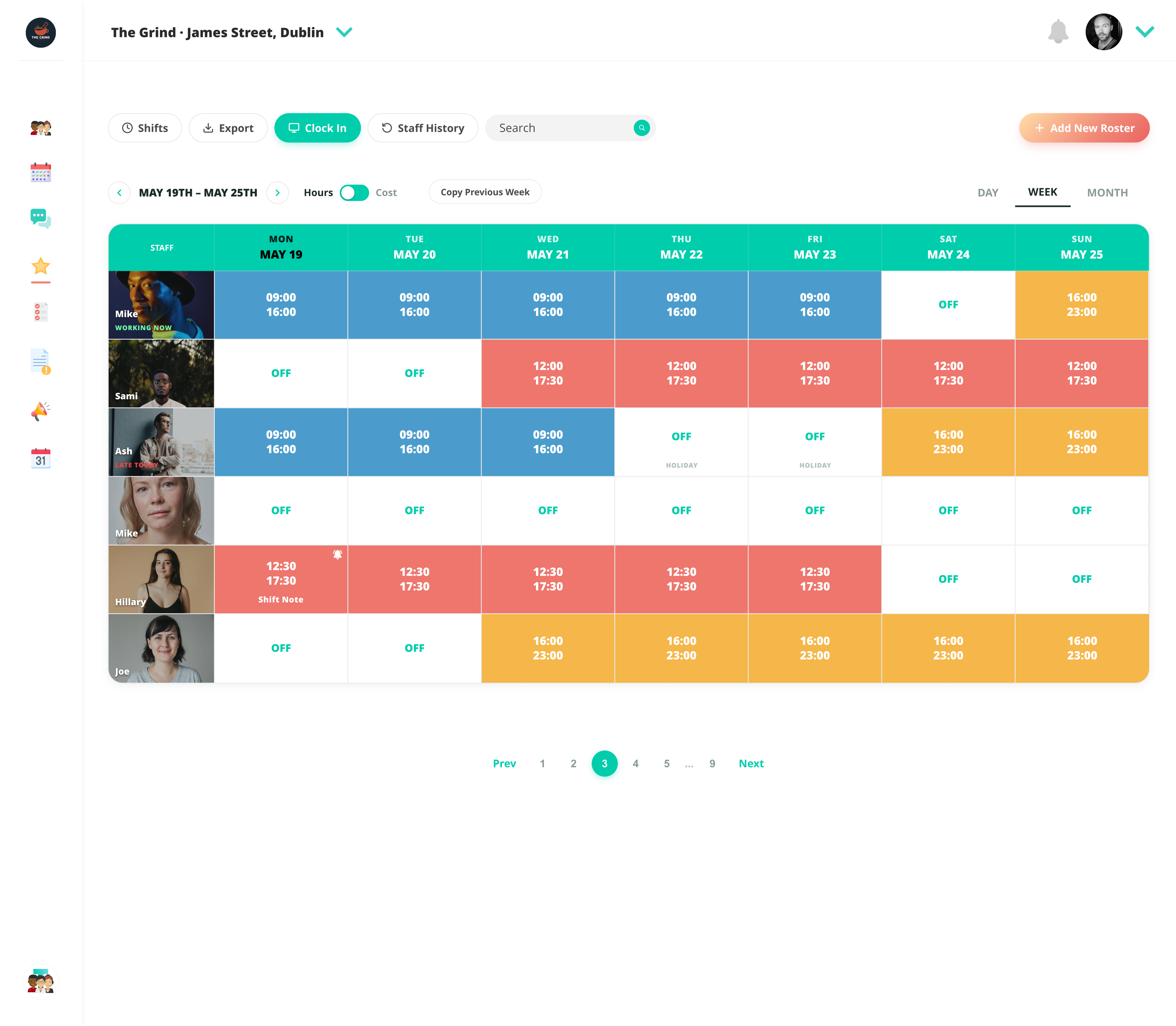
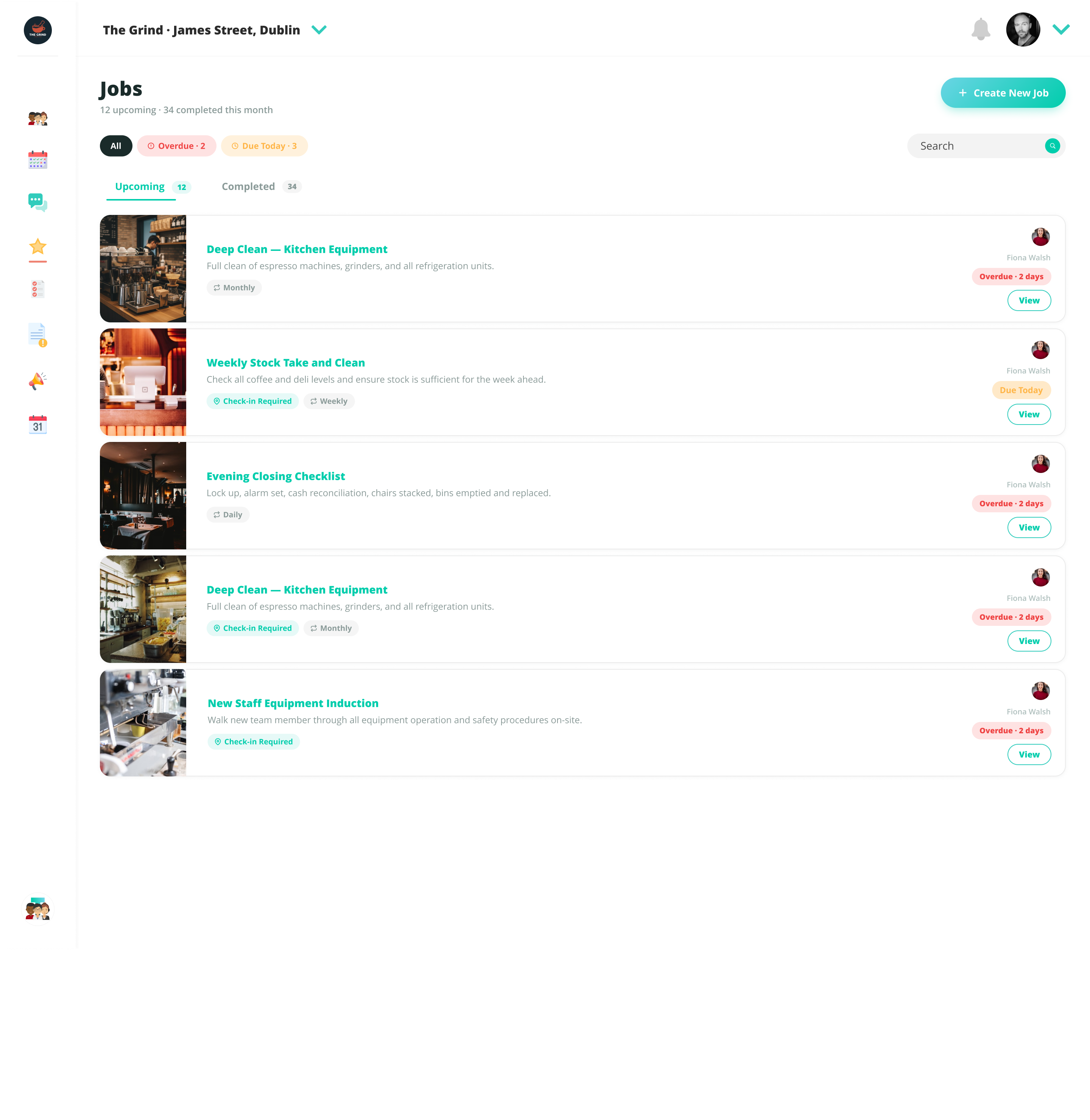
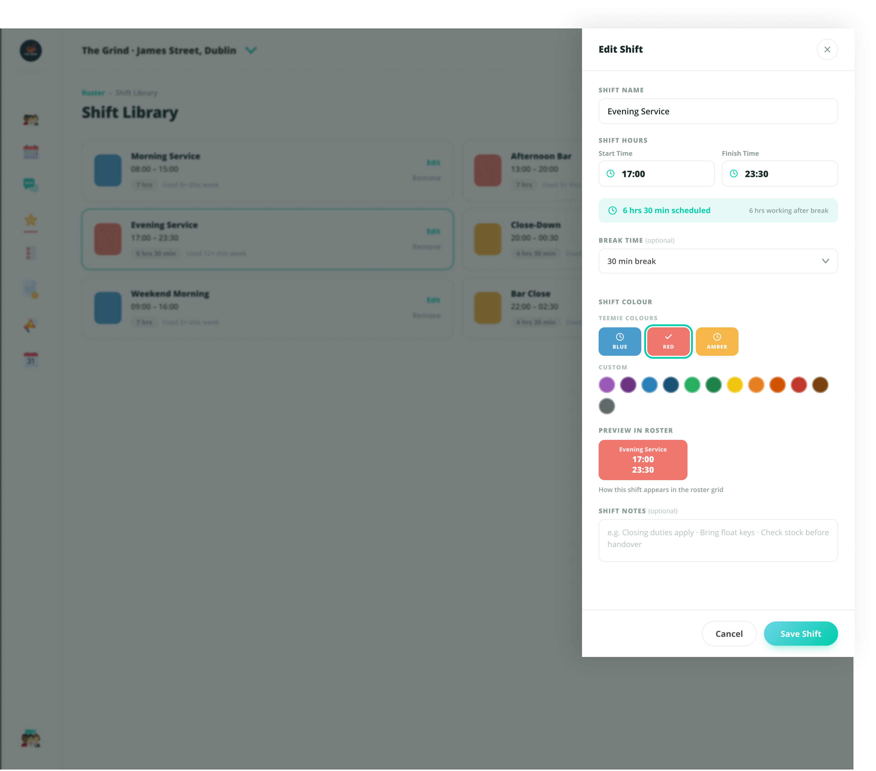
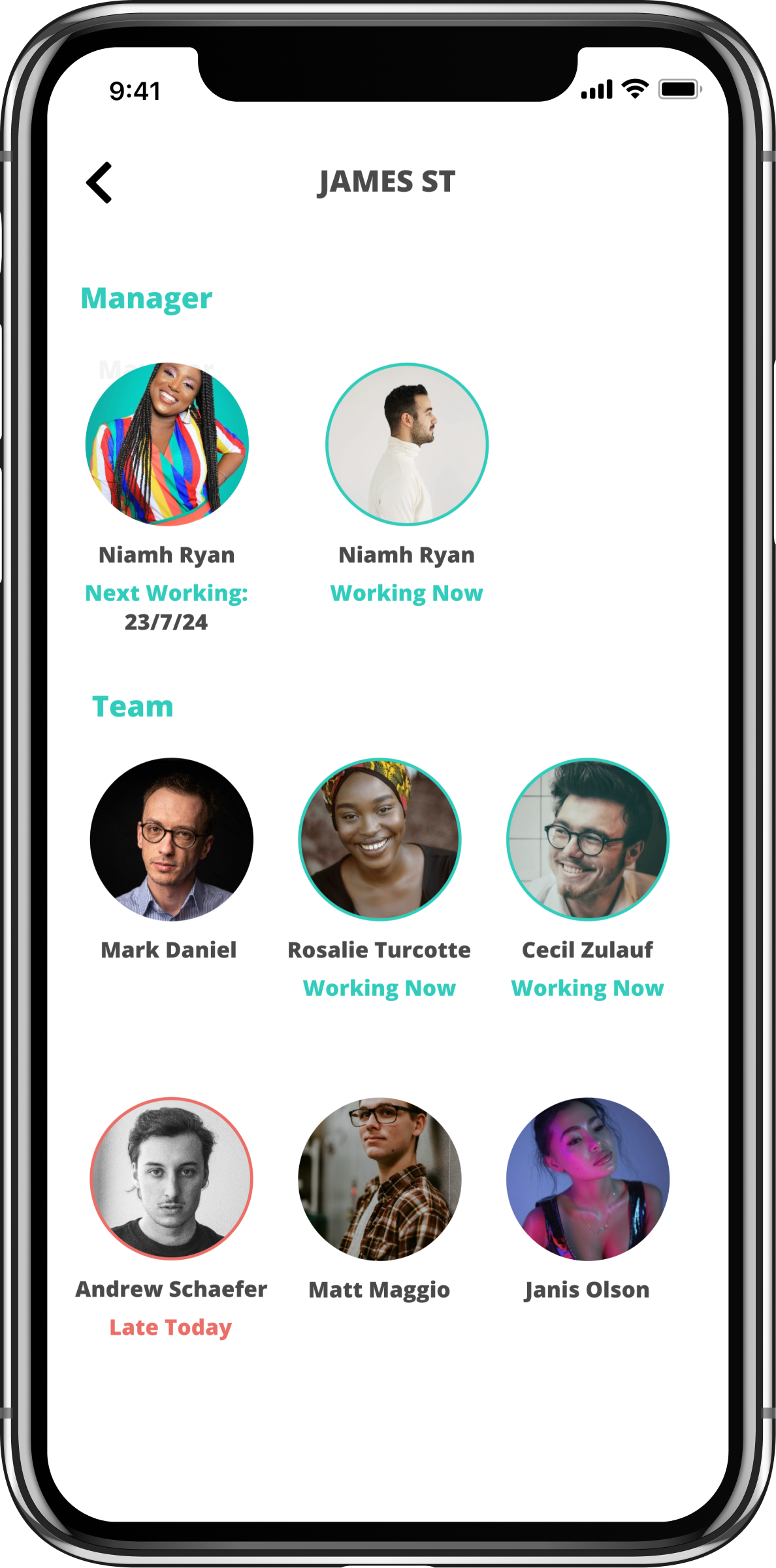
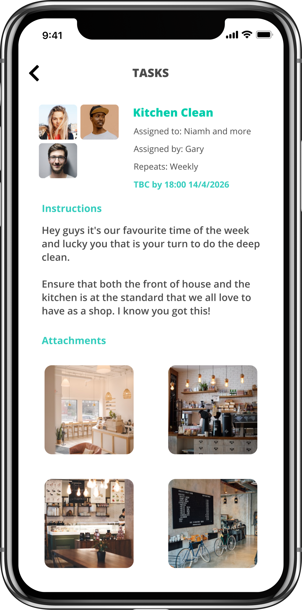
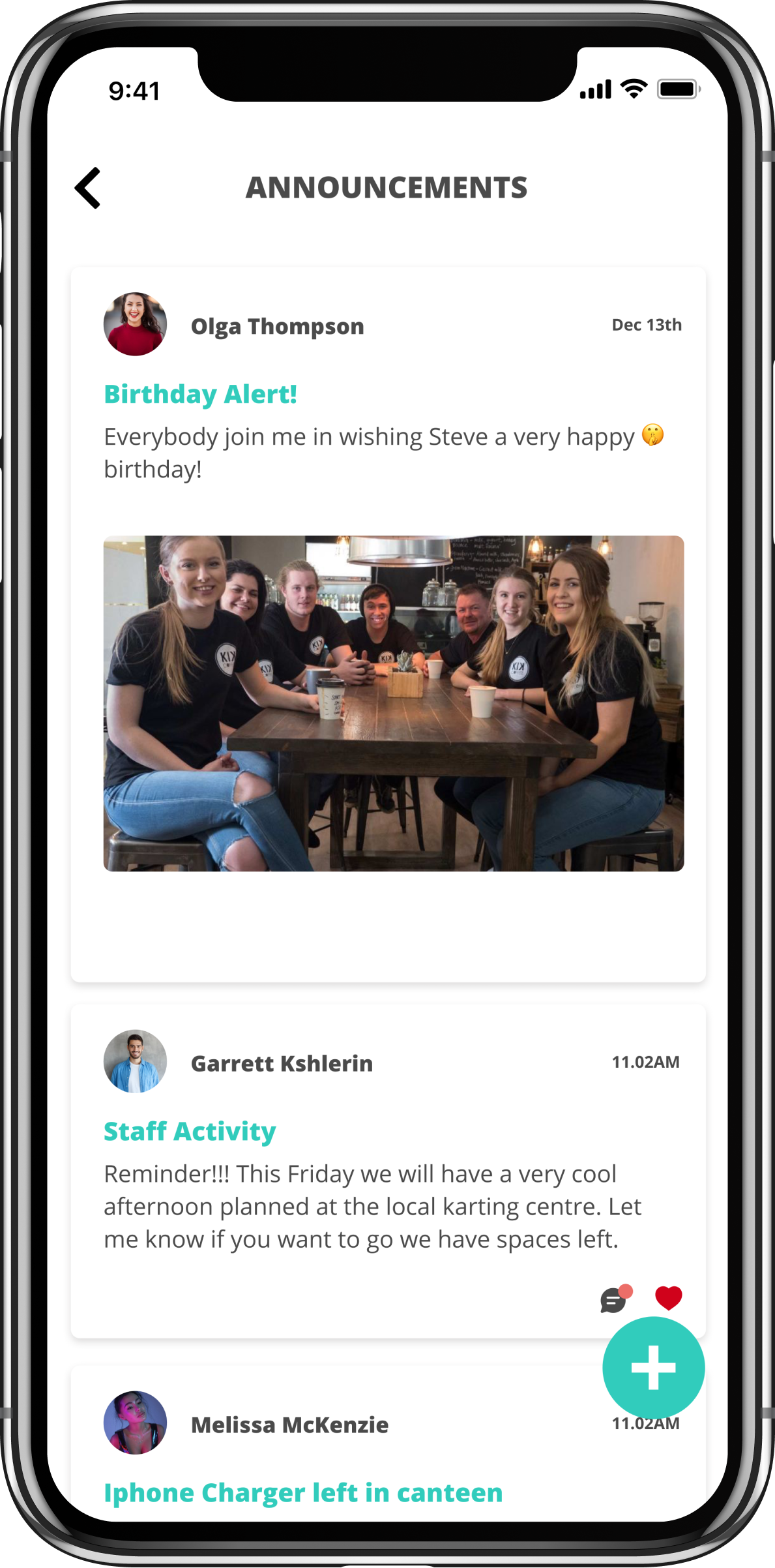
Half a refresh is worse than none. If I was committing to the new design language, I was committing to the whole platform — My Teams, Roster, Jobs, Reports, Announcements, Messages, Calendar, Welcome.
The refresh ran over roughly six months in three phases. Discovery and audit — every existing screen catalogued, every pattern drift documented, the brand guide revisited and aligned to. Build — Rewards web and mobile shipped first; the design system was extracted verbatim from those screens, class names preserved one-to-one; every other tool refreshed using the system, screen by screen, with Figma refinement passes for screens where pixel polish needed a different tool. Rollout — locked tokens, canonical reference screens, a documented “pre-build protocol” added when the project hit roughly thirty screens and consistency became a coordination problem rather than a craft problem.
Throughout, the work was checked against six years of post-launch observation — not formal user research sessions, but the accumulated knowledge of having watched the product fail and succeed in real businesses over time. That observation log was the source of most of the design decisions worth making.
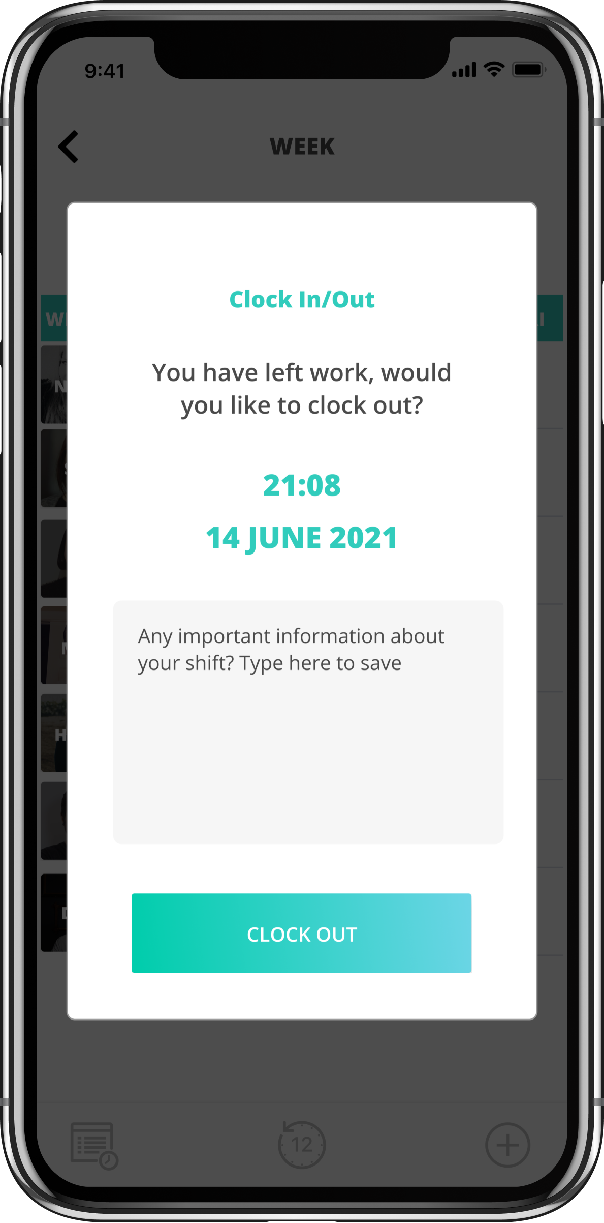
Most workforce SaaS is built for office workers — long-form, dense, click-heavy. Teemie's users are on the shop floor, behind the bar, on a delivery route. They share devices. They work different hours. Many don't speak English as a first language. They don't read manuals. They use the product in 30-second windows between tasks.
Glance-able information over complete information. Predictable interactions over clever ones. Fault tolerance over efficiency. Specific design choices that ran through every screen: large tap targets on mobile, GPS clock-in over manual entry (clock-in failure is a wage dispute waiting to happen), high-contrast type, no decorative motion, every primary action one tap from the home screen.
The proof was six years of post-launch observation. I've seen what fails in real businesses. When a screen has too many states, staff hit the wrong button under pressure. When information requires scrolling, it gets missed. When error messages use product language instead of human language, staff stop trusting the product. The refresh was an opportunity to bake six years of learning into the system, instead of patching the existing UI tool by tool.
The trade-off was deliberate: glance-able means less information per screen. Some power-user features ended up gated behind a "more" tap. Power features used 5% of the time should not slow down the actions used 95% of the time.

Most “rewards” software is built for end customers. A retail business gives a customer a card and offers them discounts to come back. That market is saturated, and large players dominate. There's another problem nobody is solving: frontline workers in retail and hospitality are underpaid and undervalued, and the perks economy doesn't reach them. The corporate-perks platforms gate access behind enterprise pricing that small businesses can't afford.
Invert the audience. Teemie Rewards is a closed network. A small retail or hospitality business signs up and offers a perk to other Teemie businesses' staff. In return, their own staff get access to perks across the entire network. The card never goes to a retail customer. It stays inside the closed loop of frontline workers, verified through their existing Teemie staff status.
That closure is what makes the product distinctive — and it shaped every design decision:
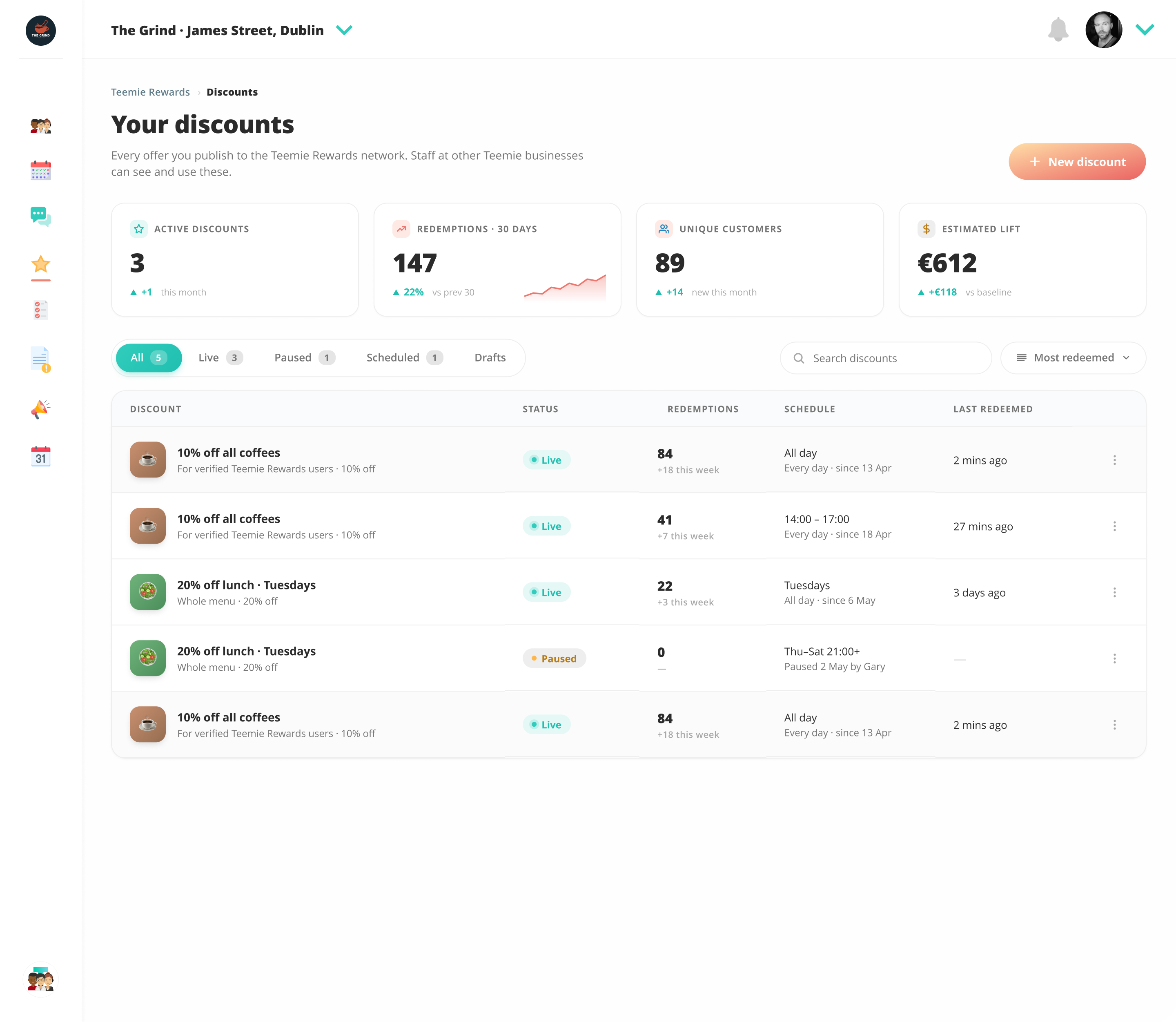
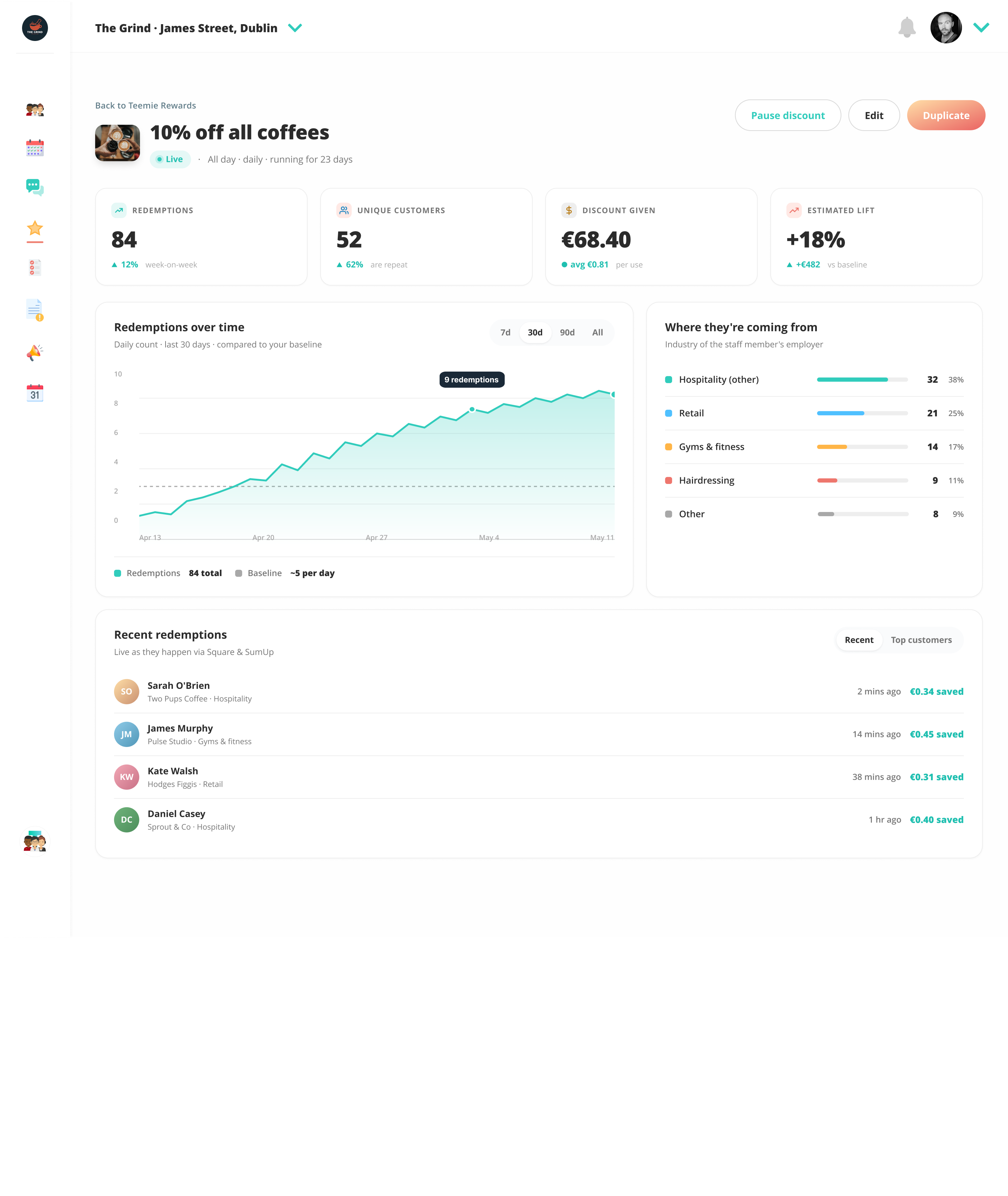
A closed network only works if the network grows. The launch playbook is a founding cohort — recruited city by city — who get value from giving and receiving simultaneously. Designing the landing page and the merchant onboarding flow was as much a design problem as the product itself. Four landing-page iterations later, the current version is the active base, with a Manhattan map section, two-logo nav, real product cards, and per-staff pricing presented clearly.
The system isn’t a starter kit. It’s a record of what real shipped screens needed.
By the time the Rewards screens were shipping, the new design language was visibly better than the existing platform UI. The choice was: let the platform stay inconsistent (Rewards lives in 2026, everything else lives in 2019), or commit to refreshing every existing tool using the same language.
The hard part isn't the visual decision. It's the operational one. As a solo designer working across eight tools and a new product, with refreshes typically taking two to four screens per tool, the work fanned out to roughly forty screens in flight. Without a system, consistency breaks. Without a methodology, the work slows.
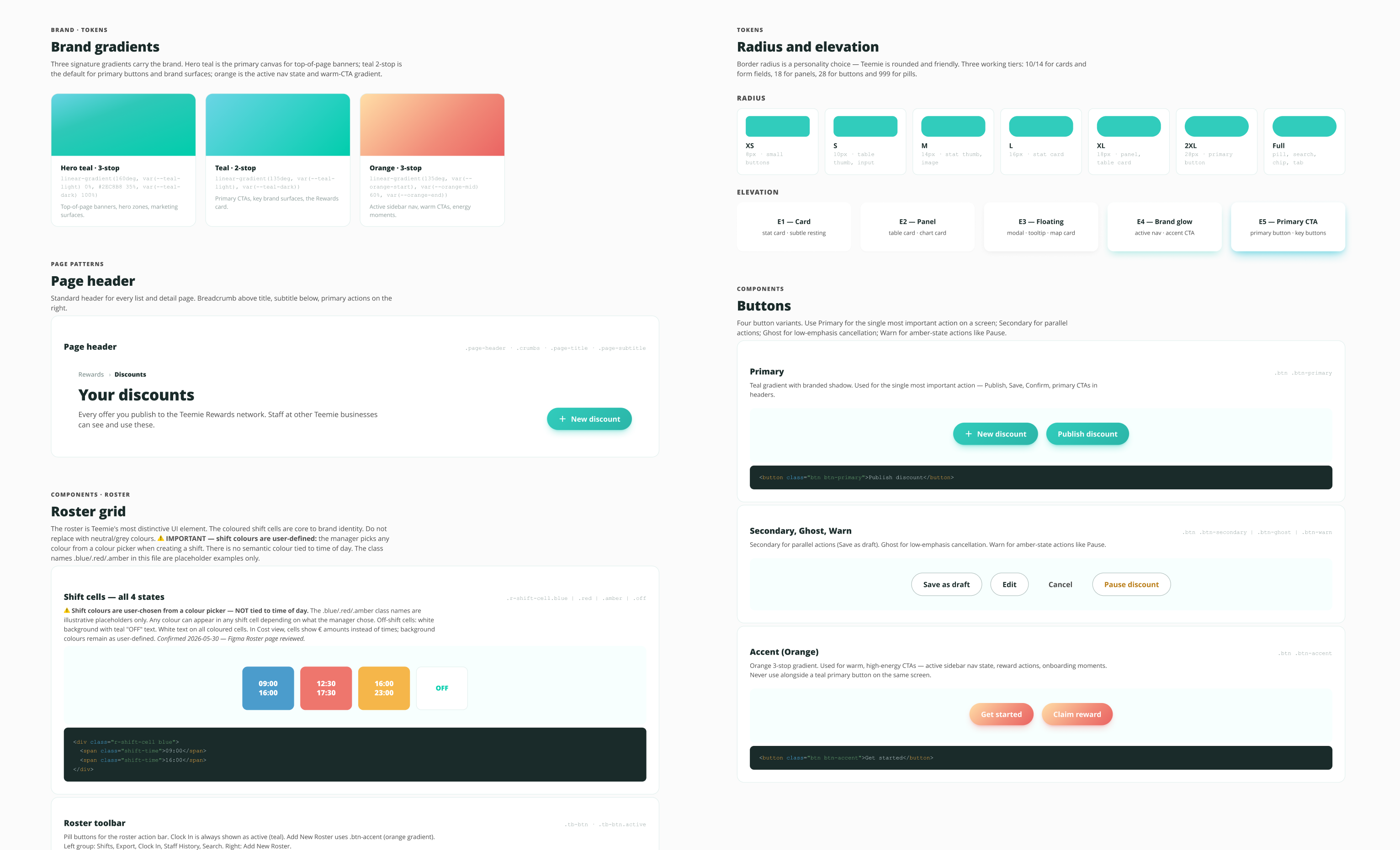
HTML-first as the design format. Every screen was built as production-fidelity HTML, with the design system extracted verbatim from the screens themselves — class names preserved one-to-one, no reinterpretation. Three benefits: I could render any screen in any browser at any moment to gut-check it; engineering would get a real prebuilt brief instead of a Figma reference; component reuse was enforced by file structure rather than goodwill.
As the work scaled, a mandatory pre-build protocol became necessary — rules I had to follow before writing a single line of HTML for any new screen. Always re-read the design system file (especially after a session break). Always check the canonical reference screen for the component type. Always stop and ask before inventing a new pattern. The protocol sounds like overhead. In practice it kept the system from drifting as more screens shipped.
By the end of the refresh: forty-plus shipped HTML mockups, a 125 KB design system file with twenty-five components across ten sections, a canonical reference screen designated for every component type, and a documented decision log capturing every material choice. The system isn't a starter kit. It's a record of what real shipped screens needed.
Build the system from real screens. Don’t start with abstract tokens.
The 2026 refresh shipped across every tool in the platform — My Teams, Roster, Jobs, Reports, Announcements, Messages, Calendar, Welcome — plus the new product, Teemie Rewards (web admin and mobile). No platform downtime.
Production-fidelity HTML mockups shipped across 8 tools and a new product, in roughly six months. Single designer, end to end.
Components across 10 sections, locked and used as the authoritative reference for every screen.
Platform downtime through the refresh. Live customer base served continuously.
Founder, designer, operator. Six years of post-launch observation baked into the system.
Enterprise Ireland-funded venture. Google Adopt-a-Startup alumni.
The pre-build protocol that kept the system coherent was added at roughly thirty screens in flight — after I'd seen drift creep into the work. Next time, I'd codify on screen five and tighten the protocol as the work scales. Catching drift after the fact takes more time than preventing it.
What became a platform refresh was scoped as a single-product launch at the start. The folder was even named "Teemie Rewards Design" for the first two months. With hindsight, the platform-refresh framing — and the design system codification that goes with it — should have been the brief from the beginning. The work would have run leaner and the inevitable rename would have been avoided.
The same approach applies to any platform refresh on a live product — particularly internal tools or workforce platforms where consistency across many surfaces matters more than novelty in any single one. Use a new feature launch as the source of the new language. Codify the system as it emerges. Refresh every tool, not half.