Lobbi — Feb 2026 to present
Case study
03 / 06
The work

Building the social layer streaming forgot to build — end to end.

A communal viewing companion — timestamped social commentary for shows, films and live sport. Users watch on their own streaming service; Lobbi provides the conversation layer, pinned to the exact second. I designed it, coded it, and shipped it — solo, augmented by Claude Code, Cursor and Figma MCP.

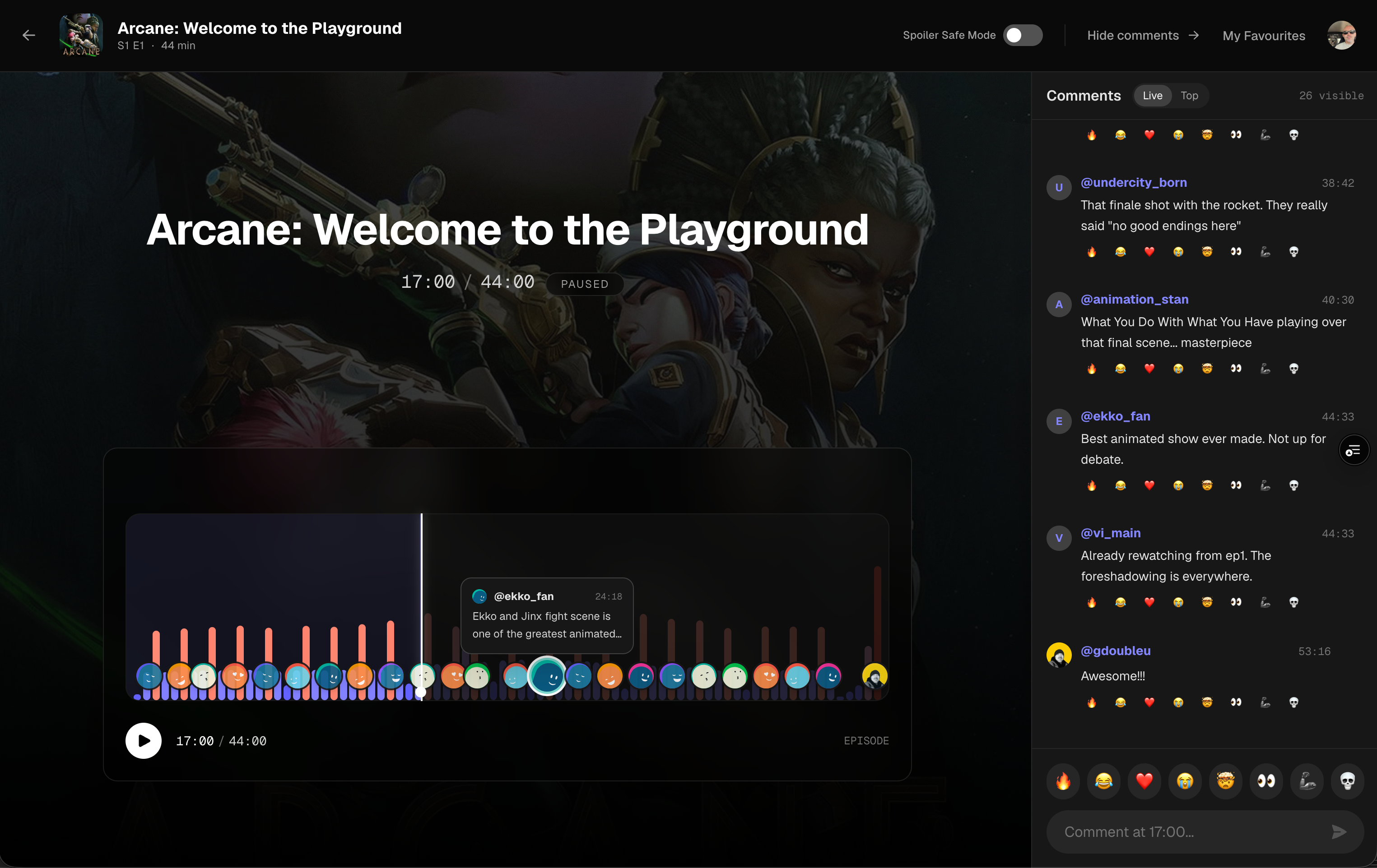
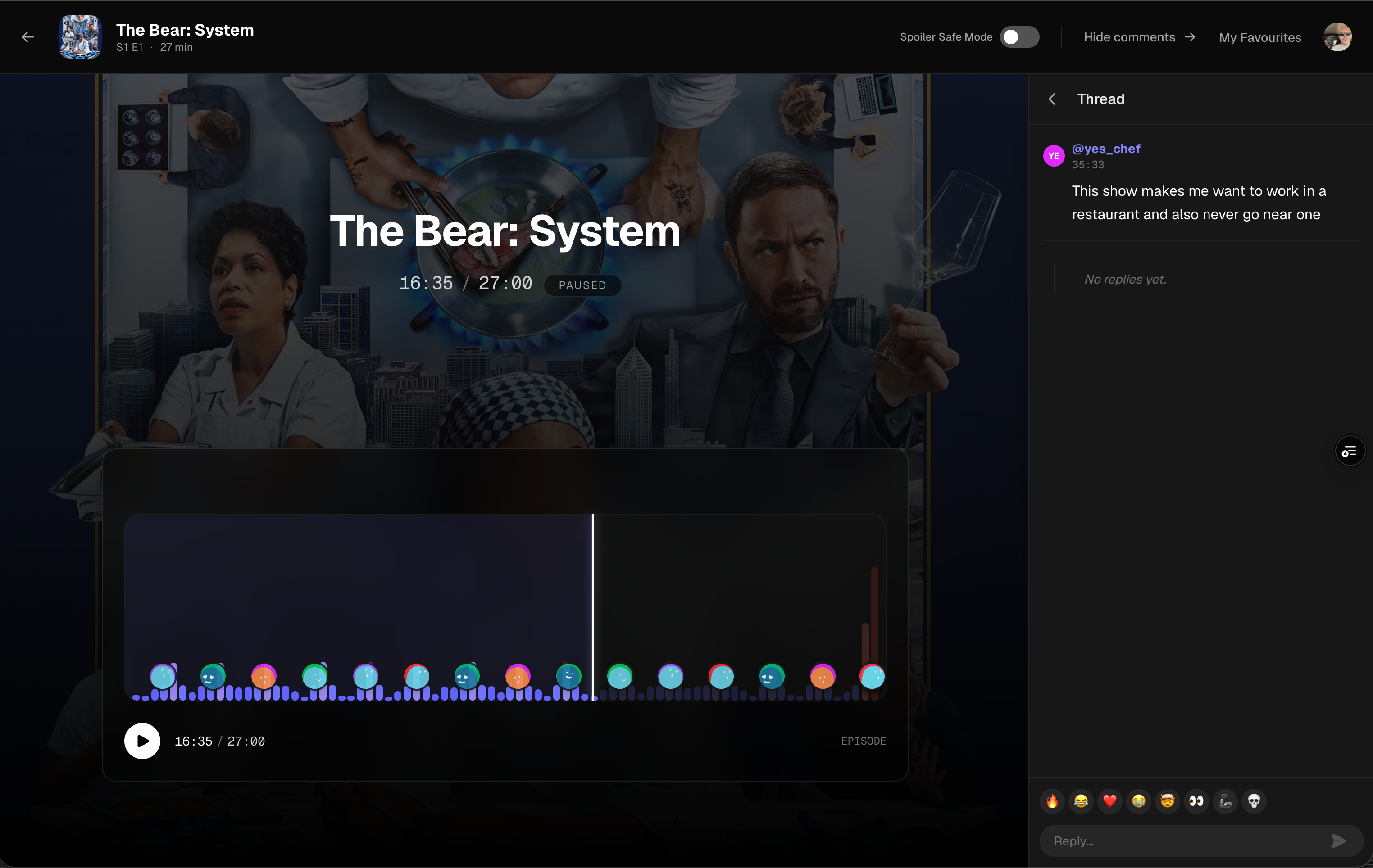
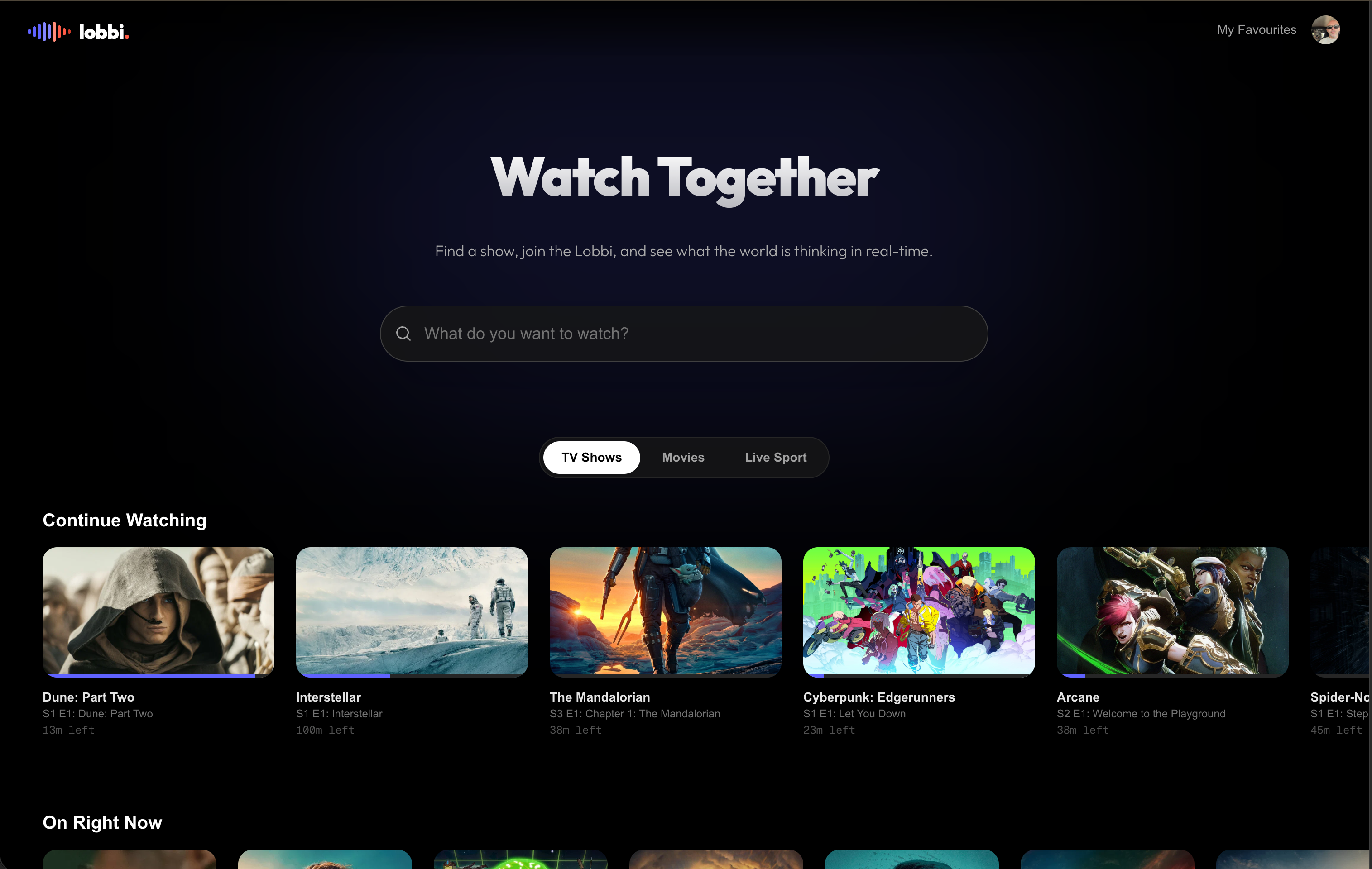
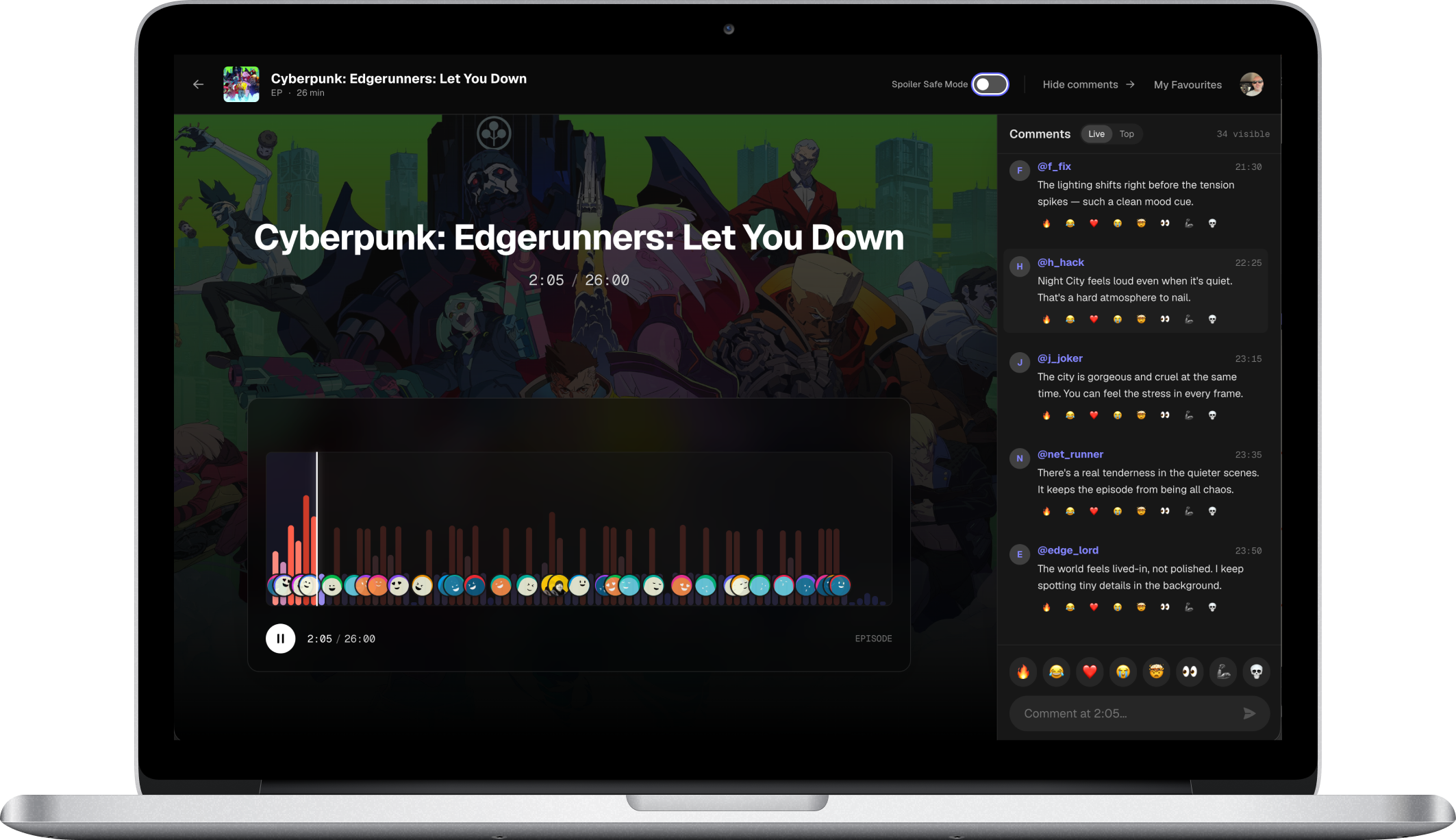
The Lobbi Room in production on web — Timeline waveform, comment feed with live reactions, Spoiler Safe Mode toggle.
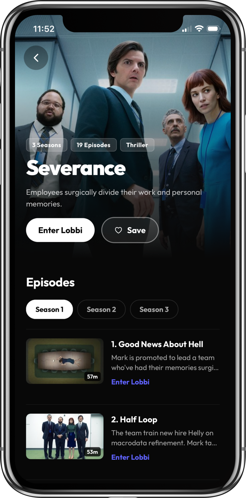
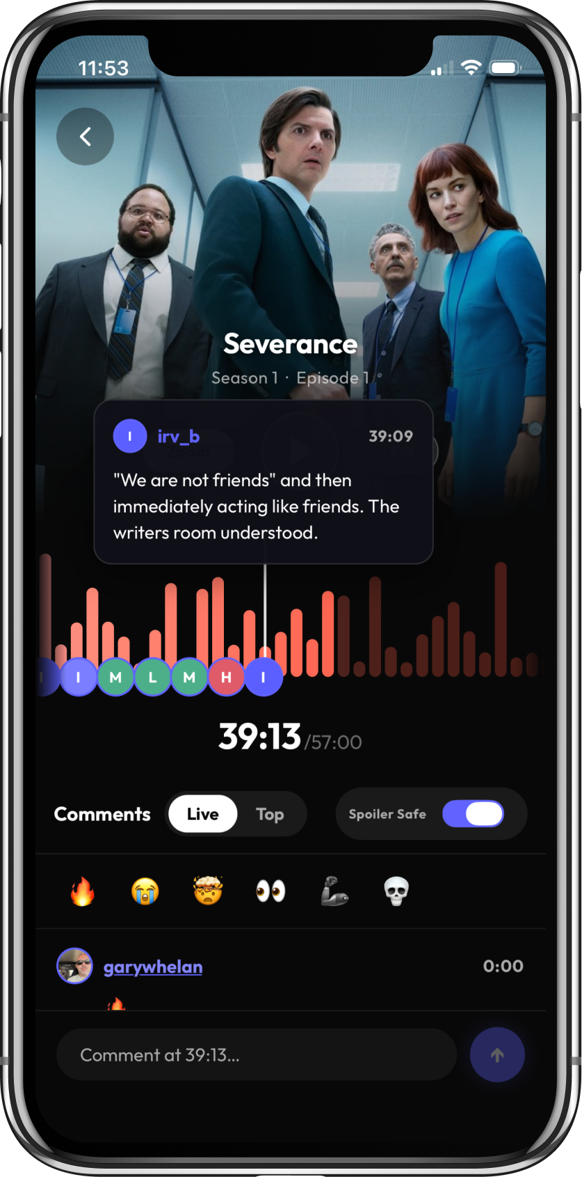
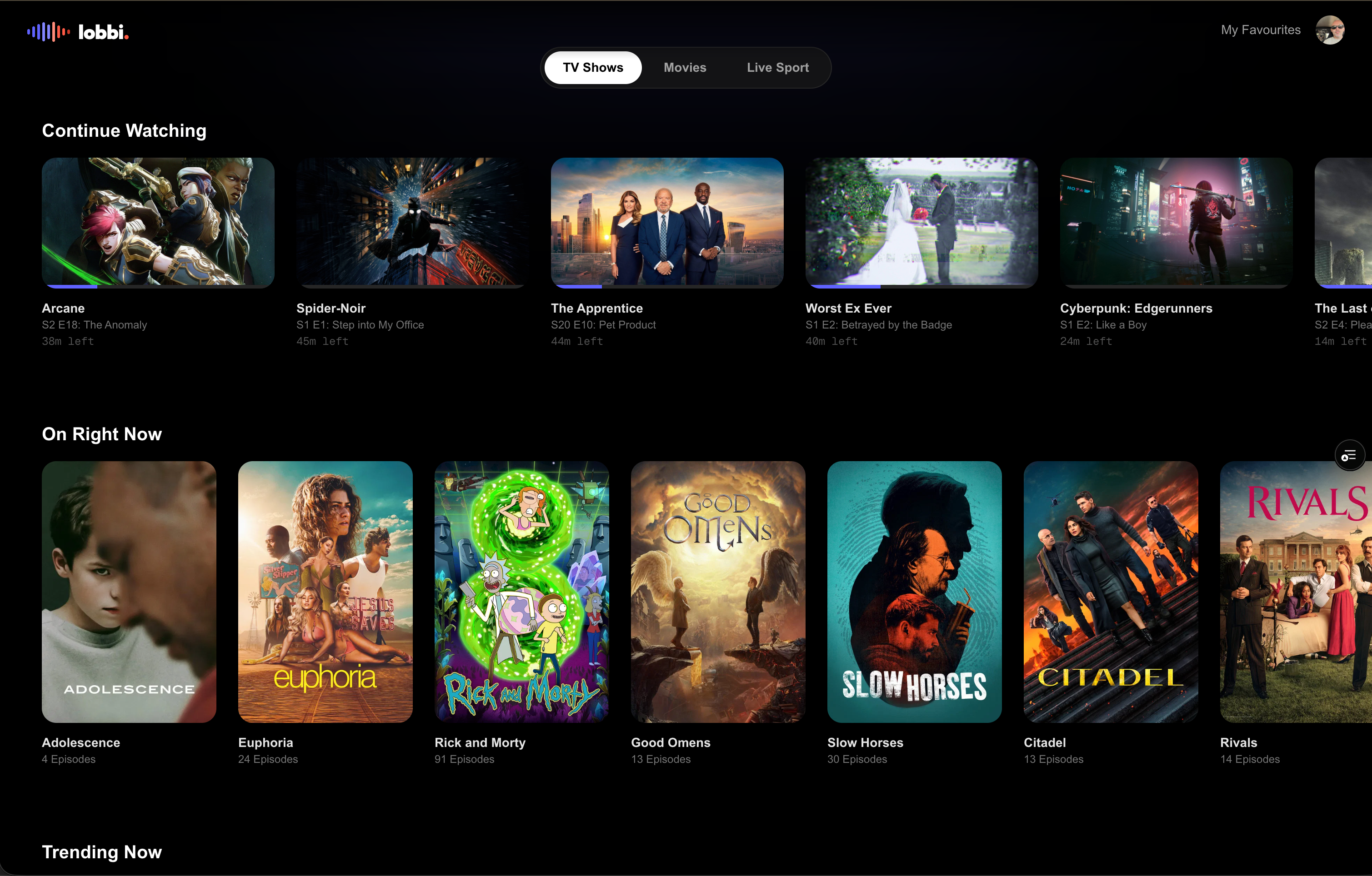
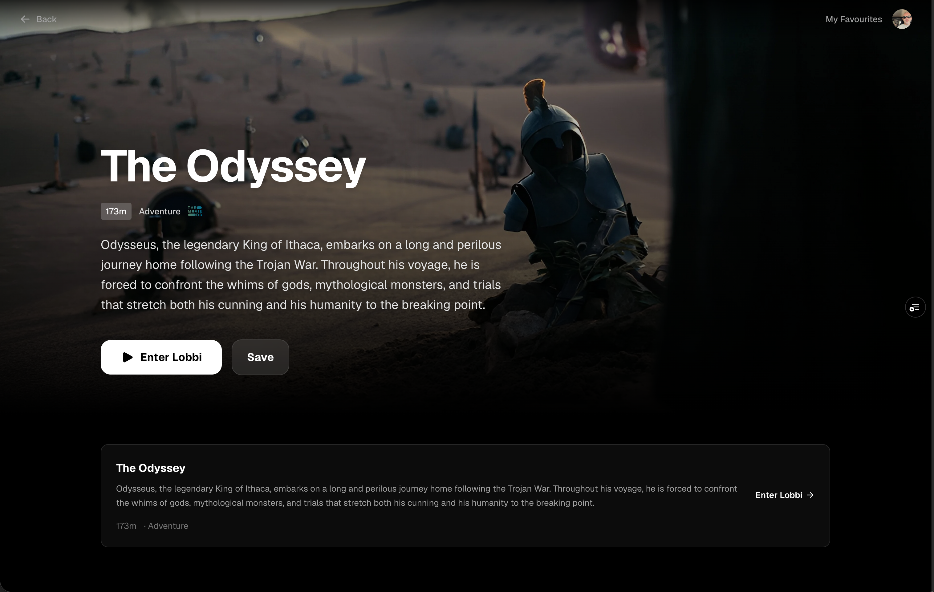
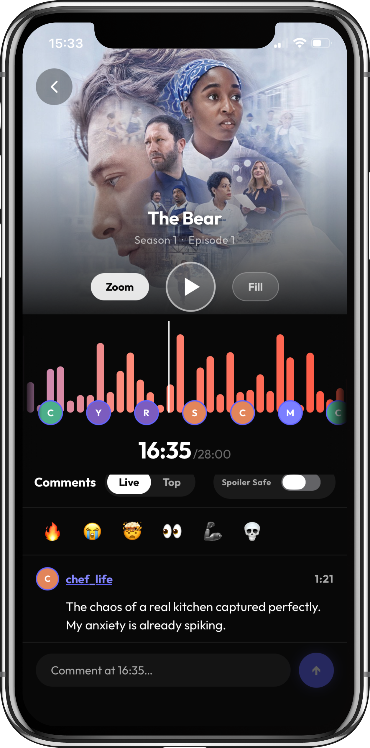
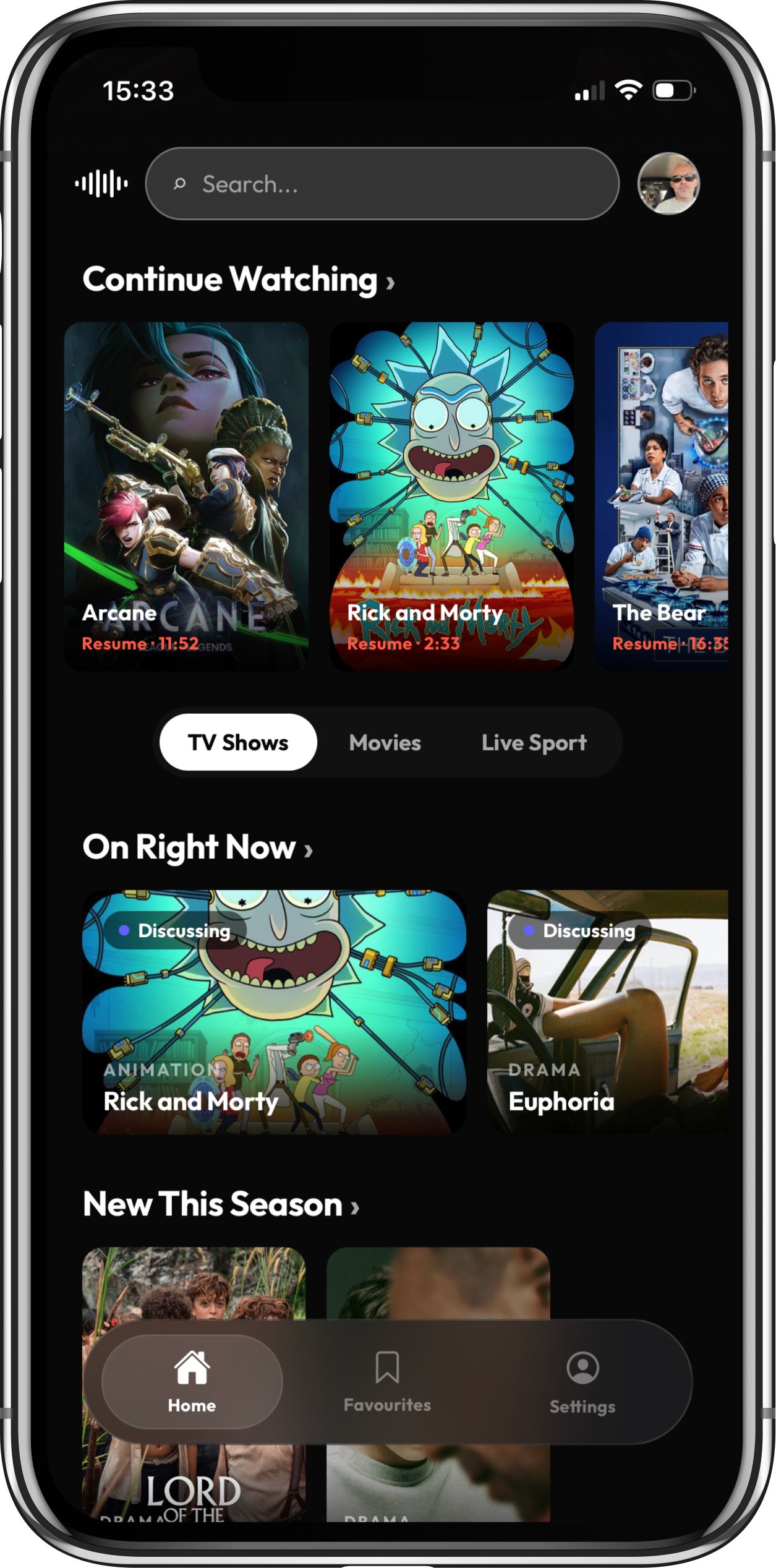
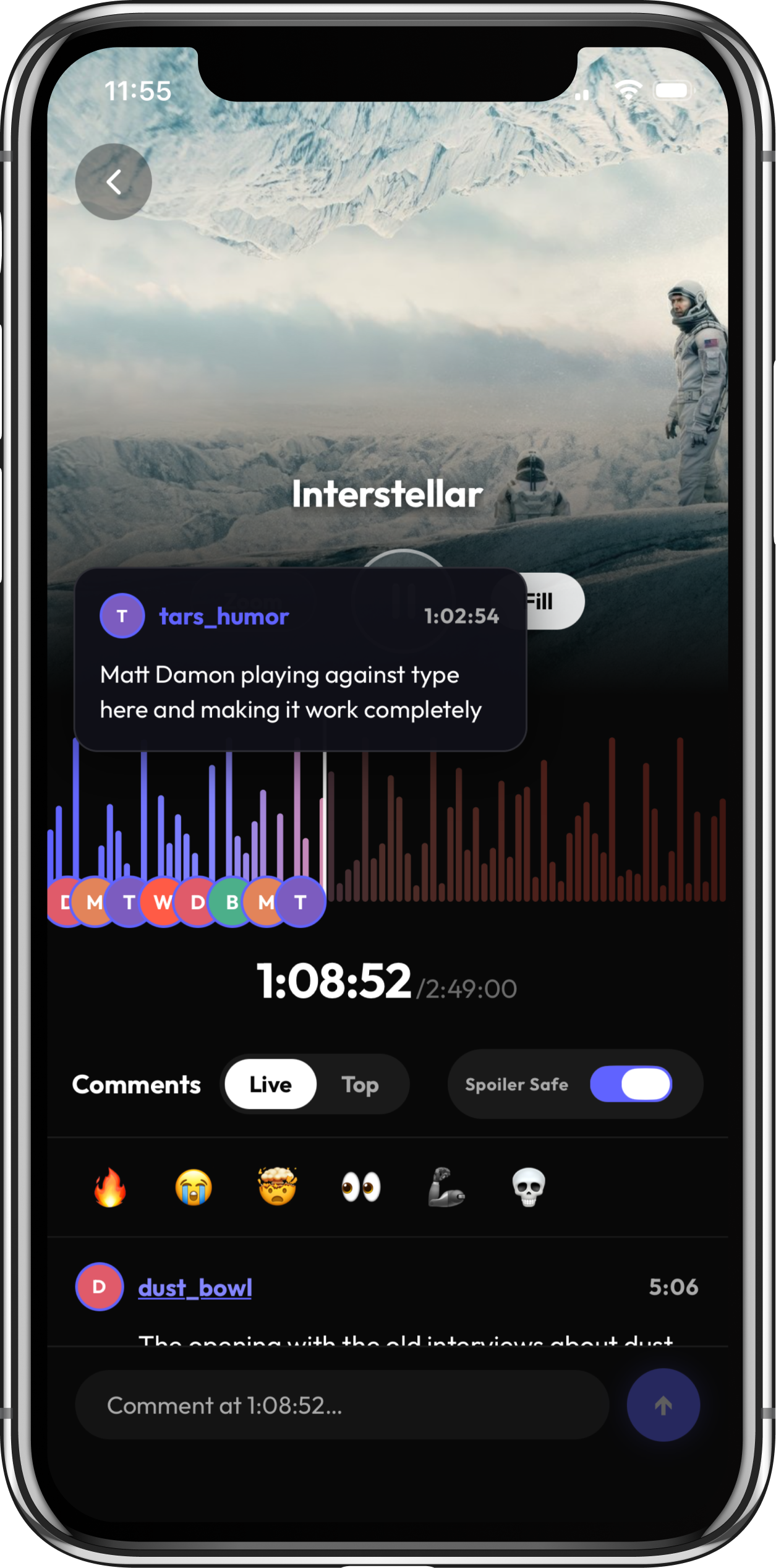
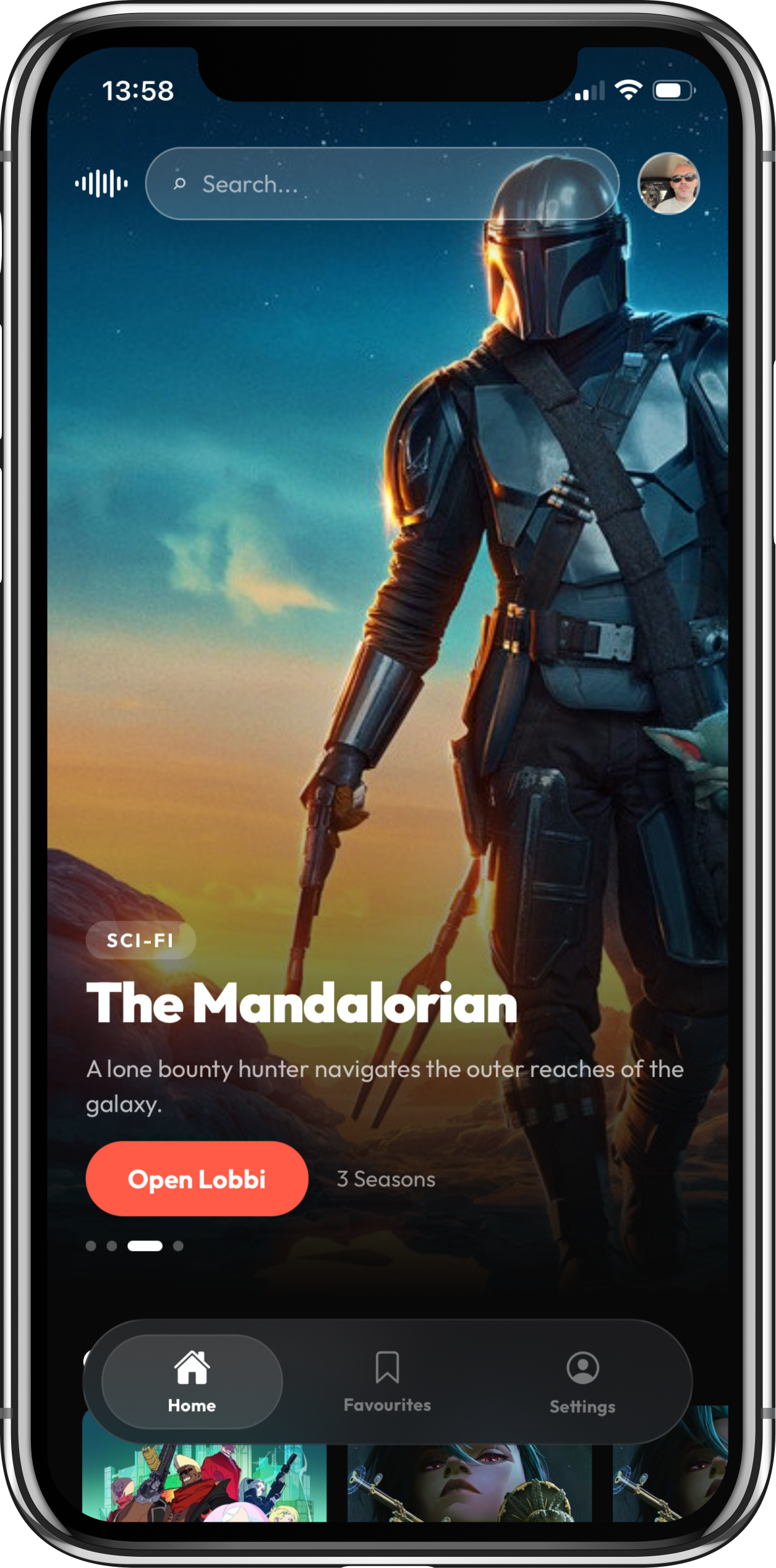
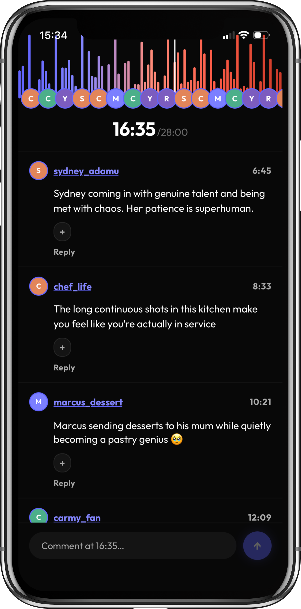
Lobbi on iOS — the Home page with Netflix-style content rows on a dark cinematic background. Lobbi on iOS — the Lobbi Room with compact Timeline waveform and comment feed synced to playback.
Role
Founder · Designer · Builder
Active
Feb 2026 — present
Status
Live · Web + iOS TestFlight
Stack
Next.js · Supabase · Expo
01
Concept
02
Interaction design
03
Design system
04
Frontend build
05
Backend + auth
06
Cross-platform ship
The tension

The whole audience is having the same reaction — and there's nowhere to feel it.

Every popular show reaches a moment where the whole audience is having the same reaction at the same second — and there's nowhere to feel it. I'd watch an episode of Severance and reach for Twitter, drop the show's hashtag into the search, and scroll. But Twitter is negative by default, half the posts spoil the next episode, and a third are unrelated. When I watched YouTube videos I always opened the comments. Always. There's something universal about wanting to know what everyone else is thinking about the thing you're watching. But the current answers don't work.

Then the design question surfaced. Why can't the discussion be pinned to the exact moment I'm on? Not the show. The second.

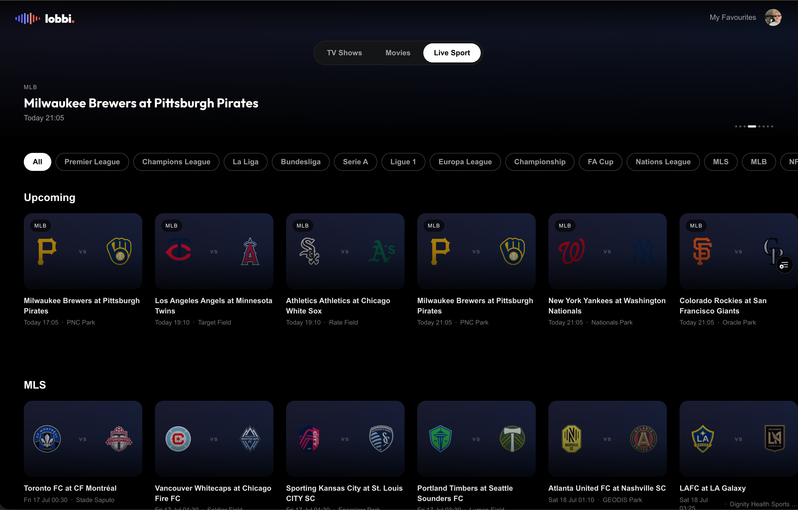
That's how Lobbi started. Not from a market opportunity. From wanting a specific product that doesn't exist. What SoundCloud does for songs, what Discord does for real-time chat, what YouTube's comment culture proves people already want — none of it wired together for TV, film and live sport. Live sport especially. A goal in a Champions League match at the 34-minute mark should leave a visible spike on the Timeline of everyone watching. You should be able to feel the whole audience react to it, at that second.

How do you build a layer of social conversation for content the platform doesn't own — and ship it end to end, solo?
The framing

Three moves shaped everything downstream.

No process diagram. The interesting work was not the sequence — it was the three moves below. Each set up the constraints I'd use to make every later decision.

Move 01
Marry the three references that already work.

SoundCloud proves timestamps. Discord proves real-time. YouTube proves people already want comment culture around video. The move: synthesise all three, pinned to the exact playback second of any show, film or match — and leave everything people don't want at the door.

Move 02
Design and build. One person. AI-augmented.

The old separation of designer and developer doesn't survive 2026. With Claude Code, Cursor and Figma MCP as working collaborators, a designer with a clear product vision can carry it end to end. No handoff loss. No mistranslation. Design decisions become deployable the same afternoon.

Move 03
The Timeline is the centre of the experience.

Not a component that supports the feed. The centre of every viewing decision. Where the audience is talking, where the spikes are, whether you're safe from spoilers, whether you're in step with the world watching a match — every question gets answered by the Timeline. Everything else in the Room earns its place by supporting it, not competing with it.

How I worked

The project has run over roughly five months and counting in three phases. Discovery and concept — I built paper prototypes and Figma mocks of the Lobbi Room, then tested the timestamp-comment concept against a fake episode with mocked comments to see if the interaction felt real before writing a line of code. Build — Next.js and Supabase for web; Expo + React Native for iOS. The whole build ran on an AI-augmented stack: Claude Code for architectural moves and stitching flows, Cursor for interactive editing on components, Figma MCP for design-to-code fidelity where a screen needed pixel accuracy. Ship — web live on Vercel at enterlobbi.com with a proper auth stack (invite codes, verification, PKCE + implicit callbacks, exponential backoff). iOS to TestFlight for alpha testers. Two codebases in production, same design system, same DAL pattern.

One rule mattered more than any other: don't stop being a designer when writing the code. Every technical decision was a design decision. Every architecture move was a UX move. The DAL pattern that separates the local mock from production Supabase isn't just an engineering choice — it's a designer's way of making sure the UI stays stable while the data layer switches under it.

Three design moments

Where the design work actually happened.

Moment 01
Designing a behaviour that doesn't yet exist.
Moment 02
The Lobbi Room — the Timeline as the product.
Moment 03
From designed to shipped.
01
Design moment

Designing a behaviour that doesn't yet exist.

I couldn't test the concept against existing patterns because the pattern didn't exist. There's no "well, the industry solved this like X." The closest cousins were SoundCloud (timestamped audio comments), Discord (real-time chat), and YouTube (retrospective comment consumption). All three helped. None solved for TV, film or sport.

Combine the three. Take SoundCloud's timestamp-anchored primitive, wire it to a video playback progress bar (of the show the user is watching on their own device), let people react and reply in real-time or after the fact. Two comment modes made this practical: Live Mode surfaces comments chronologically as the viewer progresses; Top Mode ranks the most-reacted moments (scoring formula in code: replies × 3 + reactions × 1 — replies signal conversation, reactions signal presence, replies weigh more). Spoiler Safe Mode hides comments ahead of the viewer's current position, with an optional 0–3 second buffer.

The design constraints then made themselves obvious:

  1. Platform-agnostic. Lobbi never streams. Never fights Netflix. Users bring their own subscription.
  2. Content-first, not people-first. No follower graphs. No DMs. Conversation lives around content, not identity.
  3. Dark cinematic — always. The audience's eyes are already trained for the streaming aesthetic. Meet them where they are.
  4. One typeface (Outfit). Two accent colours (Purple, Coral). Black background. No exceptions.

The user has to hold two things at once — the show on their primary device, Lobbi on a second surface. The design has to earn that second-screen with a signal-dense but calm interface: dense enough that opening it during a moment gives you the reaction, calm enough it doesn't compete with the show for attention.

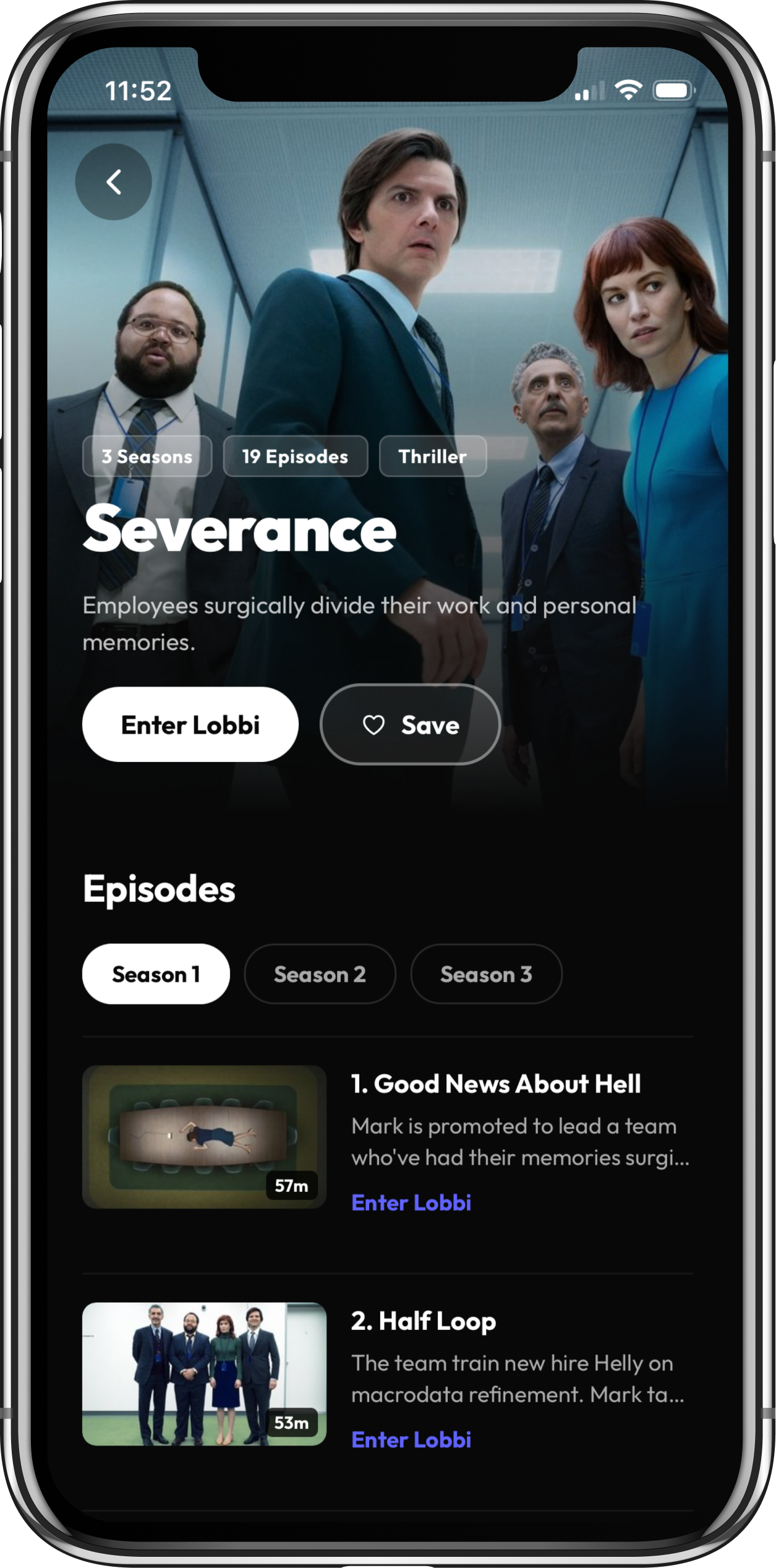
Fig. 01 iOS app · product journey
02
Design moment

The Lobbi Room — the Timeline as the product.

A timestamp-tagged comment list is fundamentally chronological. Watching a show is spatial-temporal — the viewer is at a specific point on a bar, and wants to know what's happening around that point, both behind and ahead. A list can't do that. A visualization has to. So the Timeline stopped being a component and became the centre of every viewing decision.

Four specific design decisions build the experience:

  1. Comments animate in and pin to their exact timeline point. When a new comment lands, it moves from the feed into a pin on the Timeline at its precise timestamp. Not a graphic flourish — a design choice that teaches the viewer the mental model in one interaction. Comments aren't floating in a stream. They're anchored to the moment.
  2. Bar height and colour warmth show discussion volume. Height for how many people are talking at that second. Warmth for how heated the reaction is — the bar walks from cool through to hot as the audience gets loud. The Timeline reads as a temperature map.
  3. Spoiler Safe Mode hides every comment ahead of the viewer. A boundary line inside the Timeline itself. Even for a show that aired a year ago, the viewer can experience the conversation as if it's unfolding live.
  4. Mobile has two views: filled and zoomed-in. Filled mode shows the whole episode at a glance. Zoomed-in mode expands a section around your current position — room to scrub, read individual pins, and see the density around what you're watching.

Around the Timeline sit the supporting surfaces: the comment feed (Live Mode by default; Top Mode surfaces the highest-scored moments), threaded replies, emoji reactions, and a composer tied to the current playback time.

Live sport is where this lands hardest. A goal in a Champions League match at the 34-minute mark becomes a spike on the Timeline of everyone watching. The whole world's reaction in one column.

Drag or swipe →
Fig. 02 Web app · Lobbi Room and desktop workflows
Drag or swipe →
Fig. 02b Mobile app · iOS screens
Principle
from the work
The Timeline isn’t a component. It’s the experience.
03
Design moment

From designed to shipped.

Ten years as a product designer, I'd handed final files to engineers a hundred times. This was the first time the design didn't hand off — it just kept going into code. The question wasn't "can I code this." It was "can I make design decisions with the code, deployment and architecture all in view at once, without the design suffering?"

Adopt the AI-augmented builder stack fully. Claude Code for architectural moves and stitching flows across many files. Cursor for interactive editing on specific components — closer, tighter, more surgical. Figma MCP for pixel-accurate design-to-code fidelity where a screen needed it.

The web codebase (Next.js + Supabase + TMDb + Vercel):

  1. Next.js App Router. TypeScript. No shortcuts. Middleware for route protection.
  2. Supabase for auth, database and RLS. Invite codes, email verification, PKCE + implicit callback handling, exponential backoff on repeated login attempts.
  3. The DAL pattern. A data access layer that switches between local mock and Supabase via feature flag.
  4. Vercel for deployment. Live at enterlobbi.com.

The iOS codebase (Expo + React Native): separate codebase, iOS-first via TestFlight, Android-ready but not yet submitted. Same Supabase backend as web. Same DAL pattern. Same design system. Active alpha testers using it today.

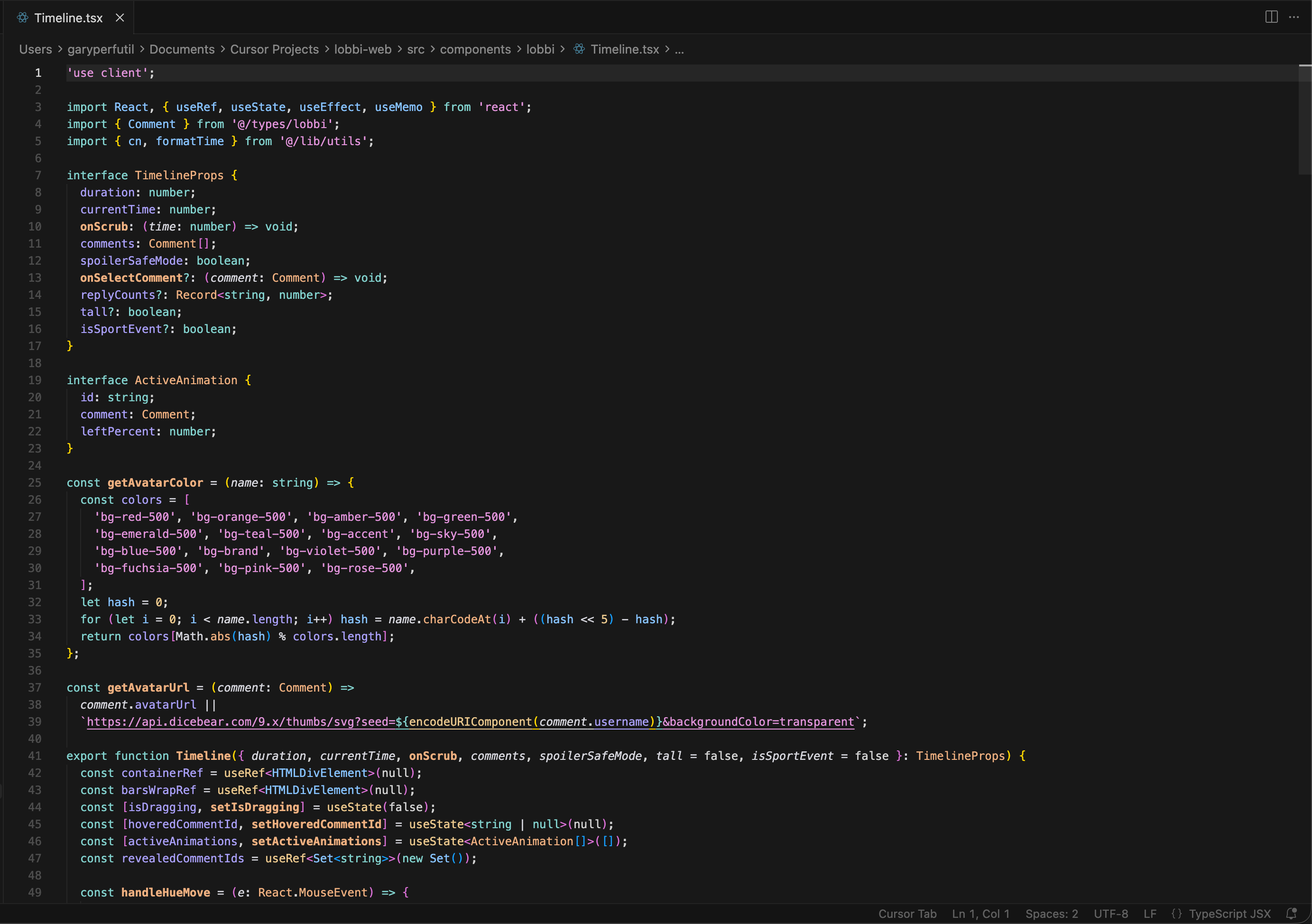
Terminal running Cursor mid-build — the actual working environment, not staged. Real code, real commits.
Fig. 06 The builder environment · Cursor / Claude Code
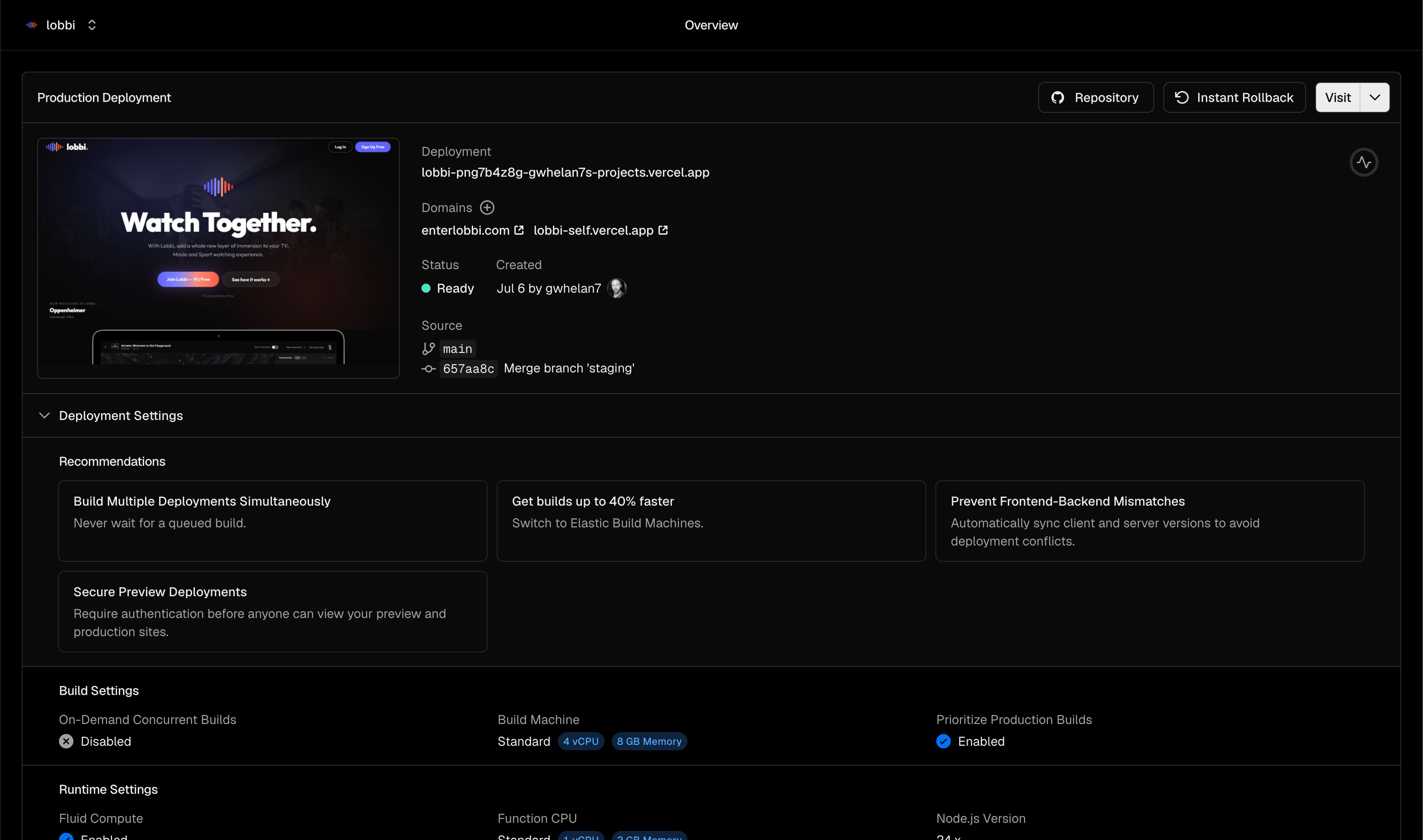
Vercel deployment dashboard — proof of shipping.
Fig. 07 Vercel · production deploys
Principle
from the work
Designing and building are the same craft now.
Outcomes

What Lobbi actually shipped.

Two codebases, in production. Same design system across both. Real security, real infrastructure, real users.

Product state
LIVE

Web app in production at enterlobbi.com. iOS on TestFlight with active alpha testers. Designed, coded and deployed solo, AI-augmented.

Codebases
02

Next.js web + Expo iOS. Shared Supabase backend. Shared DAL pattern.

Build stack
AI

Claude Code · Cursor · Figma MCP as working collaborators, not demos.

Design system
1FONT

Outfit only. Purple + Coral on Lobbi Black. Zero accent drift across two codebases.

Security posture
RLS

Invite codes · email verification · PKCE + implicit callbacks · exponential backoff · Supabase RLS · zero any in TypeScript.

What this project taught me

The compounding advantage.

Taking Lobbi from an idea to a fully-built product in production taught me the shape of an end-to-end build in a way a designer normally never sees — architecture and security decisions included. Next time, I won't just design faster. I'll build faster and cleaner, because I now have a mental model of the whole system, not just the surface. The next project will feel like a second draft, not a first one. That's the compounding advantage of shipping the whole thing yourself: every part of the build gets better the next time, not just the design.

Where this thinking goes next

Design and ship. Every product from here.

Every product design decision from here forward gets made with the ship path in view. Not "I'll hand this off" — "I'll ship this." Not for every project, and not for every context — but for the ones where the compression matters, the ability to design AND ship end to end is now what separates the great UX people from the rest.