Welcome to Week Three
Week 2 gave both projects a solid research foundation — viability studies, behavioural research, even the research podcasts I shared with clients. Now, in Week 3, we started turning that evidence into something tangible. Early wireframes, flows, and workshops began to make the projects feel real. This was the week of moving from words to visuals.
Monday – HYD: From Research to Wireframes
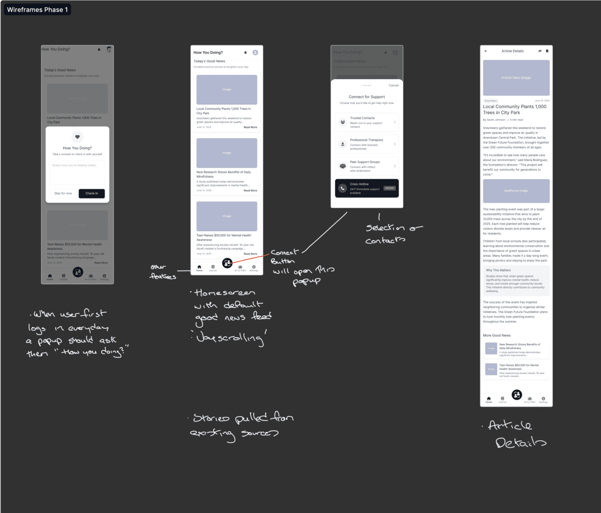
After last week’s viability and doomscrolling research, I sat down to sketch the first HYD wireframes. These weren’t polished screens — more like rough outlines to test assumptions:
- How should the emergency contact flow actually work?
- Where do we introduce preventative nudges without overwhelming users?
- What does the onboarding journey look like for someone already under stress?
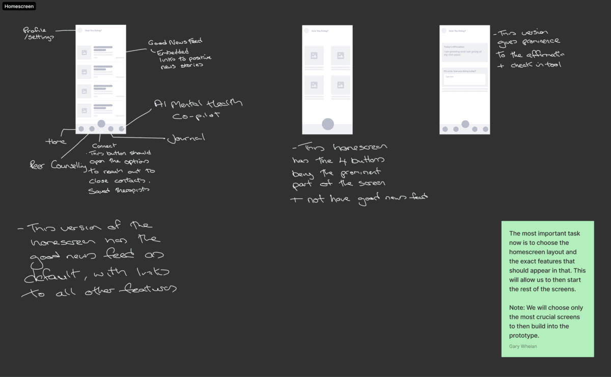
At this point, it was about creating something concrete to react to, knowing most of it would change.
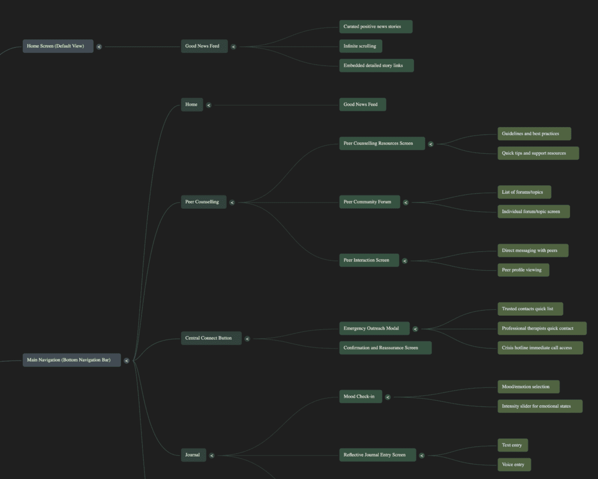
Tuesday – HYD: Mapping the Flows
Tuesday was about sequencing. I began the flow mapping exercise for HYD:
- Onboarding > Daily wellbeing prompts > Emergency escalation.
- Conditional paths depending on whether users engaged with nudges.
- Fallbacks if contacts weren’t available in the moment.
This exercise revealed friction points early. For instance, if a user ignores prompts for too long, should the app escalate, or should it step back? Big ethical questions.
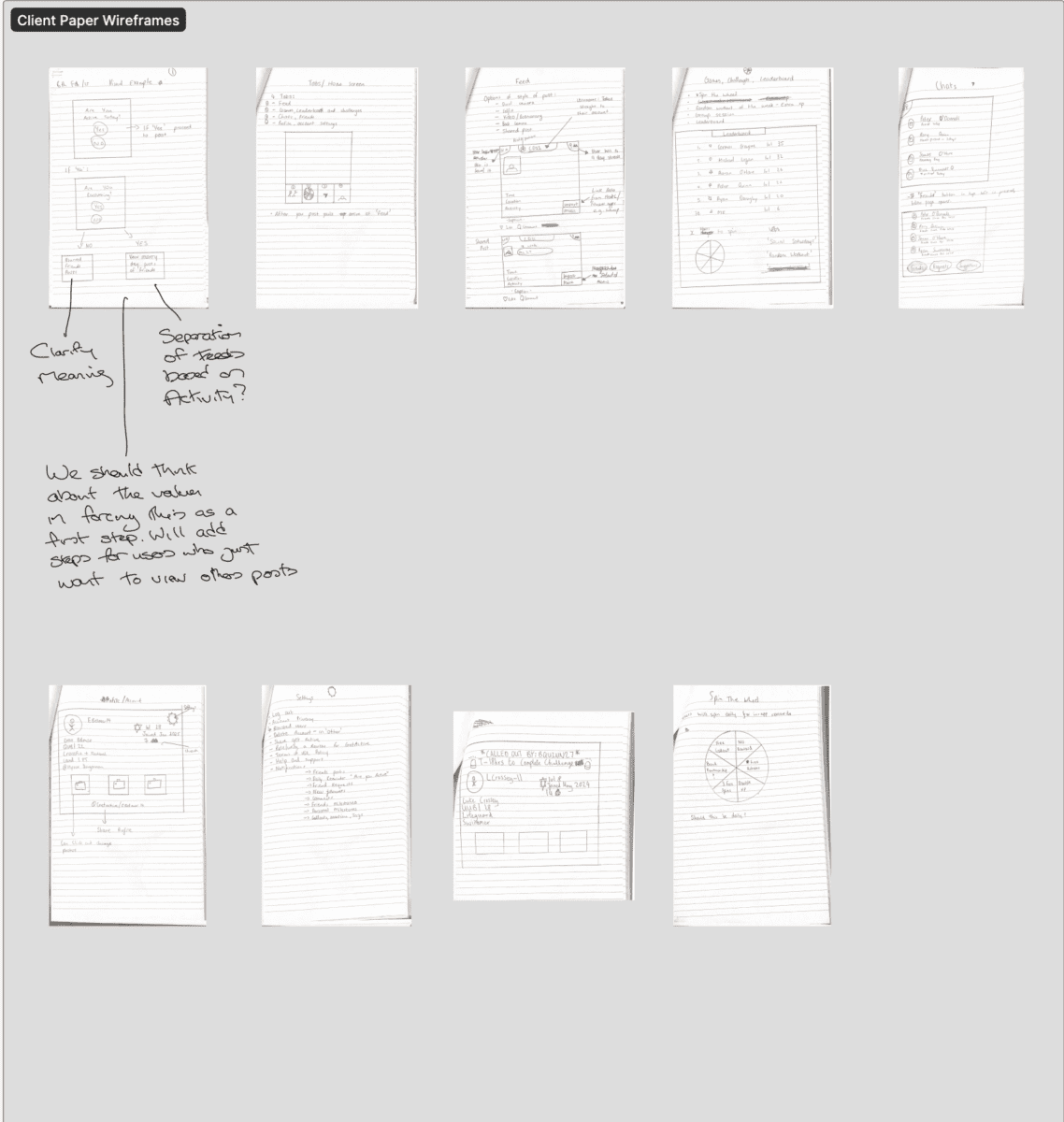
Wednesday – GetActive: Client Paper Wireframes and Flows
Wednesday belonged to GetActive. We ran a collaborative session where the client produced their own paper wireframes. These are always raw, but they surface assumptions:
- Heavy emphasis on leaderboards.
- Competing visions of how habit tracking should appear.
- Confusion about how to balance community vs. solo experience.
From there, I drafted initial flow maps that translated their sketches into workable structures. This gave us a baseline to critique.
Thursday – Refining and Testing Assumptions
Back at my desk, Thursday was about iteration:
- HYD wireframes refined with clearer UI scaffolding.
- GetActive flows redrawn with a focus on clarity and reducing dead-ends.
Here’s where research began to ground design. For example:
- HYD’s doomscrolling research informed how and when to show prompts.
- GetActive’s behavioural research shaped how often streaks and nudges should appear.
It was also a reminder that wireframes aren’t about being pretty — they’re about asking the right questions visually.
Friday – First Demos and Alignment
Friday was a milestone: both projects had something to show.
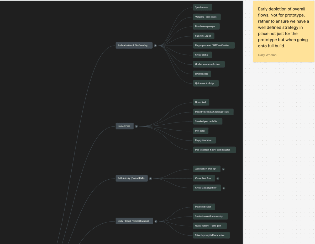
- HYD: A clickable prototype of the initial flows. Not polished, but enough to walk through the logic with stakeholders.
- GetActive: A rough demo of the Phase 1 onboarding and habit-setting journey.
Both demos surfaced immediate issues — which is exactly the point. It’s far better to catch friction in week 3 than in week 10.
Reflection: “This was the first week where the work felt real to the clients. Until you put something on screen, everything is just talk.”
Elsewhere This Week…
Outside these two big projects:
- Facilitated a client walkthrough for an MVP prototype in another project.
- Participated in a Q2 roadmap review — making sure UX priorities weren’t lost in sales discussions.
- Drafted a quick UX estimate for a returning client interested in a 6-week sprint.
Looking Ahead
Next week is all about the home screen. For both projects, this is the most critical UX entry point — the first impression and the daily touchstone. Decisions made there will ripple across the rest of the experience.