03 / 06
Architecting a complete P2P neobank platform from concept to launch.
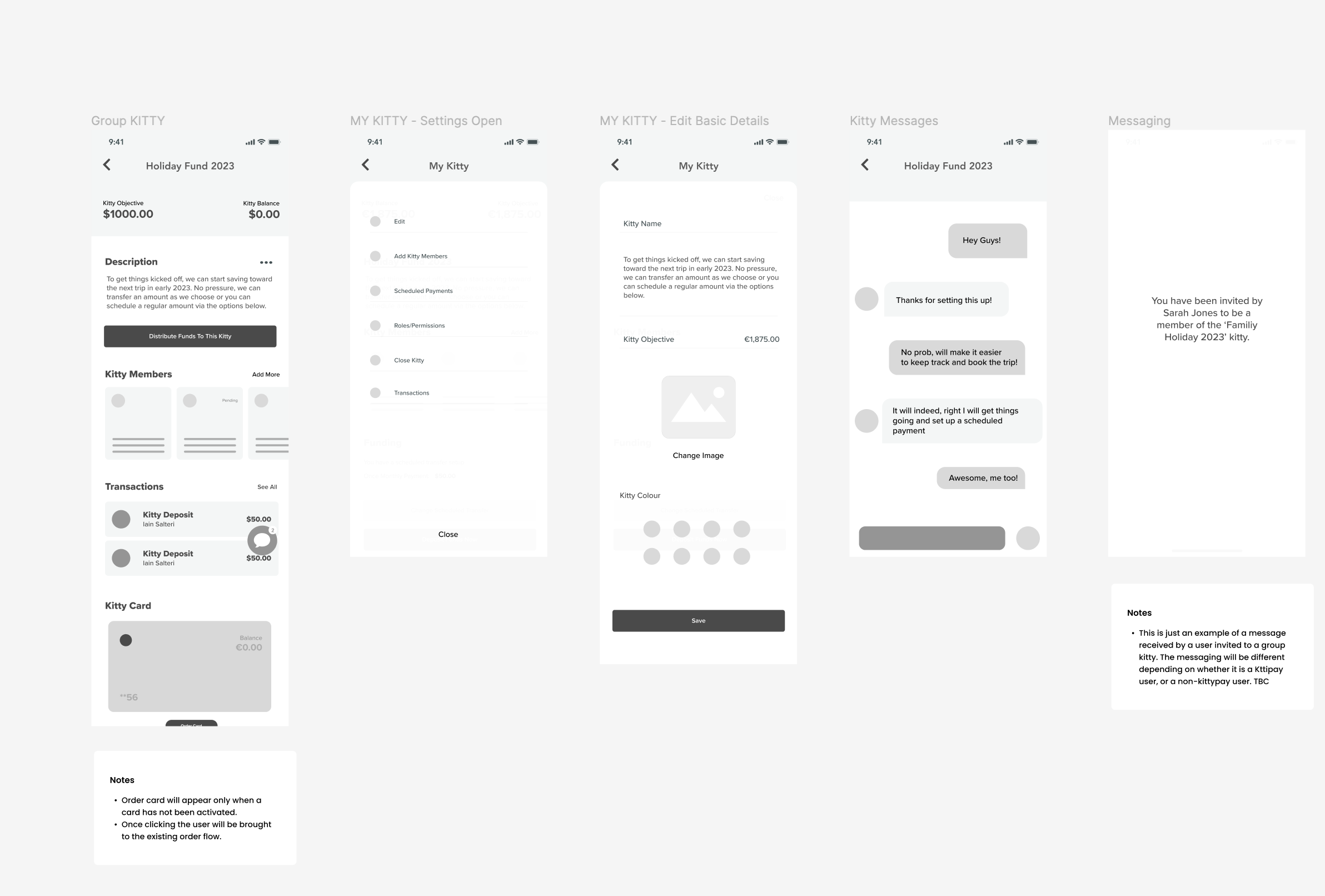
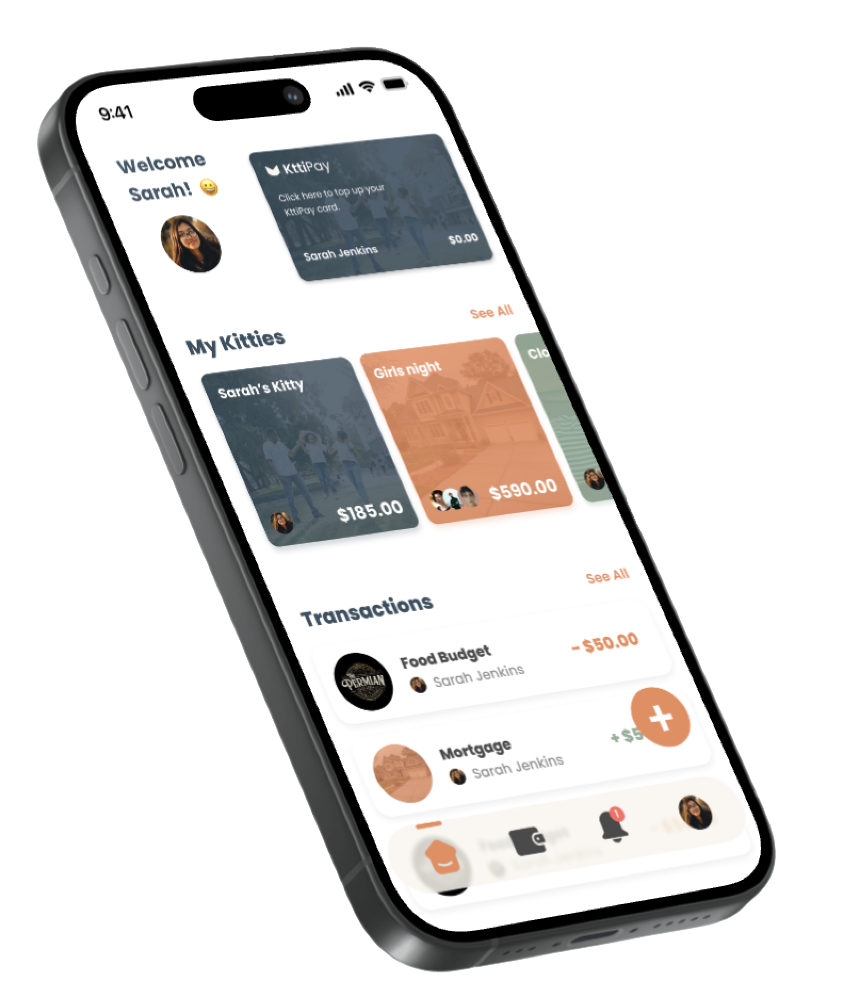
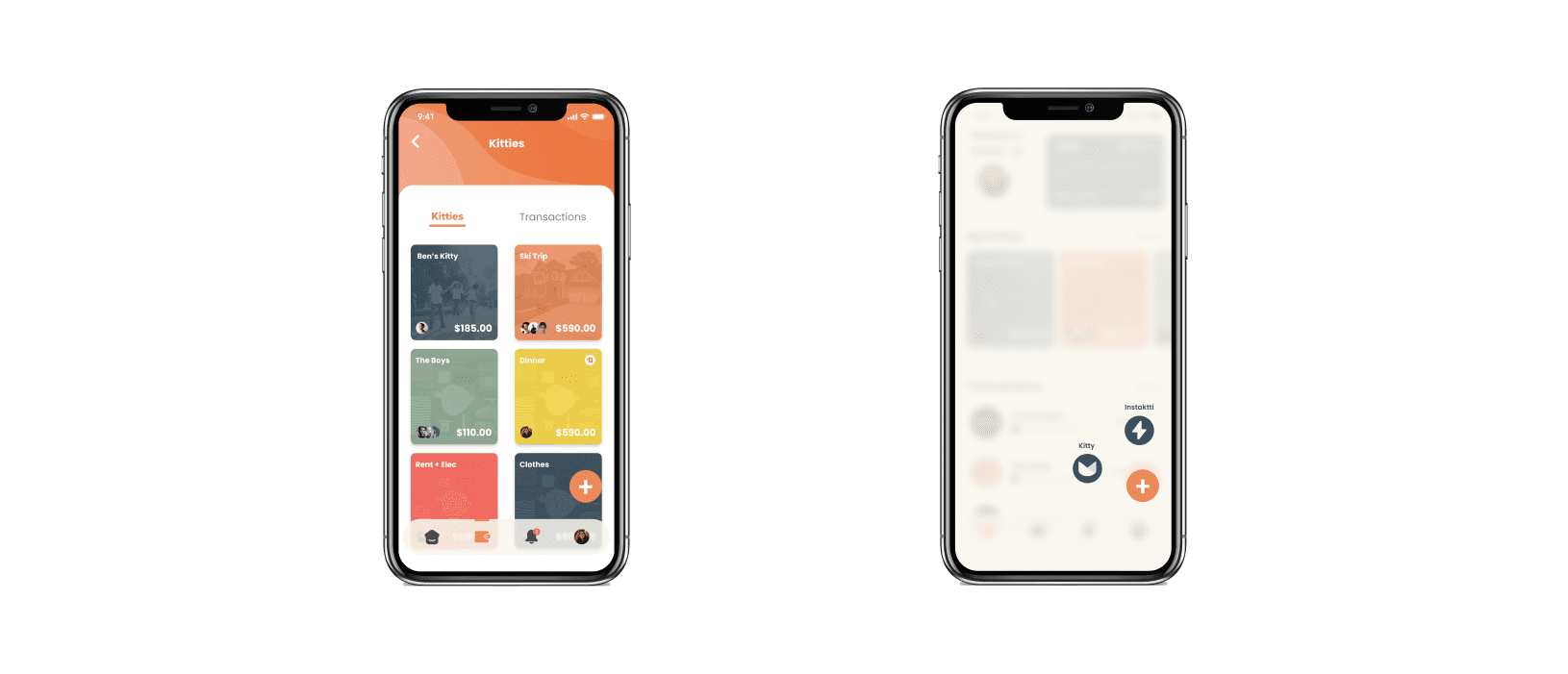
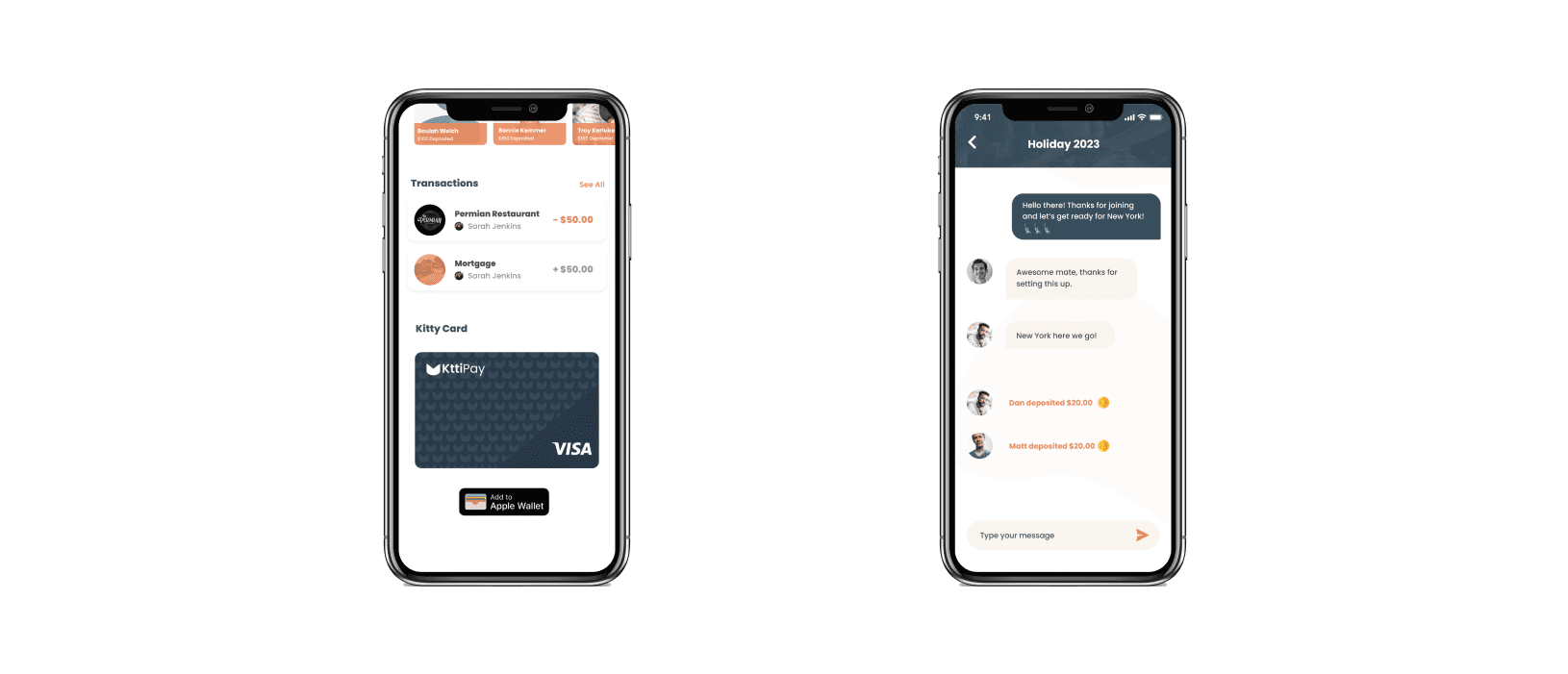
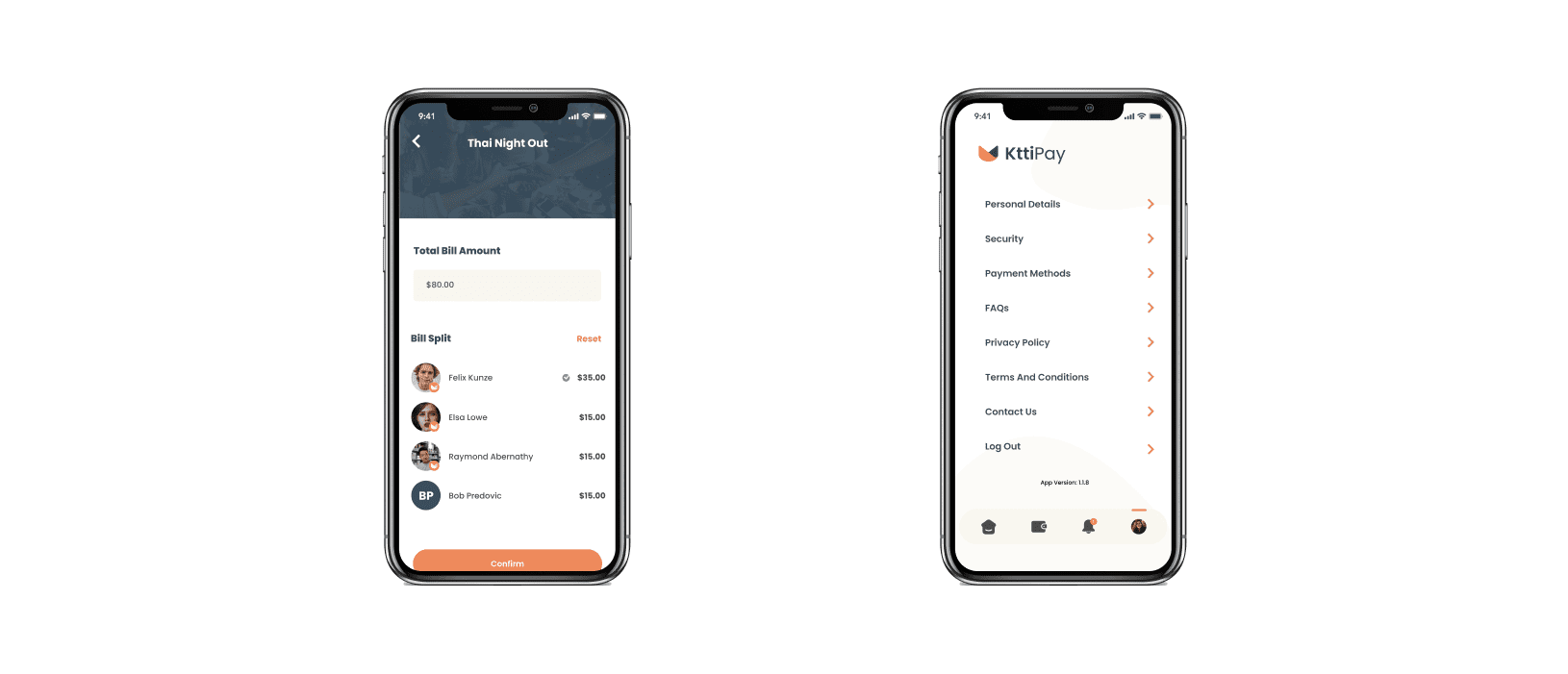
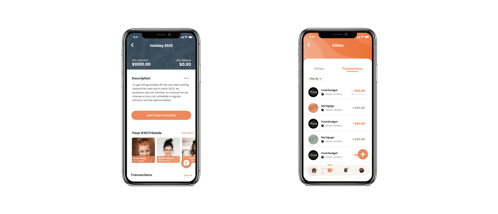
The objective was to develop a robust peer-to-peer neobanking platform from the ground up — advanced security, full regulatory compliance in fintech, and a simplified experience for shared financial activities across Australasia. What arrived as bill-splitting became group finance: shared Kitties, group saving, and instantly issued virtual cards.
Build trust in finance without making the product feel like banking.
The project began with an idea and a validation phase — workshops with target users, prototyping, and desk research to give the client confidence to proceed. The product evolved from bill splitting into shared Kitties, group saving, and virtual cards issued to every member.
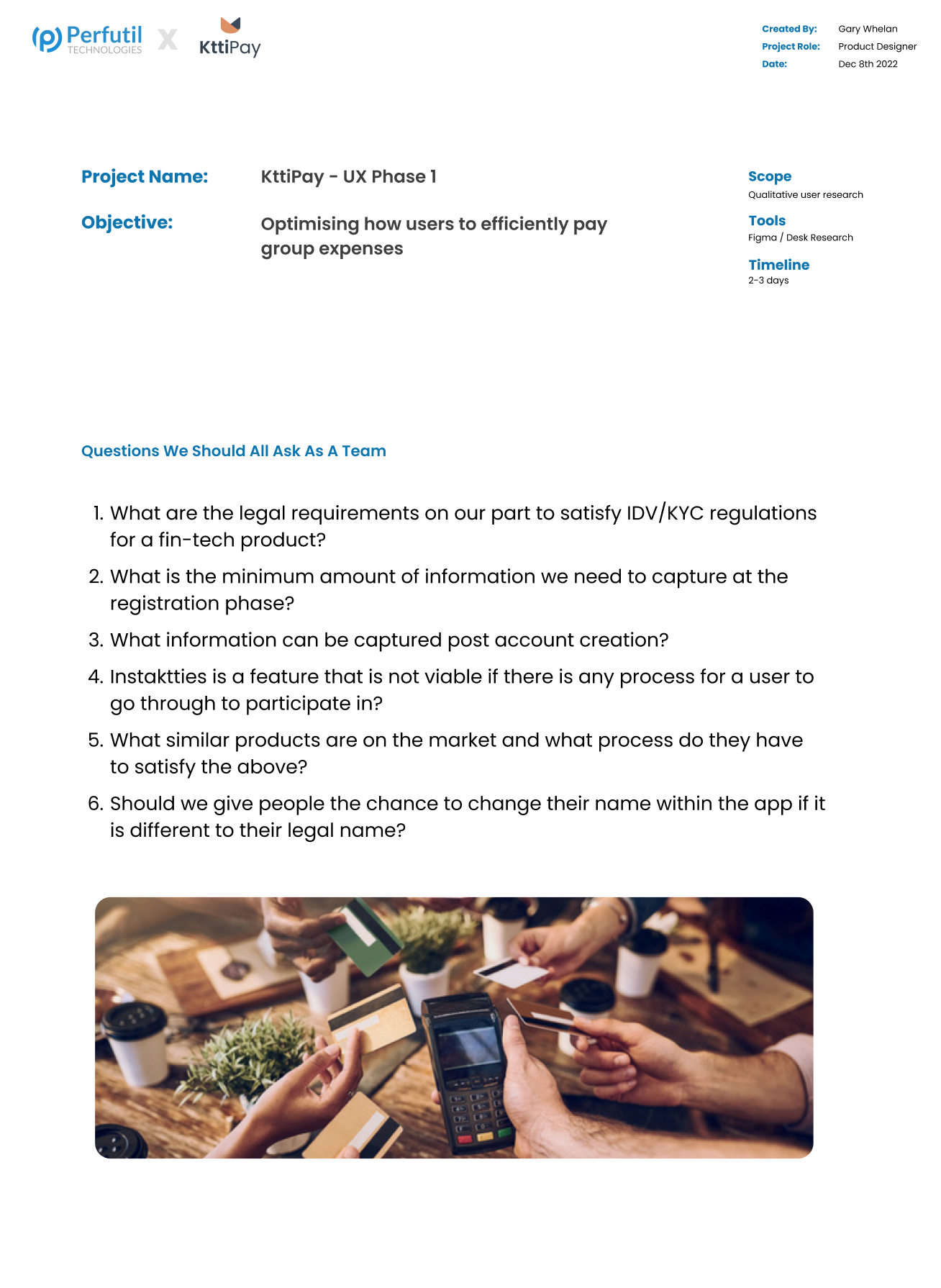
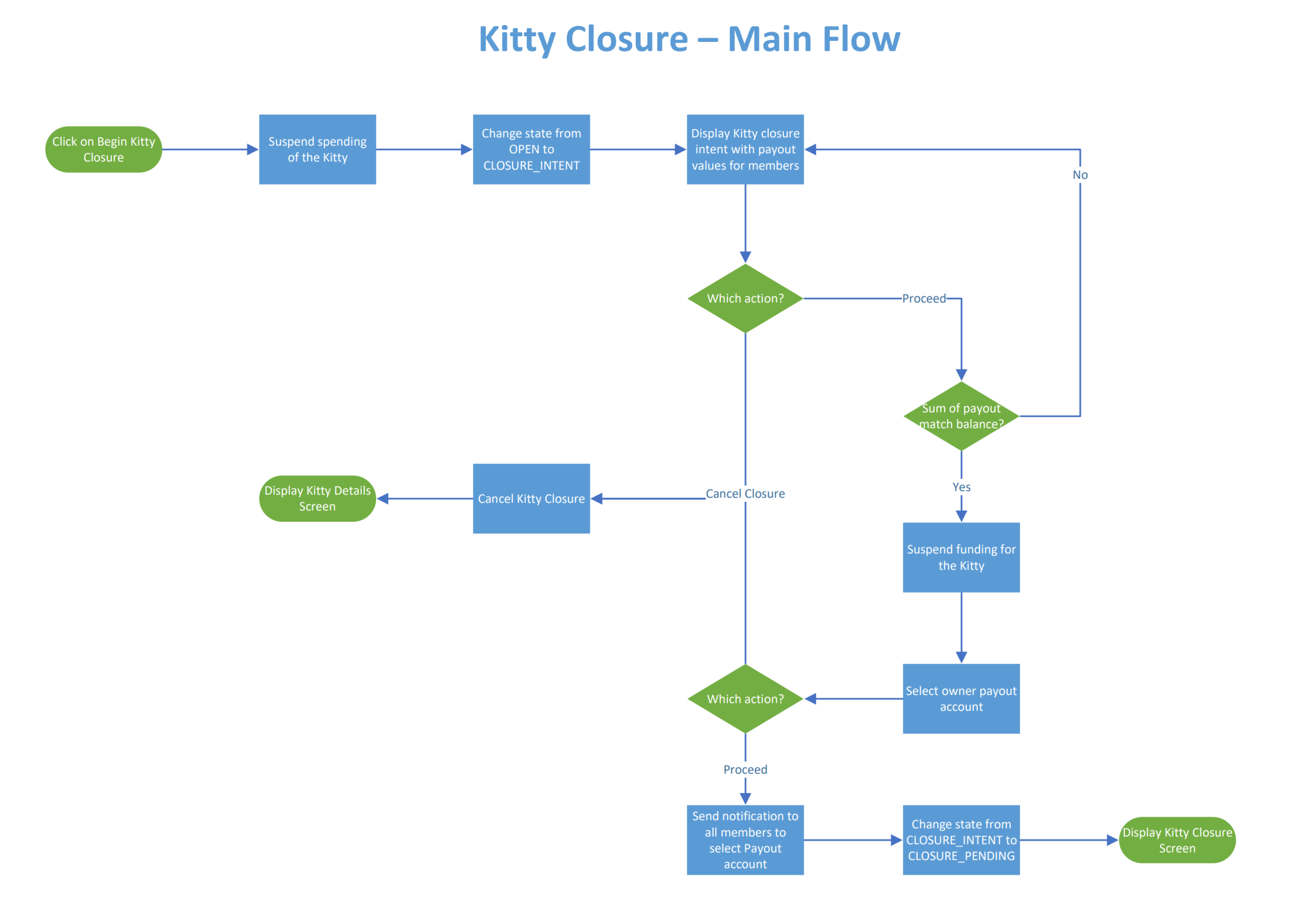
Three constraints ran through every screen: security and privacy (financial data is never abstract), regulatory compliance across regions (legal teams involved from day one), and complex user interactions simplified into flows that feel quick — especially compared to traditional banking products.
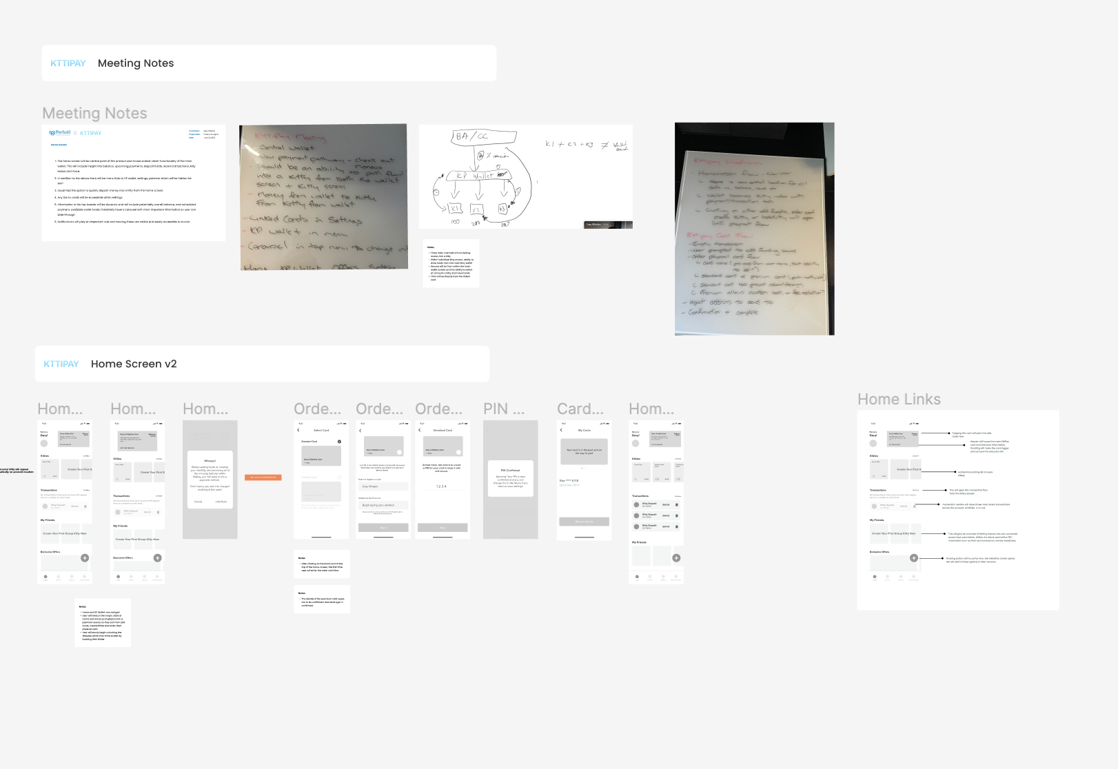
The hardest pivot came when the initial payment processor fell short on integration and UX. We evaluated alternatives in sandbox environments, re-architected flows around a new provider, and kept the interface simple and secure throughout the switch.
Validation workshops that changed the product.
Target user identification started with surveys and interviews with families and friend groups. Market analysis mapped gaps in group financial management. Wireframing and prototyping explored user flows; multiple rounds of user testing refined interactions before high-fidelity design.
When the first payment integration failed, focused test sessions prototyped the flow changes required by a new processor. Iterative prototyping integrated feedback until the new integration was user-friendly and met functional requirements.
The final product — friendly, approachable fintech.
The final UI had to meet fintech industry standards while feeling friendly enough for users new to digital banking. Home screen and member management, account details and Ktti Index, full virtual card functionality with messaging integration, split expenses and system settings — each designed for clarity and trust.
My work in numbers.
From concept on paper to full launch — metrics from the shipped product.
Users and rising every month since launch.
Specialists — solution architects, PMs, and developers across stacks.
UX-led journey from beginning to launch.
Gary was there every step of the way, from ideation, wireframing, solution design, and implementation. We couldn’t have launched KttiPay without him. — Ian Salteri, Founder
When onboarding is the product.
Humm needed a UX audit that turned drop-offs into conversions — research first, redesign second.