04 / 06
Research, test and redesign a BNPL onboarding flow at scale.
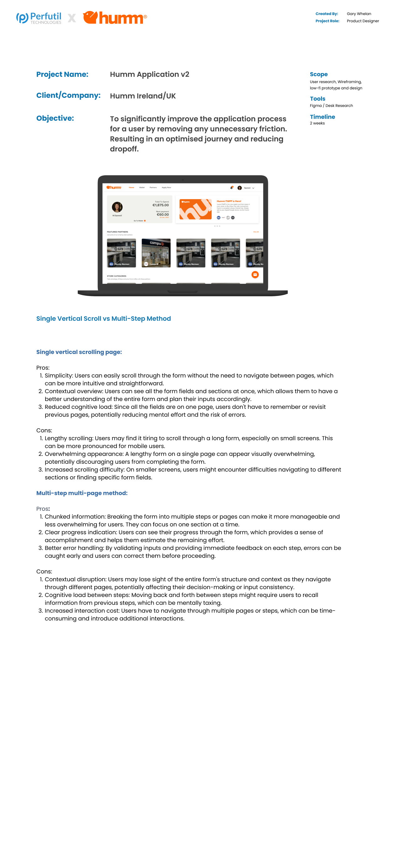
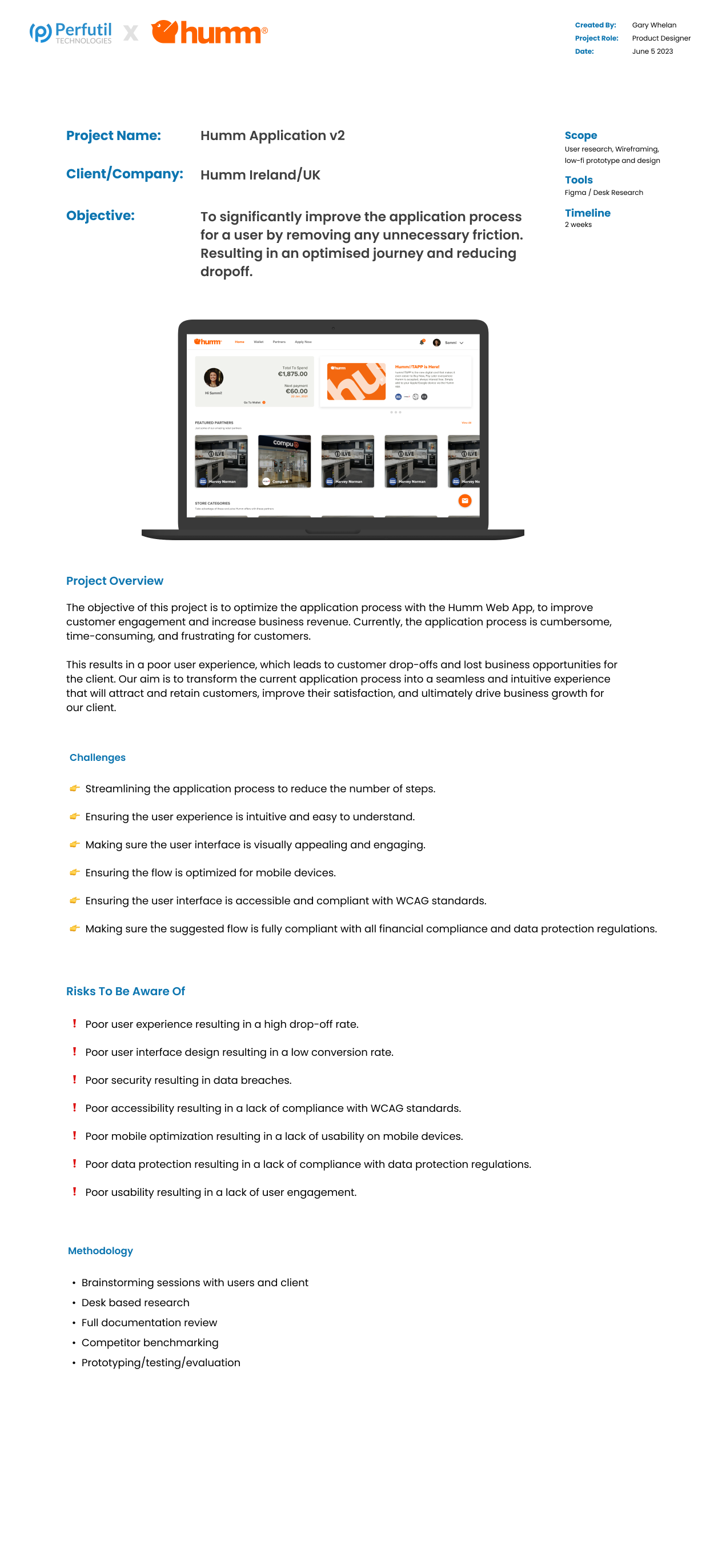
Humm approached us with a significant problem: their loan application experience was built for functionality first, not users. A long, multi-step sign-up process was causing huge drop-offs. I led a comprehensive UX audit, presented findings to the client, then redesigned and tested the onboarding end to end.
A low conversion rate hiding in a too-long form.
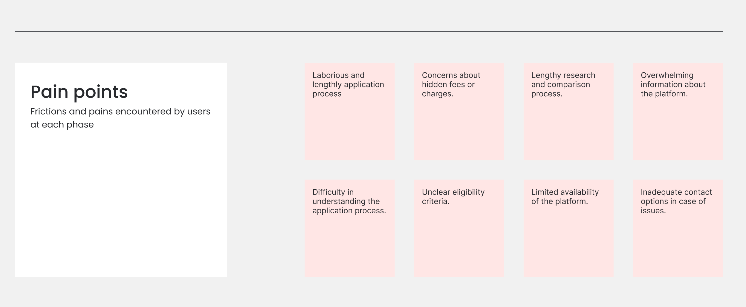
The original onboarding was too lengthy — too many steps and complex questions. That friction drove significant user drop-off. Third-party verification integrations added risk to the experience. Users needed to feel secure sharing financial information, with transparent communication about data security and trust signals throughout.
Research confirmed what we suspected: form length significantly affects completion rates. Shorter forms, or forms broken into manageable steps, see better completion because they reduce cognitive load and make the process feel quicker.
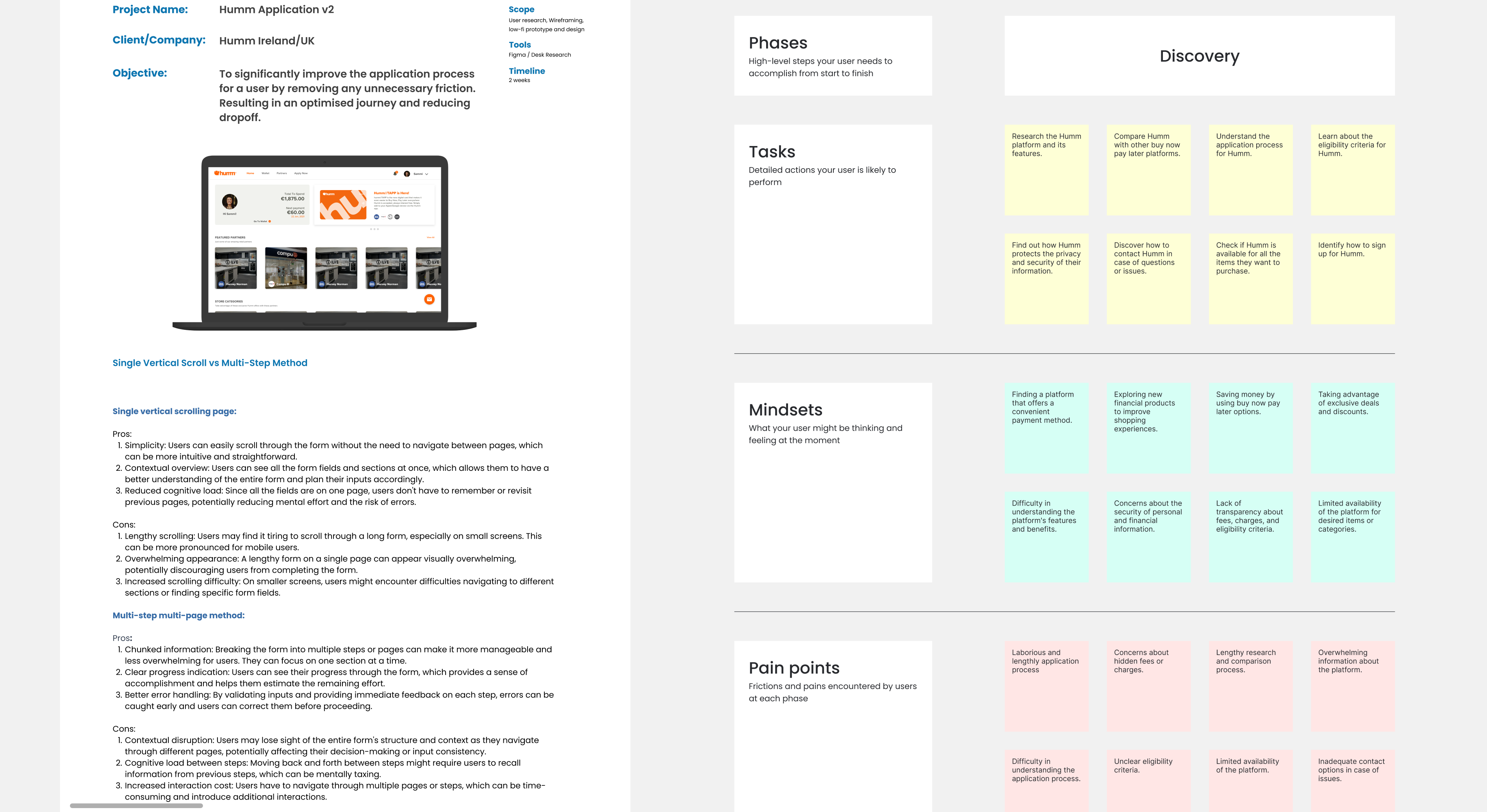
Research that mapped where users actually dropped off.
I conducted a thorough heuristic evaluation to identify usability issues, engaged users through interviews and surveys, and analysed journey data to pinpoint where drop-offs occurred. That quantitative and qualitative mix focused redesign efforts on the most critical stages.
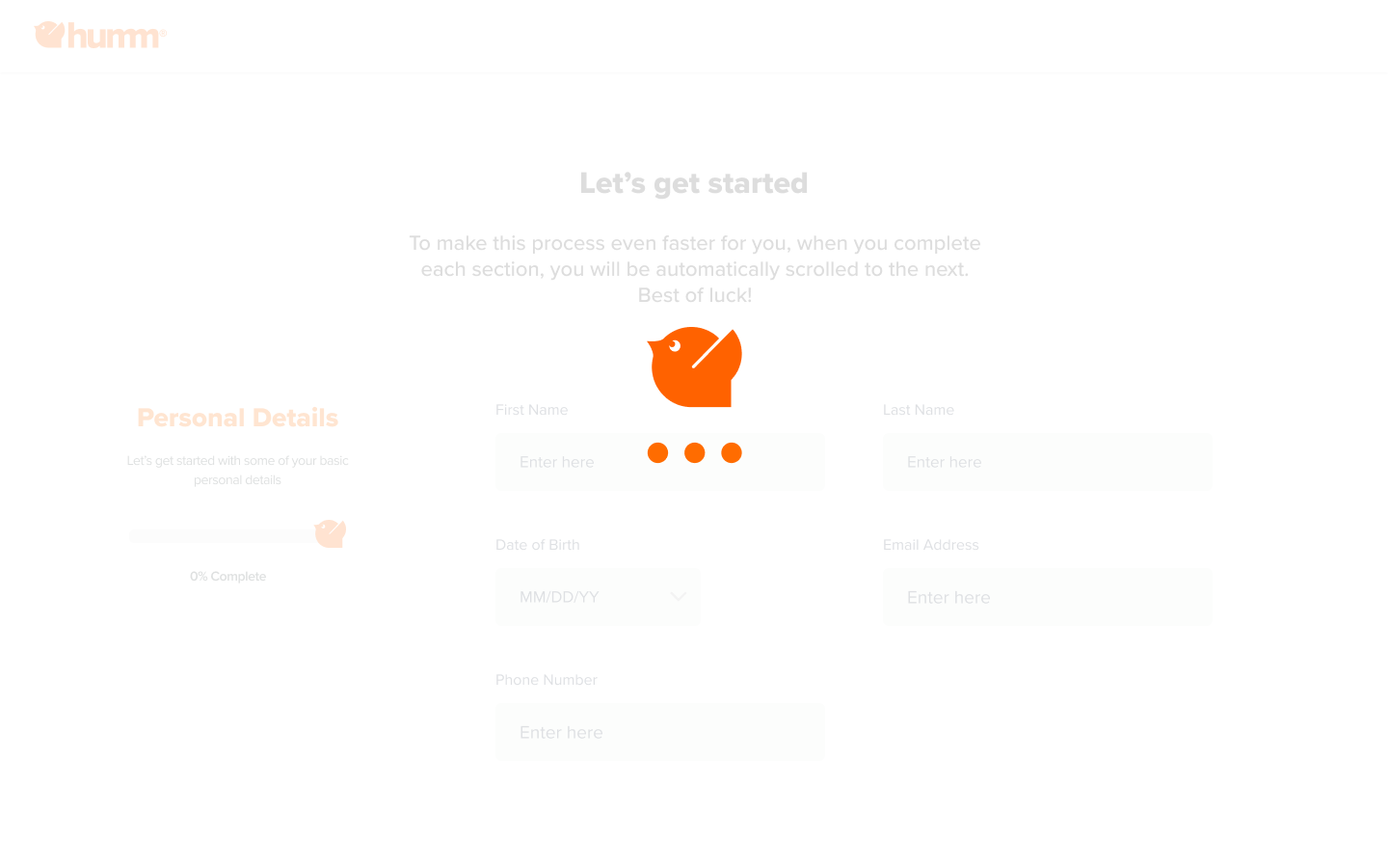
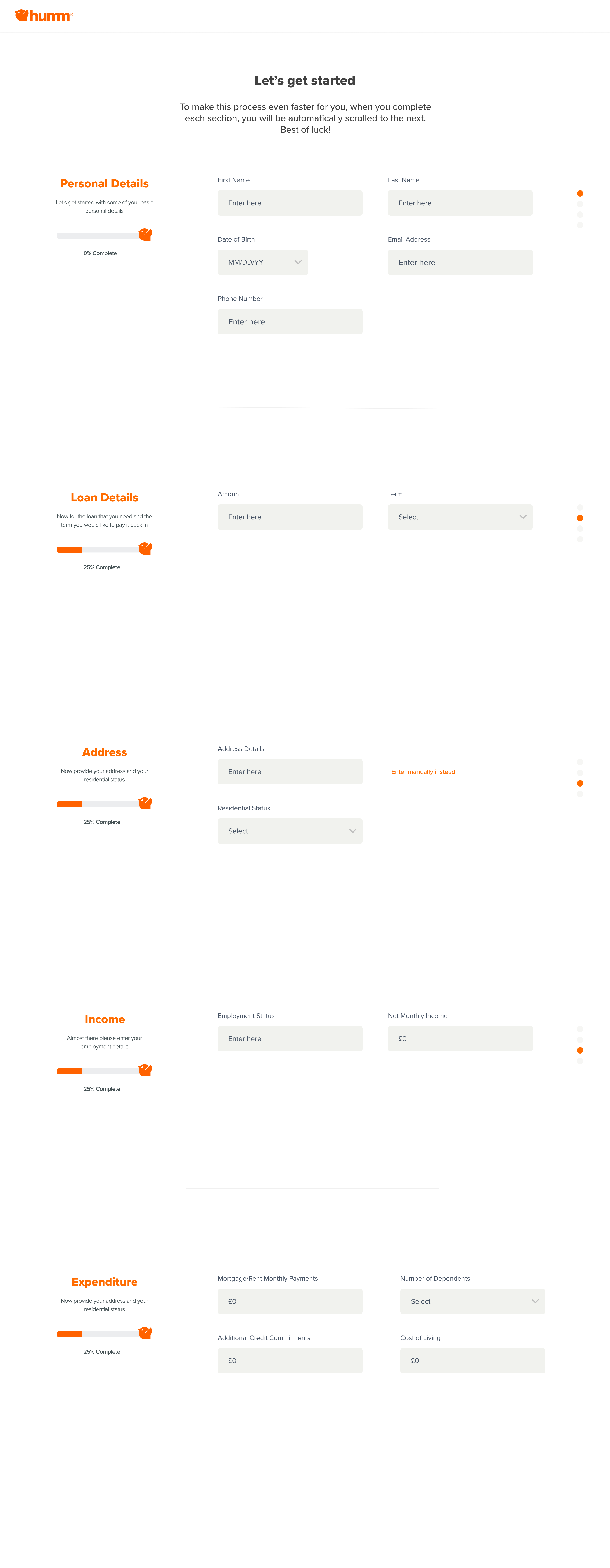
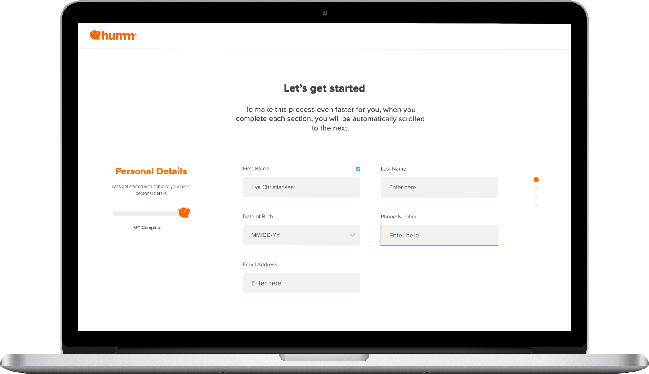
The redesigned onboarding — clear, concise, compliant.
The final UI aligned with Humm's branding while guiding users through onboarding effortlessly — clear visual cues, concise instructions, and streamlined steps. Success grew into multiple applications across different regions; I continue working with the Humm team through UX-led workshops.
The impact of the work.
Reduction in user drop-offs on the redesigned flow.
Increase in completed onboarding applications.
User feedback highlighted ease and intuitiveness of the new flow.
Designing for teachers and students in the field.
Ed Tripper focused on what happens during the trip — not just the admin before it.